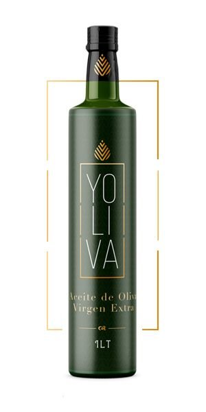
Designing a label for extra virgin olive oil Yoliva
PROJECT DESCRIPTION
Listening to entrepreneurs talk passionately about their projects seems like an easy task, but it is not, because many times they have excellent ideas and other times you have to listen to the market to learn about the brands and products they want to develop.
This is how this Extra Virgin Olive Oil project was born, listening and trying new things. The challenge was create a name and a graphic design for the label .
of a gourmet olive oil brand made in Spain.
Label design is an essential part of the branding and positioning of any product brand. Good design can communicate the values and quality of a product in an intuitive way, creating an emotional connection with consumers.
The aim was to communicate the rigorous quality of this olive oil in a subtle way, positioning it as a gourmet and luxury product without the need for explicit words.


CHALLENGES
Communicate the rigorous quality of this olive oil by treating it as a luxury product, without announcing it with words, only with its name and logo, nothing else. Let the packaging, or in this case the labeling, create that connection with the consumer from the mere aesthetic appearance.
We conducted an exhaustive research on the sensory attributes and values associated with top quality olive oil. We discovered that it is associated with concepts such as territory, tradition, purity and authenticity. However, many of the existing labels on the market manage to communicate all these aspects. Some do it in a minimalist way and others in an invasive way.
We started from the premise that the packaging itself should become the main means of communication. We decided to use a minimalist design with golden details, inspired by the ‘green gold’, the elegance of the olive tree and the delicacy of its fruit. The “Yoliva” logo was designed in an isotype of a drop of green gold with dynamic arrows pointing to the earth, our roots.

BRANDING AND PACKAGING SOLUTIONS
We conducted A/B tests with consumers to validate that the label design intuitively conveyed concepts such as quality, tradition and luxury. The response exceeded our expectations, with over 90% of respondents associating the product with these attributes without needing to read any text. Without overloading the label with banners, icons or long stories.. (For storytelling, we already have instagram).
At Brandesign we wanted to create a short brand, without many explanations, going for the most complete minimalism in the selection of the name and in the creation of a simple but direct icon, because in the same way the client does when purifying his olives drop by drop and creating this select olive oil.
Conjugating and amalgamating the names of its creators with its key ingredients, the name “YOLIVA” is born, a woman’s name that evokes the flavour of the olive cultivated in the province of Cordoba and Antequera with the aptitude of an olive mill.


RESULTS
The label communicates by itself.
Simple but luxurious in appearance, this olive oil label appeals to the target audience with a very select look and feel, giving it the “luxurious” character of the fruit that yields the oil.
Without the emotional connection created by the new design to values of luxury, tradition and purity, it is likely that sales would not have increased so significantly. The brand could have been lost without visibility on the shelf and remained in the standard olive oil segment, instead of positioning itself as a high quality premium product.
IS YOUR LABEL NOT TRUE TO YOUR PRODUCT?
Do you have a product that does not communicate its truths? We can help you. At Brandesign we design labelling and packaging strategies designed to make your product unique, different and attractive.