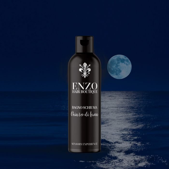
Design of a luxury cosmetic brand:Enzo Hair Boutique
As a branding and packaging agency we are pleased to present a success story we have developed for the renowned stylist Enzo. In this success story, we will share the details of our project, from the initial approach: the design of your logo and design of the labels and design of the labels. for your hairdressing salon and hair care product line.
APPROACH
Enzo wanted to launch his own line of hair cosmetics, he had been working as a hairdresser in Madrid for many years, but was looking for a new venture at this stage: to open not only a more eclectic and exclusive hair boutique but also to create a brand of ‘vero veríssimo italiano’ products that would gradually become recognised in the hair care sector, he approached us for a complete design of his hair care product line (Hair Care).
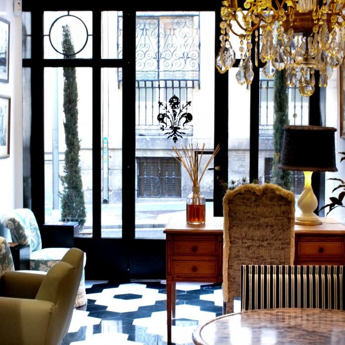
Our aim was to reflect his style (based on his training in Florence, Italy), his space and transform it into a brand that would convey the Italian essence of Enzo Hair Boutique and create a brand positioning for his select clientele.
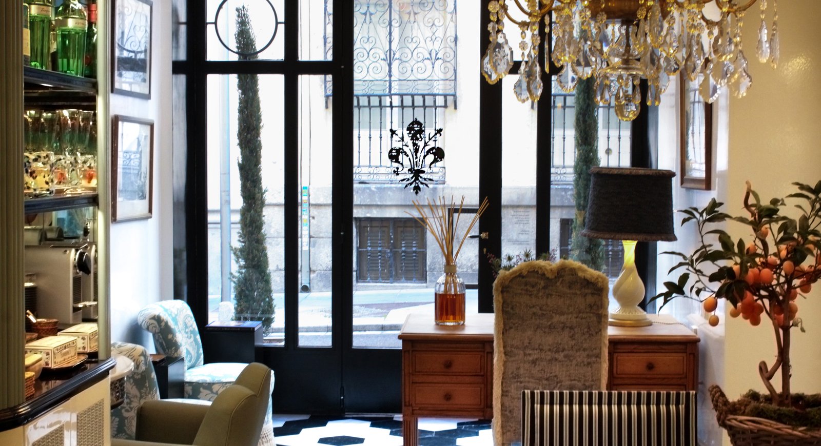
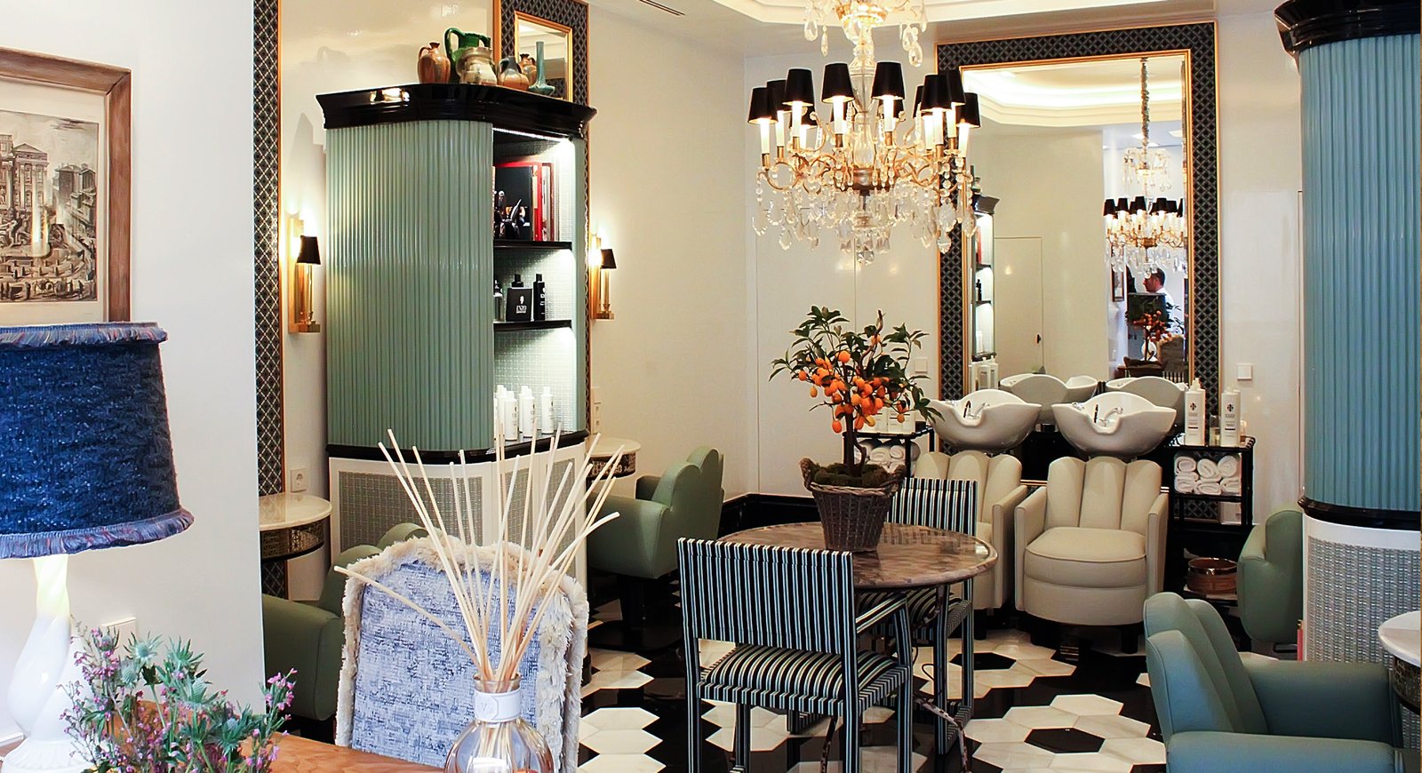
This new brand would be based on a hairdressing salon in the Salamanca district of Madrid as well as an exclusive line of hair treatments created in the best laboratories in Italy that would be sold from his own online shop.

BRAND DESIGN
At Brandesign we always say that a brand is not a logo, it is the tip of the iceberg of a brand. corporate identity and the first aspect of the recognition of the brand image..
In the case of Enzo Hair Boutique, our task was to design a logo that would capture the essence of the brand and convey their approach to ‘natural beauty’ and cosmopolitan luxury (for their desired positioning). Working closely with the client, we immersed ourselves in their past, their background, their working style and the world of Italian aesthetics to find the right inspiration.
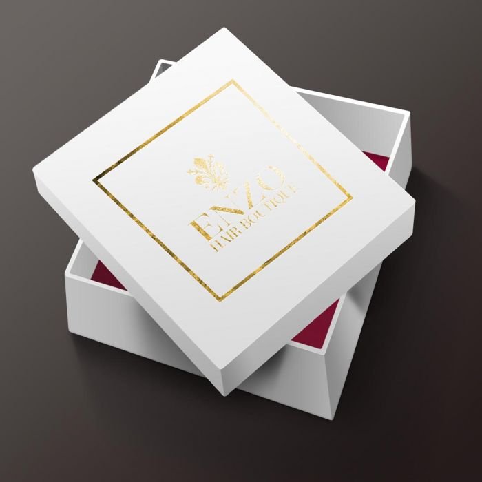
After several proposals and concept explorations, Enzo was fascinated with a grunge proposal inspired by the fleur-de-lis of the Medici family: an icon present all over Florence.
After several test runs, the resulting logo is a combination of cosmopolitan, Florentine style, simple, classic and elegant at the same time.
.

LABEL DESIGN
Once the visual identity of the brand has been established, we focus on the label design.of the products.
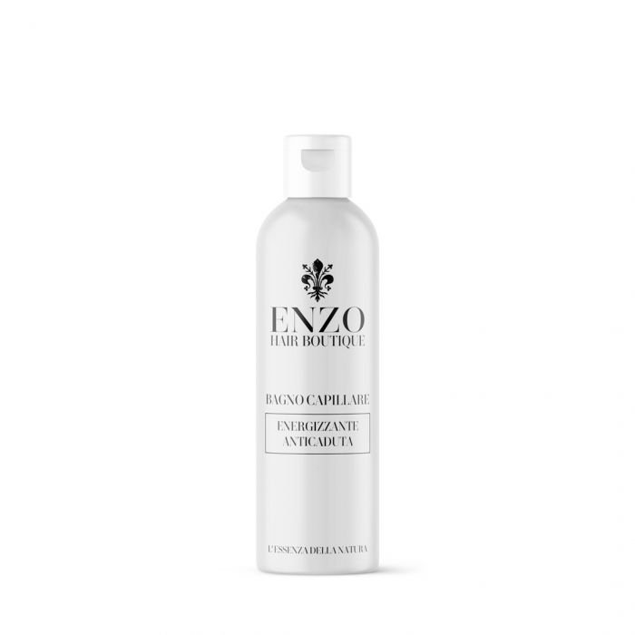
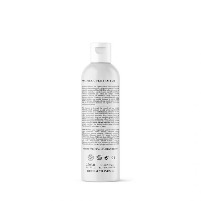
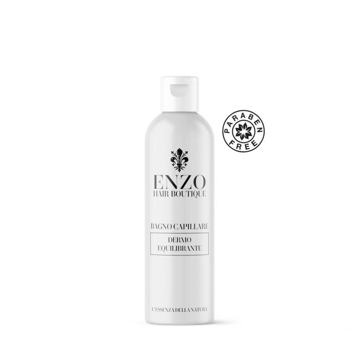
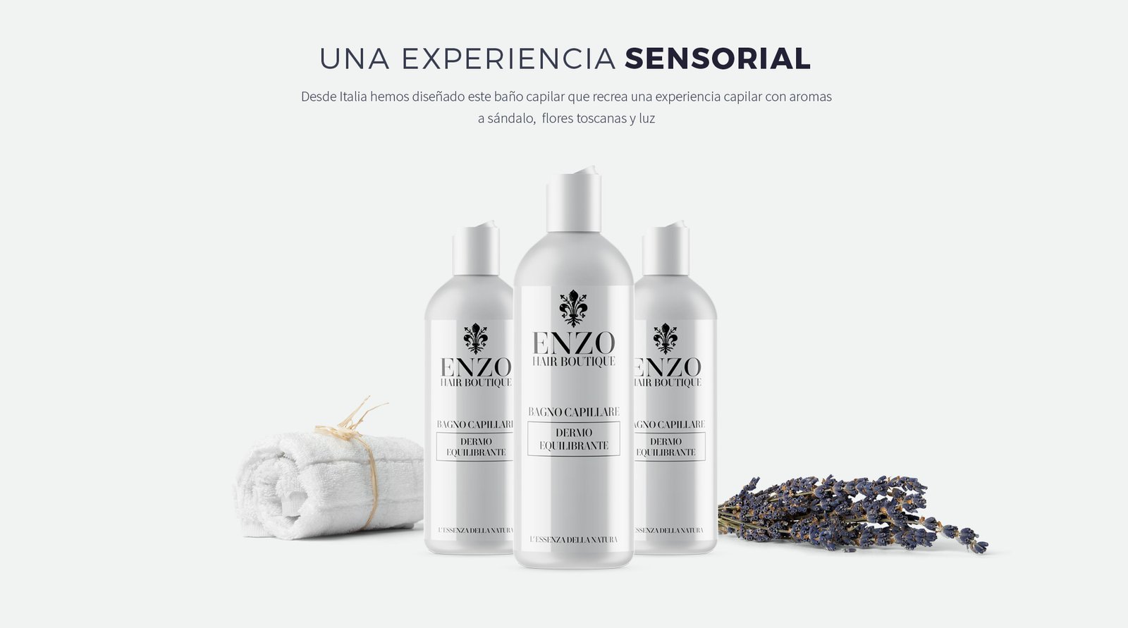
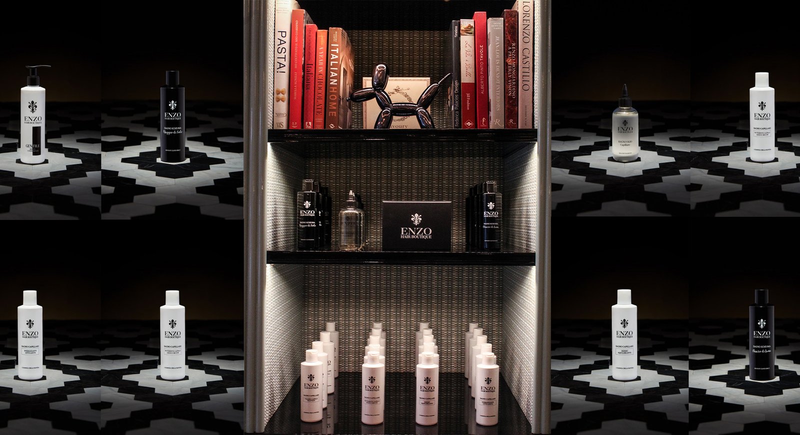
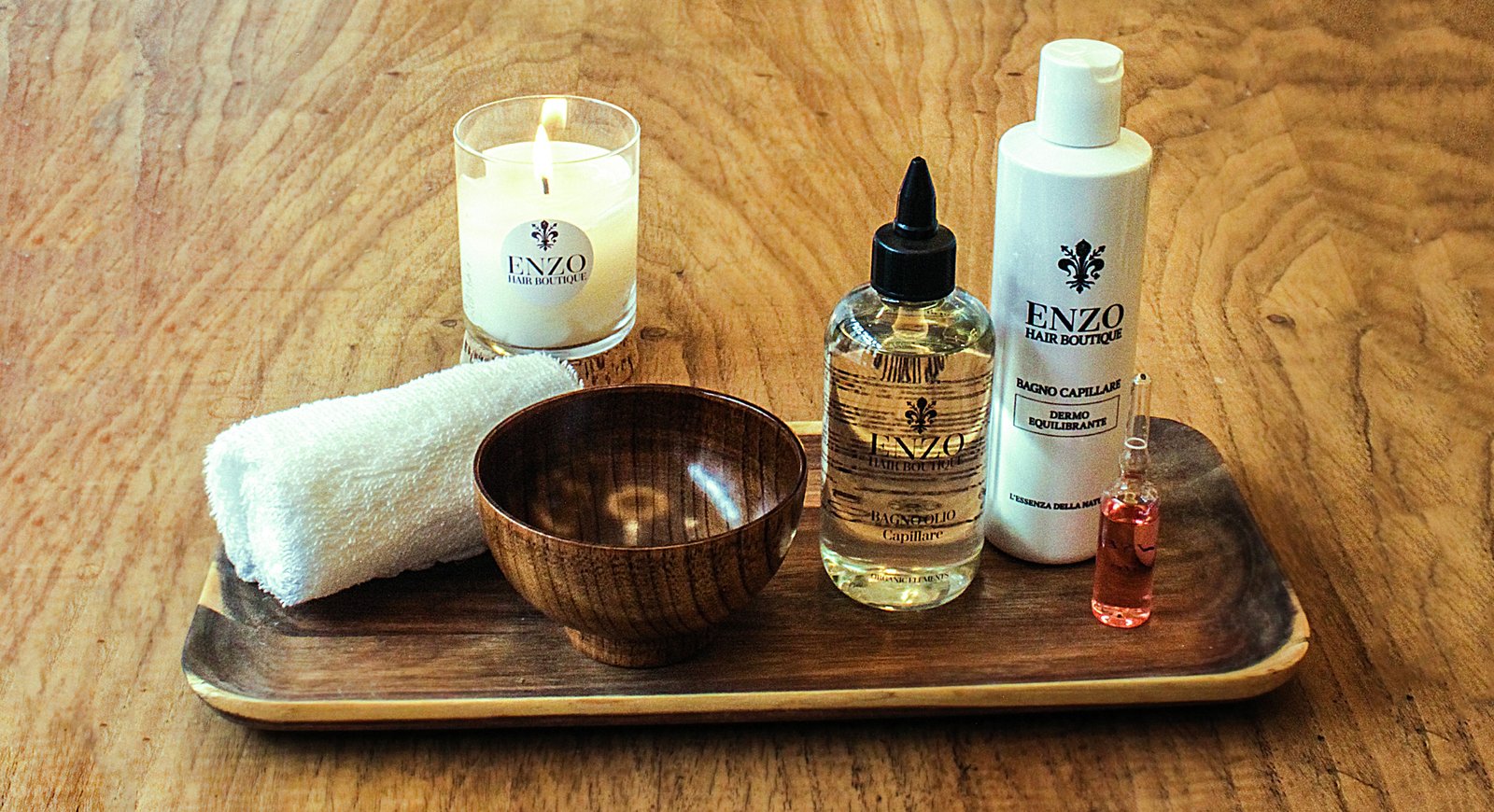
The Bianca line: intended for hair baths, required a serene and pure appearance. We opted for a purely typographic approach (less is more), taking advantage of the fact that we were able to select the types of packaging offered by the laboratory together with the client, we opted for matt white packaging with very straight shapes.
We incorporated subtle details, such as delicate lines outlining the type of product at the bottom base and the leading Enzo Hair Boutique logo at the top of the labels, to maintain coherence with the brand’s identity.
On the other hand, the Black line, which comprises the foaming bath products, required a colour differentiation, so it was clear to switch to black and make it look bolder and more sophisticated. As a copy we worked on “L’ Essenza della Natura” (The essence of nature).

RESULTS
Since the launch of both the new product line and the opening of her Hair Boutique she has experienced a significant increase in her sales bookings from both her physical and online shop.
The classic, cosmopolitan and luxurious approach, combined with the minimalist and elegant touch, has resonated with their luxury client base and has attracted new consumers who experience their quality products first hand in their salon and can also buy online at their eCommerce.
Premium branded label design has allowed Enzo Hair Boutique to stand out in the competitive hair care market.
We have managed to capture the essence of the Italian feel that Enzo was looking for, creating label designs that reflect natural beauty, elegance and cosmopolitan luxury. We hope you liked this success story that we are carrying out in 2019.

IS YOUR PRODUCT NOT TRUE TO YOUR BRAND?
Does the design of your packaging or the presentation of your product not communicate its key features and unique value proposition? You don’t have 2 chances to communicate your product well. The current market demands authenticity and innovation. Brandesign is a branding and packaging agency that designs brand strategies so that your brand becomes your company’s most valuable asset. We do it from research, preparation and with excellent care to creativity, because your product must be unique. Shall we start?

I worked in P&G building global brands with branding strategies for regional markets according to each consumer. I complemented my 360º profile working in media agencies to analyze campaigns after the click.

I’ve always been with a pencil in my hand, scribbling ideas to design professional projects in the environment of digital arts, graphic design, animation and 3D. I love to see how step by step my creations come to life.

Versatile, decisive and productive. Throughout my career as a journalist and digital marketing specialist, I have done reports, articles, interviews, public reports, creating content for brands on social networks and portals.

I like to thoroughly understand the client’s needs and translate them into digital solutions, the Internet is growing every day in a diversity of formats and digital resources and we always find the tailored IT solution that best suits the users.

Some call me a designer, others an art director, even my mother says I’m an artist and the truth is that I only like labels to design them.

I always try to give an answer and a solution every time you call me, I answer the calls and the Brandesign chat from the customer service.
