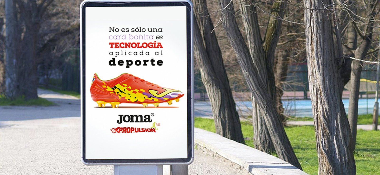
CREATIVE CAMPAIGNS FOR THE SPORTS BRAND JOMA
BRIEFING
Advertising Campaign for the new JOMA shoes Project: Redefine the graphic line of the Joma brand to create a clear line in all advertising media.
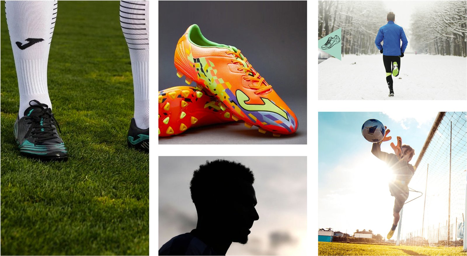
Campaign aimed at capturing the attention of our target: Athletes who regularly practice running, football, futsal, tennis and paddle tennis. At an individual level. They are more and more demanding in the product they buy and they handle more information. Create a single graphic line for all product ranges. Transmit: overcoming, effort, competition, anonymous sport.
In this project we were able to develop:
- Art Direction Product Photography
- Direction Creative Conceptualisation
- Production of Billboard Pieces and
- Advertising Ads Brainstorming in PLV Material.
DESIGN CHALLENGES
Joma, a benchmark company in sports equipment with decades of experience, has detected a lack of coherence and recognition in its graphic image in its latest product launches. This is due to the fact that it has not maintained a unified visual line that clearly identifies the brand and connects emotionally with its target.
After analysing the latest campaigns, Joma considers it necessary to develop a new creative direction that provides them with a strong visual identity. The objective is that when consumers see a piece of Joma communication, they immediately associate it with the brand.
In this way, the advertising campaign to be developed should provide a renewed image of Joma, conveying its key attributes such as innovation, vanguard, performance. At the same time, the visual coherence will allow the audience to quickly identify that it is Joma, increasing brand recognition.
TARGET
TARGET TO CONQUER
“THE ANONYMOUS PLAYER”.
Sportsmen and women who regularly practice running, football, indoor football, tennis and padel… At a non-professional level. They are more and more demanding in the product they buy and they handle more information. They do not want to position this product next to a great football figure, they want to dedicate it to the anonymous player: the one who plays for fun and wants to improve his technique in the game.
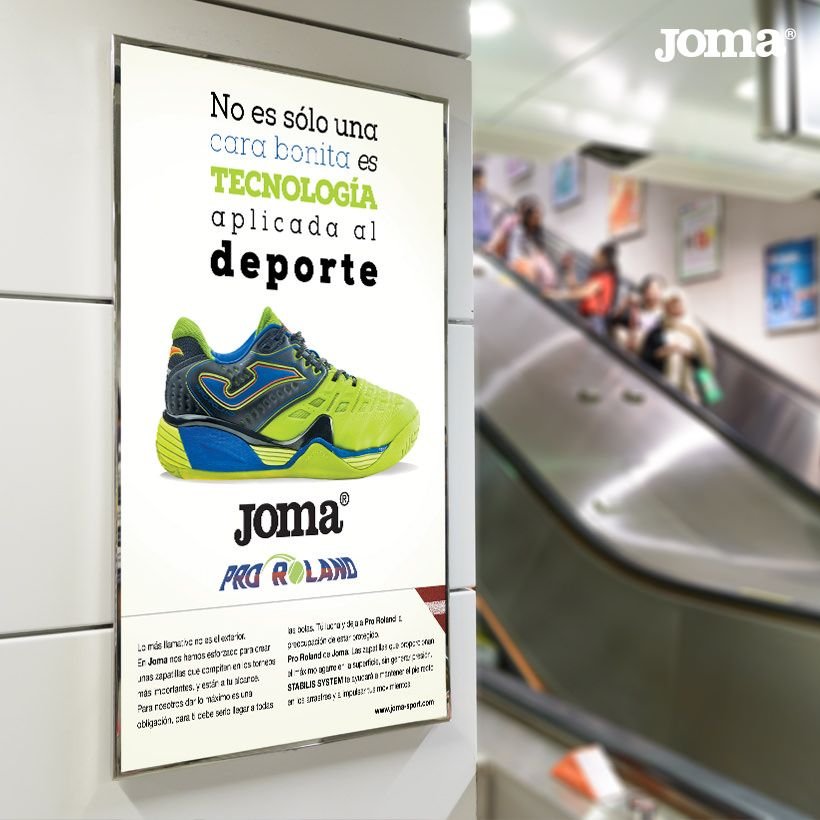
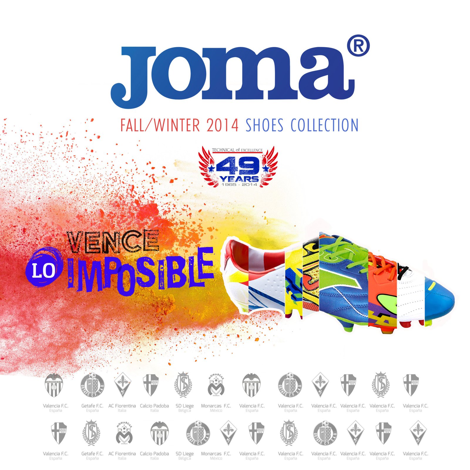
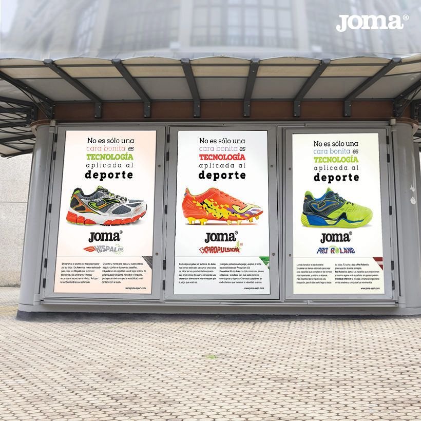
The copy “It’s not just a pretty face, it’s technology applied to sport.”describes that it is not only the declaration of an aesthetic change of their shoes, but that they entail a profound change in the manufacturing technology of the shoe to elevate the values of a 100% technical and at the same time 100% aesthetic shoe.

ADVERTISING SIGNAGE
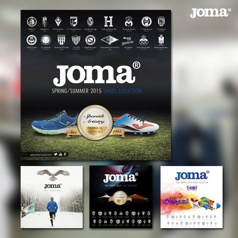
Beyond requesting the design of the advertising campaigns for the launch of its new flagship products – the Propulsion 3.0 football shoes, the Super Regate and Pro Roldan tennis shoes, and the Hispalis running shoes – Joma required us to faithfully capture the identity of these flagship models in the launch of several advertising spots, posters and sporting events to be launched that year by the brand.
The objective was to create a visual coherence that would reinforce the link between the shoes featured in the campaign and the rest of the Joma product offer. In this way, the distinctive graphic codes of each line had to be expanded to the equipment, clothing and accessories, in order to consolidate the renewed brand image that the brand would be able to offer.
they wanted to convey.
Advertisements were sought for each of its shoes that were in line with the first master campaign or key visual “Propulsion 3.0”.

RESULTS ACHIEVED
High visibility of the campaign at national level
The campaign was first launched at a national level and in a second phase the brand was launched in other regions in Latin America where JOMA is sponsor of several national football teams.
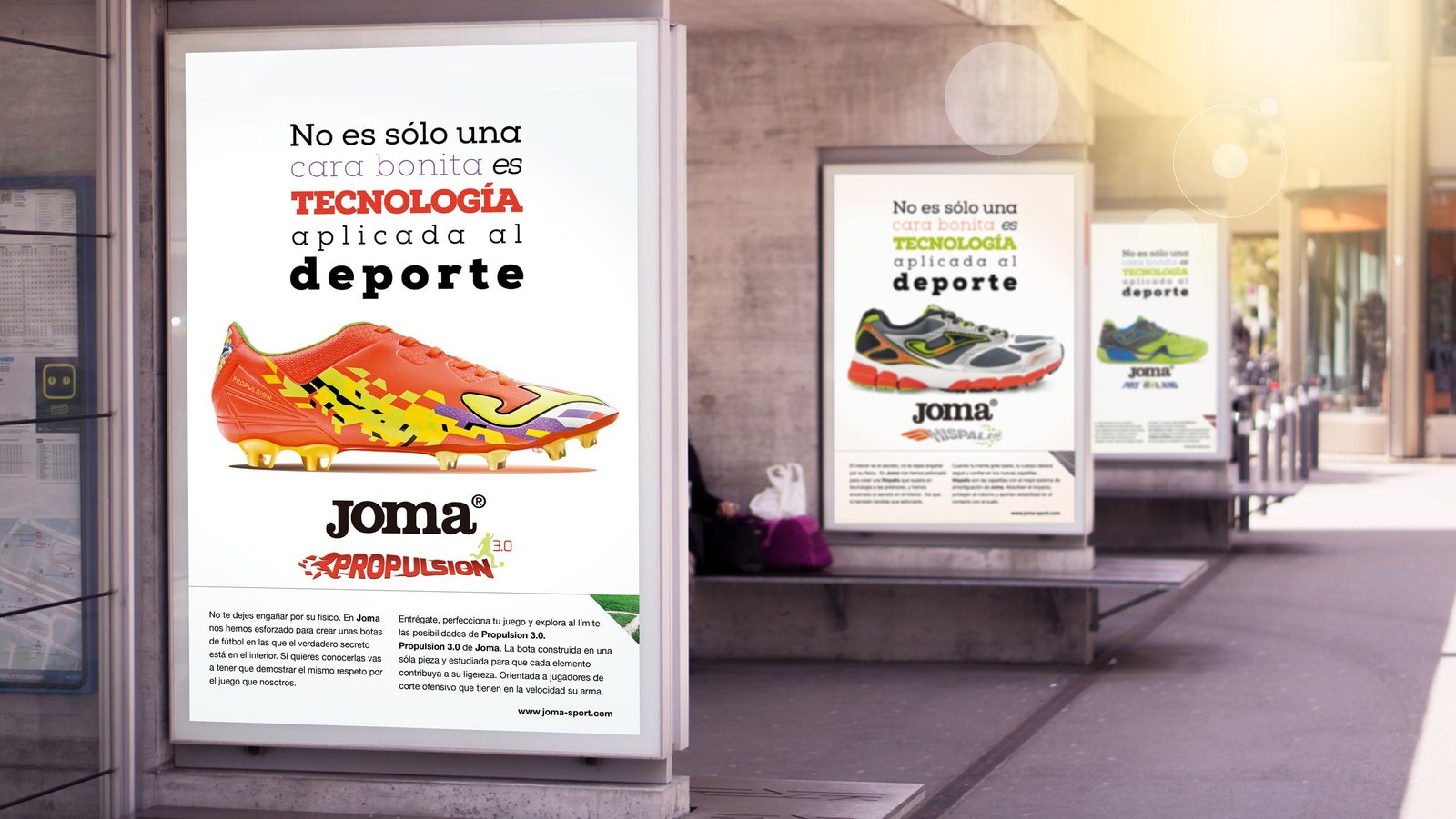

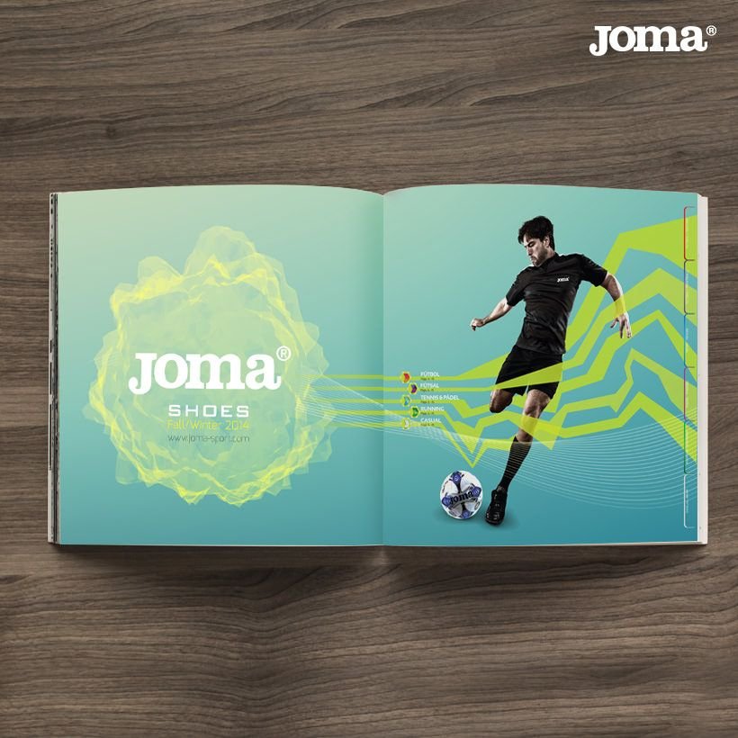
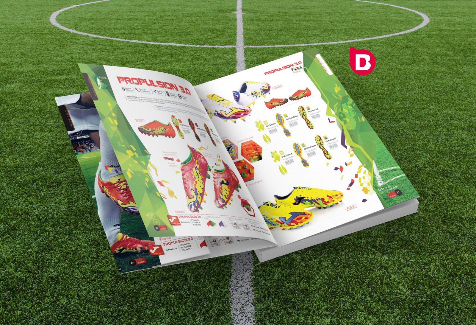
DESIGN OF THE SPORTS PRODUCT CATALOGUE
Joma, a benchmark company in sports equipment with decades of experience, has detected a lack of coherence and recognition in its graphic image in its latest product launches. This is due to the fact that it has not maintained a unified visual line that clearly identifies the brand and connects emotionally with its target.
After analysing the latest campaigns, Joma considers it necessary to develop a new creative direction to provide them with a strong visual identity. The aim is that when consumers see a piece of Joma communication, they immediately associate it with the brand.
In this way, the advertising campaign we developed provided a renewed image of Joma, conveying its key attributes such as innovation, cutting edge, performance. At the same time, the visual coherence will allow the audience to quickly identify that it is Joma, increasing brand recognition.
DO YOU WANT YOUR CAMPAIGN TO BE CREATIVE?
Are you looking to make an impact with your campaign? We can help you! At Brandesign we produce creative campaigns to create a visual impact on consumer retention. We work from the concept, the copy, the photography and the message studying the where and the when.
