From Storm to Clarity: El branding de Atmosphere
In June 2021 Jaime contacted us to ask us for branding support for a new business idea that had been attracting his attention for a long time, it was a new technological startup that was different and unique in the market:
Create the first company of weather reports specialised in the audiovisual sector.
He contacted Brandesign as agency specialised in branding to help him find a name, an idea and design a branding concept for this new venture from Canarias.
Understanding that Spain is increasingly becoming an ideal destination for large film and television super productions, Jaime sought to create the first company specialized exclusively in weather forecasting for audiovisual projects.
Do you know the big budgets that are allocated in exterior production to gamble on whether or not it is going to rain that day? It is not only money at stake, but time that is even more valuable for a production team that has everything planned.
Being their Target the big production companies shooting movies and series, even the insurance companies themselves who gamble their money invested, we understood how crucial it is for this sector to have privileged and specialized information on meteorology. Currently this group of people bet big projects for a certain location, certain stage or time of day without knowing if the weather conditions (sunny, rain, light, wind, sun orientation, golden hour) are suitable for these locations for production teams, directors of photography, directors, editors, editors, sound engineers, cameras, lighting, actors, etc ….
Ser uno más del equipo: ENTENDER PARA CREAR
Yes, more and more films are being made in Spain. The number of jobs in the audiovisual sector has almost tripled in the last five years. More than 30% of the budget of an international shoot is spent in the places where it is filmed. Our country aims to become the Hollywood of Europe.
This new business idea needed formatting: Starting with an audit of other similar professional meteorology companies inside and outside Spain, the client asked us as a branding agency for a skilful name, a corporate identity, a brand plan and a website to capture leads for their specialised reports.
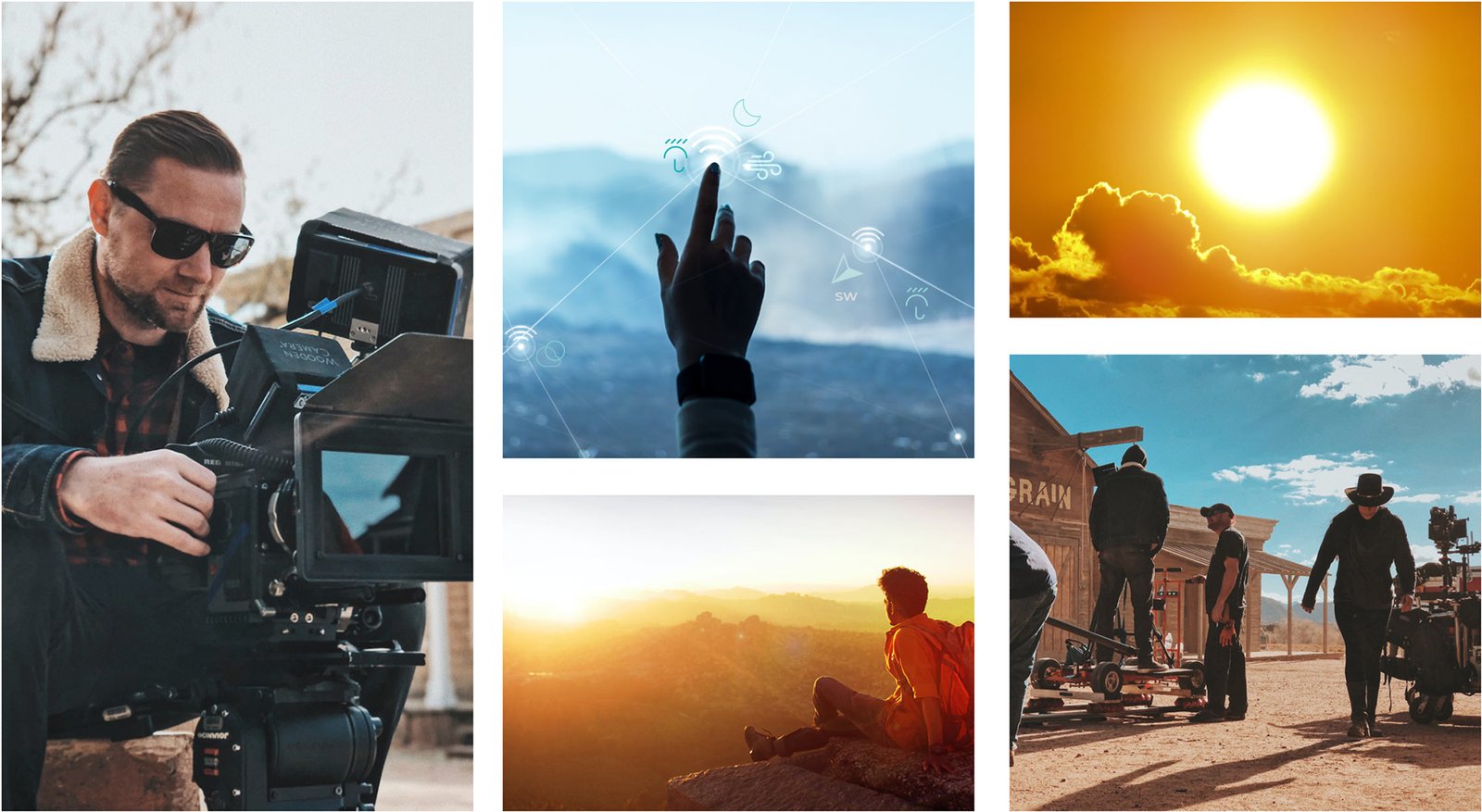
APPROACH
Before designing anything: we like to recognise the market, the direct and indirect competition, the different buyer persona profiles, those who make the purchase decision directly and indirectly, to whom and for what we design, as well as to know the communication points offered by other weather service companies inside and outside Spain.
We do not analyse free weather apps (such as Weather Channel) as we consider these weather apps to be the basic tier (free) as they are unreliable apps and not specialised in the audiovisual sector.
We also analysed the websites and campaigns of their main competitors to identify strengths and areas of opportunity. A key finding was that most adopted conventional aesthetics of generic weather forecasts that did not differentiate their expertise.
To corroborate these insights, we conducted an SEO audit of their base promises, copy, colours, communication tone. This gave us valuable feedback on how few weather companies put too little effort into a brand identity. And being our client: audiovisual production houses, we had to do an important graphic and visual work.
With all these perspectives, we defined that the new identity should emphasise the precision, scientific rigour and reliability that characterise the company, as well as an analytical and technological brand personality that speaks the same audiovisual language as the production houses.
NAMING
Choosing a brand name can be a challenge, finding the perfect name that is also free to be registered with the EUIPO. (European Intellectual Property Office)is a real challenge, but at Brandesign we came up with an effective working methodology and after several rounds of submitting names we came up with Atmosphere.
Atmosphere was carefully chosen to convey the idea of the earth’s atmosphere, the environment in which meteorology takes place. By using a universally recognized term, the brand can transcend language and cultural barriers, as phonetically it is very understandable in Spanish, and fully self-descriptive in English, allowing us to open up a world of opportunities to register and become known in international markets.
Social media also played a key role in the digital presence strategy of @AtmosphereWF (Atmosphere Weather Forecast). Leveraging its consistent and distinctive name, we registered profiles on key platforms such as Facebook, Twitter and Instagram, as well as booking the website domain atmospherewf.com.
All in all, the Atmosphere name was a genius decision that marked the beginning of an exciting journey for the development of the brand strategy.
Atmosphere
LOGO DESIGN
We started from the idea that the logo should be minimalist but at the same time representative of the company. After several proposed concepts, the client validated our proposal of the 3 drops of water that make up a letter A (initial), which achieved both readings in a harmonious way.
Minimalist and representative logo design: We wanted it to be simple, immediately recognizable. At the same time, it should implicitly transmit its accuracy, reliability and expertise in meteorology.
The 3 drops (3 pillars) of water (weather) form the initial with the letter A.
A leading color: Turquoise is a color that is generally associated with calm, clarity and serenity, it is a cool and analytical color, which is relevant for a company that specializes in providing clarity with reliable weather reports and forecasts. In addition, this Mediterranean color is so prominent that it needs no contrast.
The Gotham typeface was chosen because it is very legible and modern without losing clarity in both online and offline environments.
A minimalist, representative, powerful and easily applicable identity. Very ‘Apple Style’ which is what the client was looking for.
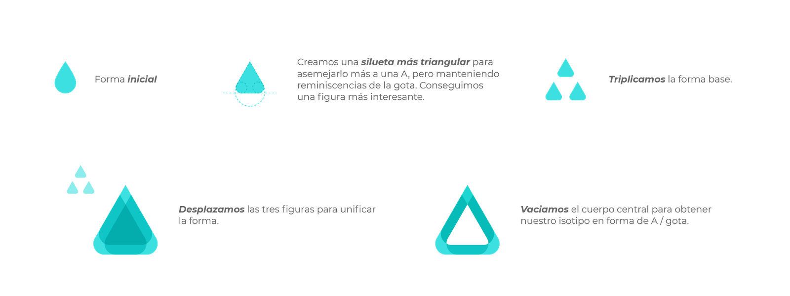
Construcción del isologo conformado por la superposición de 3 gotas de agua y la letra A.

Variaciones de las aplicaciones de marca en base a criterios responsive o de disposición de espacio de lectura
Adaptación del imagotipo en formatos diapositivo cuando el color corporativo es el fondo

Corporate Identity Manual:
Once the corporate identity has been validated with the client, the brand manual is developed with all the technical specifications for its correct application.
Detailed aspects would include:
Colour variations of the logo: colour, greyscale and white versions on a turquoise background. Minimum and maximum reproduction sizes so that it is legible in any format. Responsive logo Orientation, proportions and spacing with respect to other elements. Types of media allowed: documents, web, social networks, merchandising, folders, etc. Design standards for documents, presentations and printed materials. Specifications for the use of Gotham typeface and alternative fonts. Creation of a library of minimalist and realistic icons to illustrate the data in the weather forecast reports.
VISUAL BRANDING RESOURCES
Para crear experiencia de marca más allá del logo, diseñamos algunos recursos gráficos sobre piezas de comunicación visual.
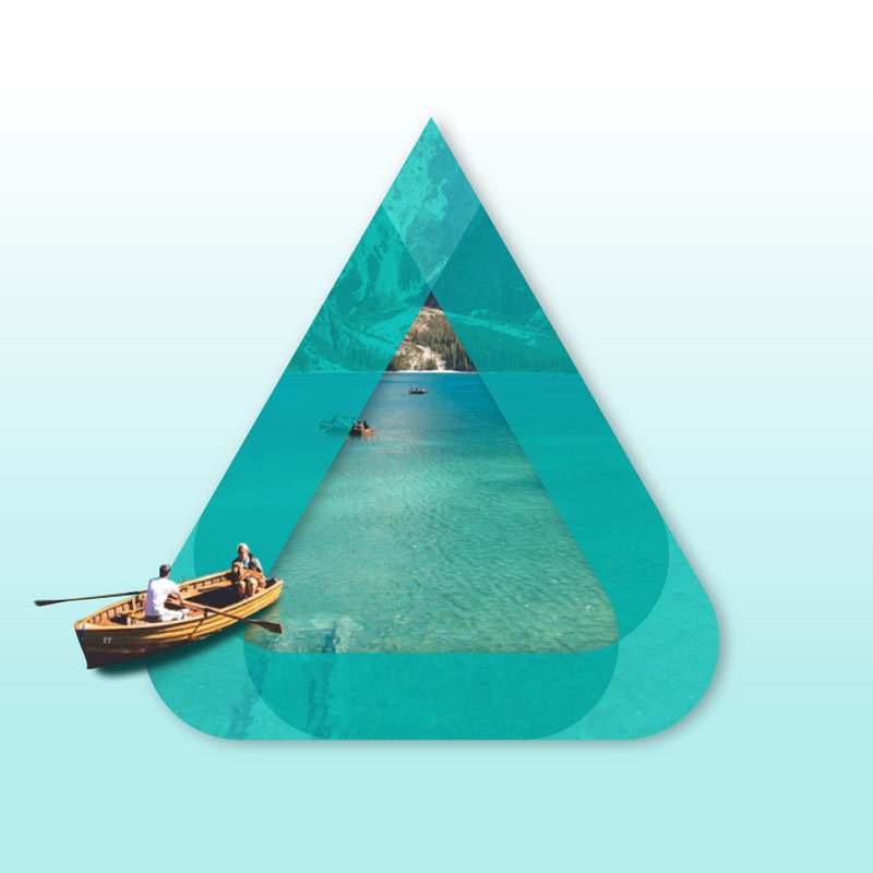
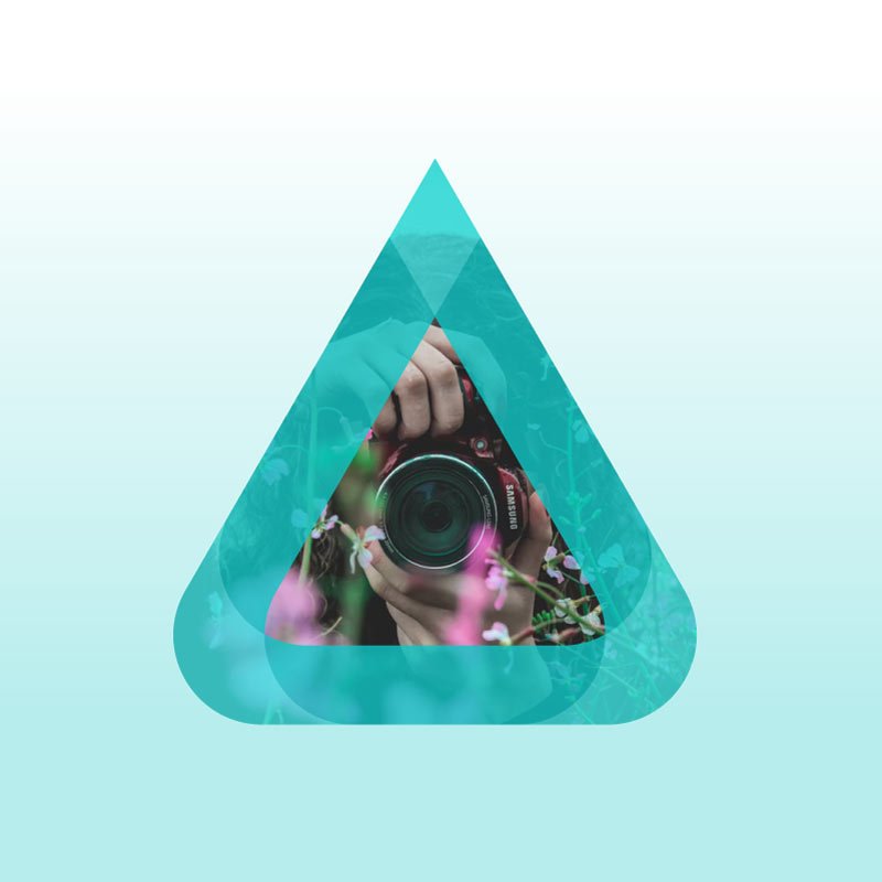
Aprovechando el uso de las propias formas geométricas del isotipo y la selección cuidada de fotografías creamos ejemplos de aplicación que transmitan alegría, positivismo
To create brand experience beyond the logo, we designed some graphic resources on visual communication pieces.
Taking advantage of the use of the geometric shapes of the isotype and the careful selection of photographs, we created examples of applications that transmit joy, positivity and, above all, coherence with the brand development.
Playing with the isotype as a “window” from which elements come and go, we created visual resources that the client can use in their presentations and communications.
y sobre todo coherencia con el desarrollo de marca.
Jugando con el isotipo a modo de una “ventana” de la que salgan y entren elementos creábamos recursos visuales que el cliente pueda usar esa sus presentaciones y comunicaciones.


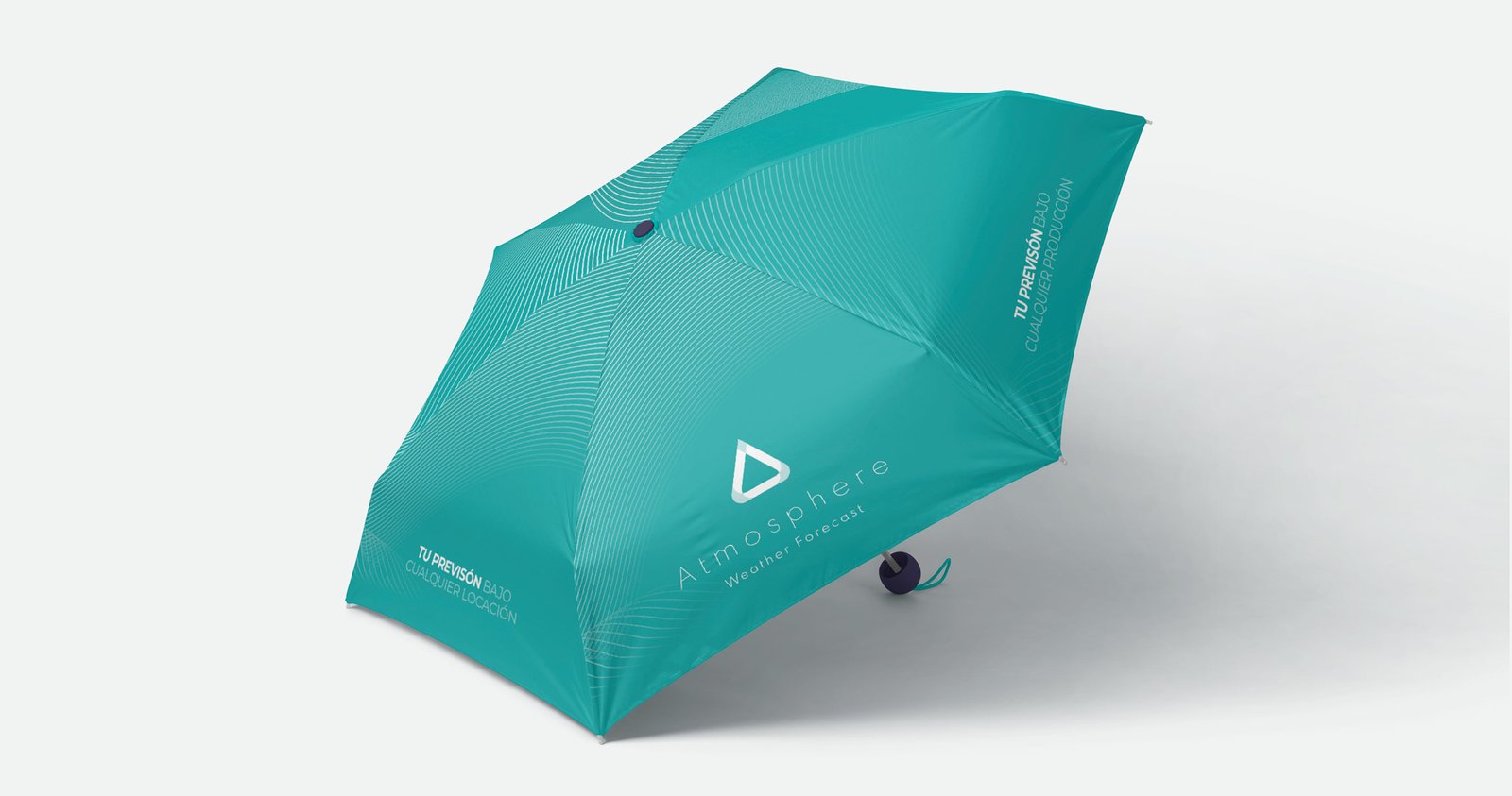
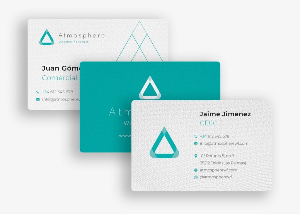
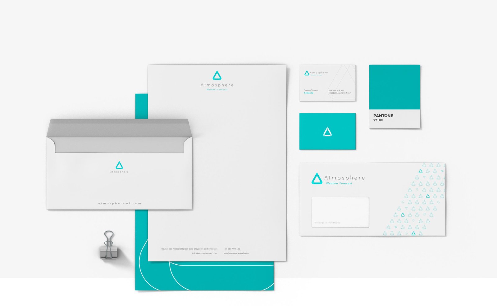
DESIGN OF YOUR CORPORATE STATIONERY
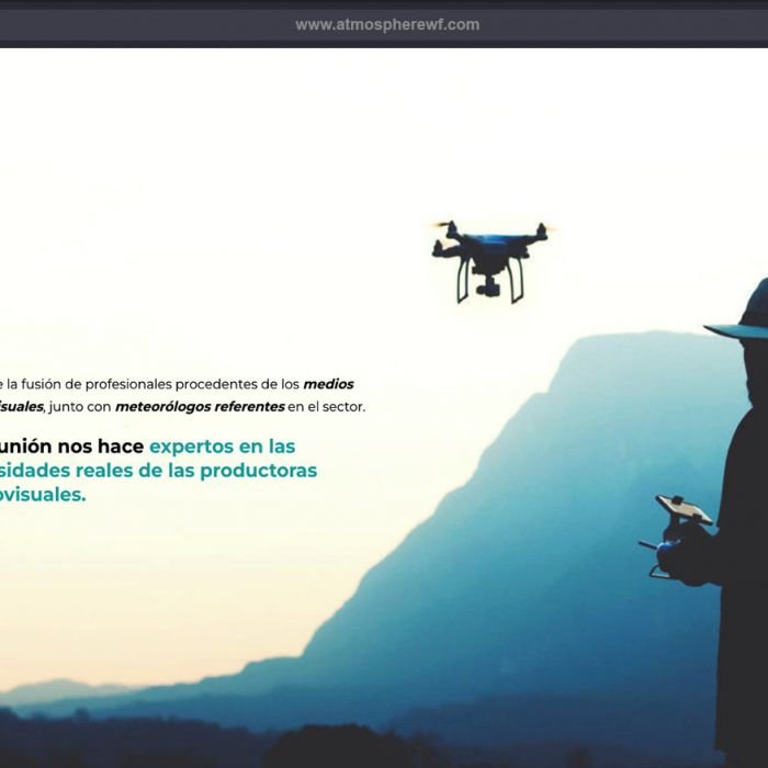
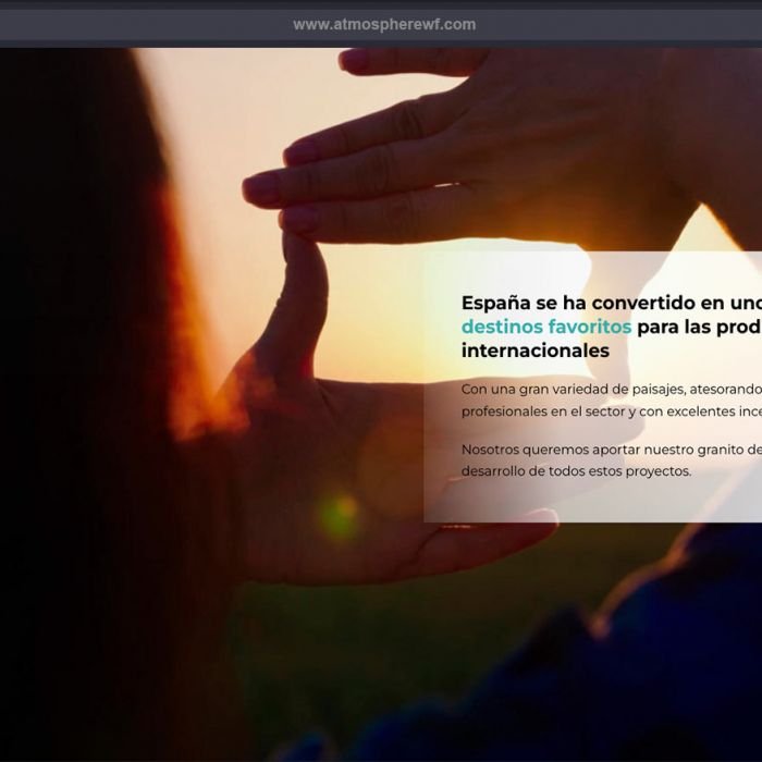
DESIGN OF YOUR CORPORATE WEBSITE
With the knowledge and experience of the branding project already in place, applying the branding knowledge to the website we were asked to develop was very simple. By entrusting your website to the same branding agency, you ensure that the criteria, visual elements, icons, logos, colours, fonts and styles are used consistently.
It is very common when completing a branding project that the client asks us to design their website, as this is the first point of contact between the brand and its leads on the internet. And the website as a medium must be able to express the objectives in a coherent way.
You can visit their website at www.fermad.org

IMPACT
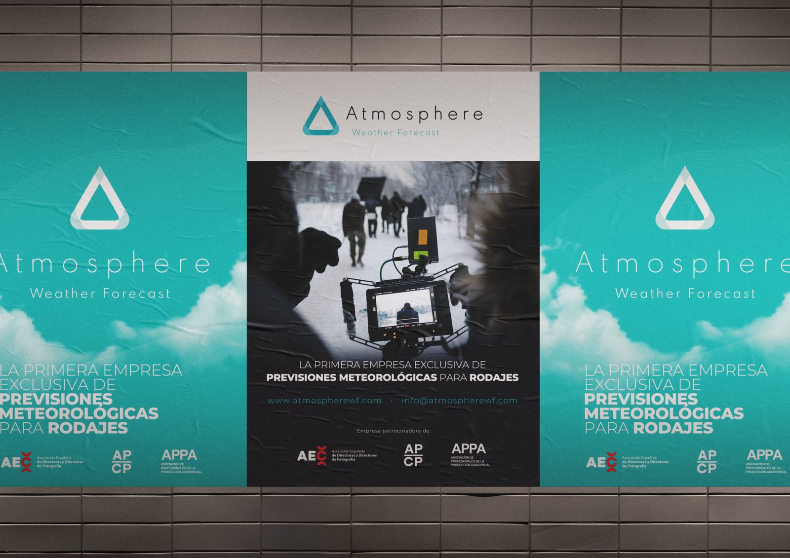
Since the implementation of its corporate identity the company has been able to develop its commercial and sales strategy with a clear brand strategy and communication tone, making it easier for them to generate leads, attract a very demanding target (such as the audiovisual arts industry) in a very professional way and speaking the same language.
Benefits of having a successful corporate identity:
- It increases the value of your brand.
- It helps to differentiate you from the competition.
- It generates greater trust in the brand and improves your reputation.
- It gives coherence to communication in all media.
- It helps your customers to recognise and remember your brand.

DO YOU HAVE AN EFFECTIVE BRANDING PLAN?
Does the presentation of your service not communicate its key features and unique value proposition? You don’t have 2 chances to communicate your company well. The current market demands authenticity and a lot of innovation. At Brandesign we design brand strategies so that they become your company’s most valuable asset. We do it from research, preparation and with excellent care to creativity, because your company cannot afford not to stand out. Shall we start?

I worked in P&G building global brands with branding strategies for regional markets according to each consumer. I complemented my 360º profile working in media agencies to analyze campaigns after the click.

I’ve always been with a pencil in my hand, scribbling ideas to design professional projects in the environment of digital arts, graphic design, animation and 3D. I love to see how step by step my creations come to life.

Versatile, decisive and productive. Throughout my career as a journalist and digital marketing specialist, I have done reports, articles, interviews, public reports, creating content for brands on social networks and portals.

I like to thoroughly understand the client’s needs and translate them into digital solutions, the Internet is growing every day in a diversity of formats and digital resources and we always find the tailored IT solution that best suits the users.

Some call me a designer, others an art director, even my mother says I’m an artist and the truth is that I only like labels to design them.

I always try to give an answer and a solution every time you call me, I answer the calls and the Brandesign chat from the customer service.


