
SHAMBI: UN ABIG BRAND FOR SMALL PETS
We had already been working with Dapac, their main dog and cat food brands, for about 9 months, supporting them in the development of their products, both in naming consultancy, as well as in the development of their products. design of your logos We discovered that there was a very interesting lineup strategy in the up-tier and low-tier, as there was a very good differentiation between product lines and prices, but in the other pet segments that are not dogs or cats there were many small and very specific brands for feeding rodents (hamsters, guinea pigs, guinea pigs, etc.) as well as many sub-brands for birds (parakeets, canaries, lovebirds, etc.).
What we really appreciate about working with this client is that they have integrated us into their team explaining the details of each of their brands and being able to understand not only the design of one of their brand lines but to make sense of the entire product line. What the most exclusive and premium products should be called and how the most economical and accessible ones will look on the shelf. At Brandesign we like to think of the forest every time we are asked for a tree.
Implicarte e involucrarte con tu cliente para obtener los mejores resultados.
The idea that we all got (client and agency) was to unify the line of birds and rodents in a single brand, more open and flexible, not that we take for granted that the customer who has a pet canary is the same as the one who has a hamster, but if the product itself is a diet rich in seeds, raw proteins, cereals and enriched mixtures with which to create a family. Hence the birth of a new brand: ‘Shambi’.
After a great investigation of the different colours and visual aspects prevailing in the poultry and rodent shelves, we saw that most of the packagings of the segment were very technical, a lot of presence of animal photography on their fronts, but a lack of ‘creativity’, illustration and showing on the front the different flavours and presentations that this product could show, besides that there was no PREMIUM category, all of them were fighting for price and not for QUALITY. So we started a design work and unification of several products in a single brand more attractive, more valuable.
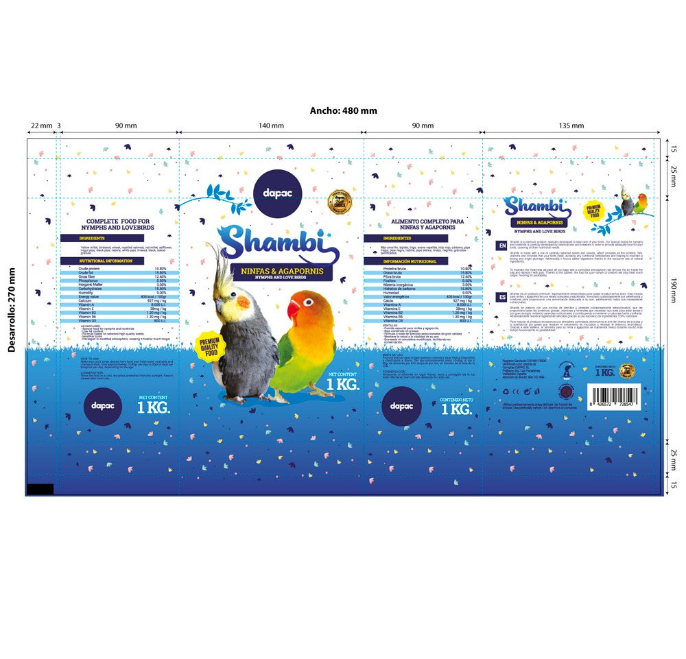
This project consisted of the design of the logo, recognition of the different packaging formats and flavour versions, as well as the creation of a creative line for its different presentations.

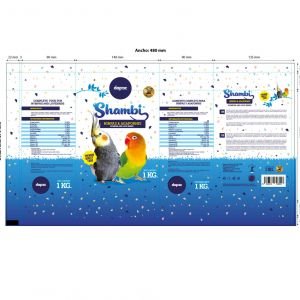
LOGO DESIGN:
For the logo design
We had to face the idea that we weren’t talking about a single gender – while we’ve designed logos for brands specifically for dogs or cats before, this new ‘multi-gender’ brand would work well for a canary, a rabbit, a hamster or a macaw.
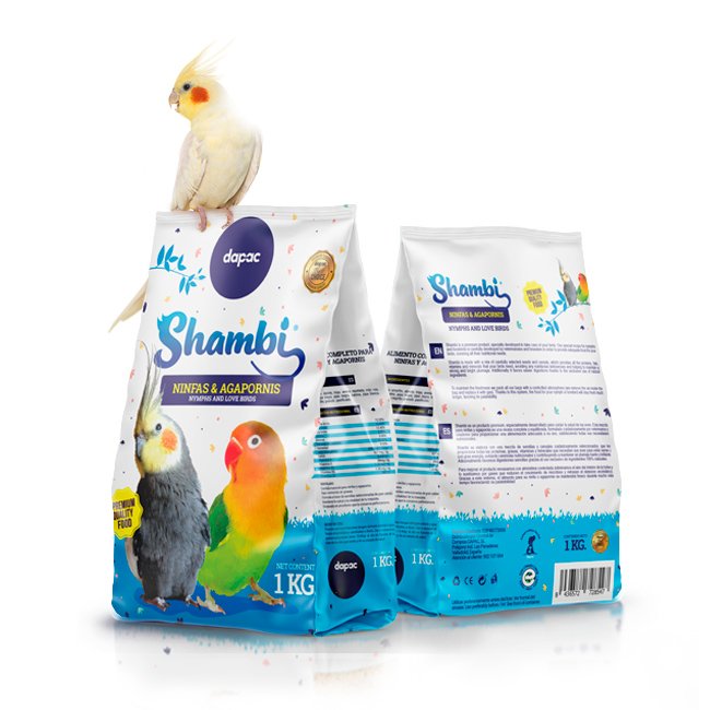
While for the Dog#1 brand we could rely on a profile of a dog, for this new Shambi brand we wanted to illustrate those little physical peculiarities of the animals we wanted to identify with the logo such as the crest of a cockatoo, the sinuous shapes of their beaks, or the tail of a rabbit and the tail of a mouse to personify this in a logo as endearing as the phonetics of its name ‘Shambi’ already were.
We used the colour blue for the logo because we wanted to create a differentiation (reds and yellows reigned) and also because this cobalt blue colour helped us to support the PREMIUM QUALITY FOOD concept, due to the psychology that the colour brings to the category.
PACKAGING DESIGN:
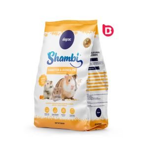
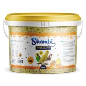
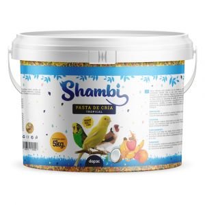
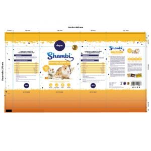
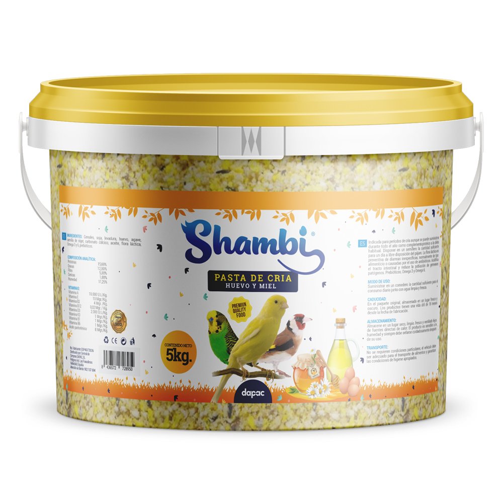
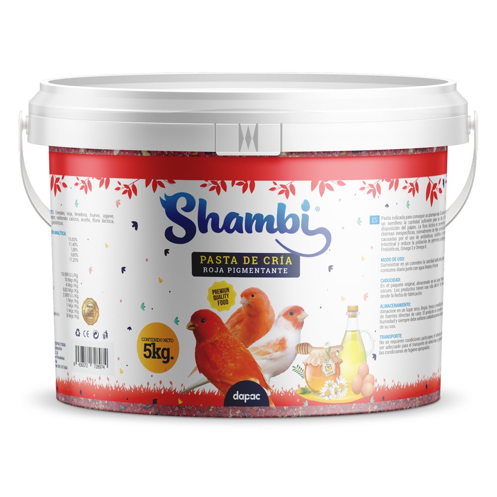
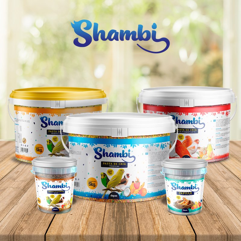
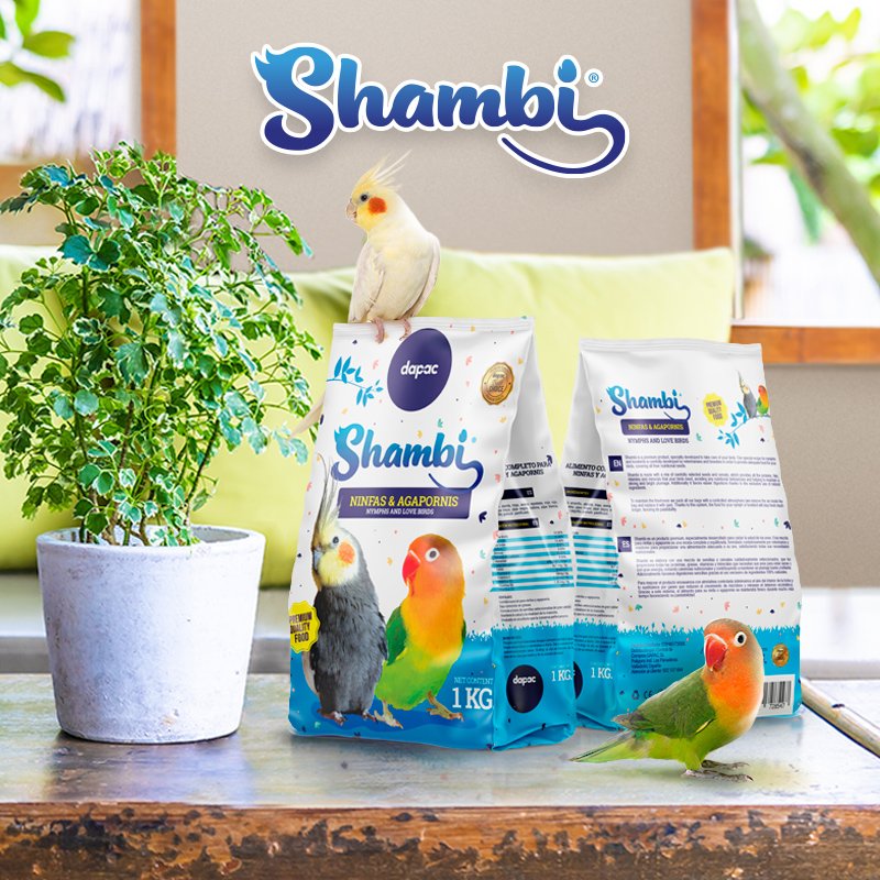
The entire design team put special emphasis on unifying the extensive and varied range of formats, presentations and types of products that Shambi could have in its product line. Since we would not only have the small bags of 300 grams of seeds and breeding pastes but also special formats for breeders in buckets and rates that could reach 5Kgs.
Putting on the drawing board all the variety of formats, presentations and versions of flavor and weight, we began to design a line that could stand out on the shelf being this product put in harmony with other packaging of the line as with those of the competition.
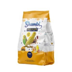
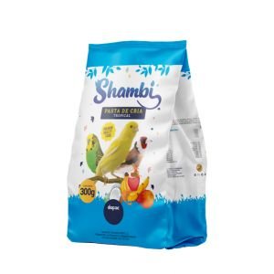
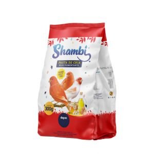
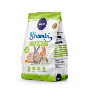
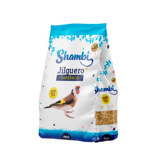
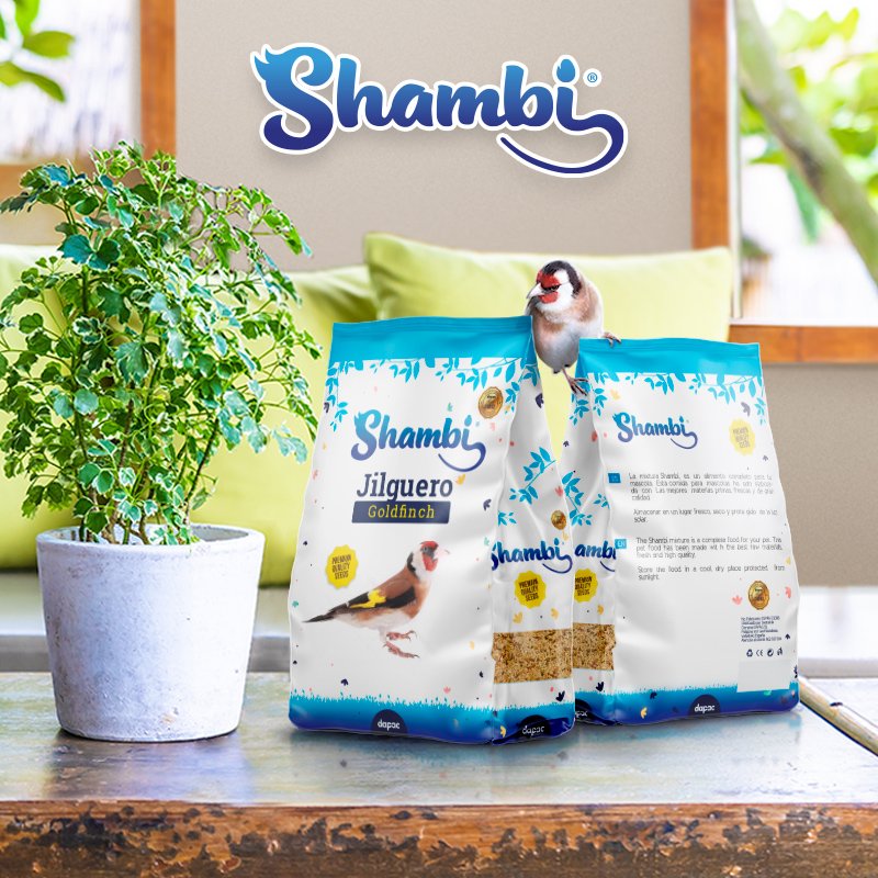
For so much variety, we did not want to focus on a single color (the blue of the logo) but to open the spectrum of colors for the packaging according to the habitat of each product. Looking for orange and yellow tones for rodents, green for rabbits, and a blue line for birds, but without limiting ourselves to only blue since Shambi would be presented for different varieties of birds and with different presentations according to flavor or ingredients such as honey, insectivores, tropical fruits, etc.
The entire design team put special emphasis on unifying the extensive and varied range of formats, presentations and types of products that Shambi could have in its product line. Since we would not only have the small bags of 300 grams of seeds and breeding pastes but also special formats for breeders in buckets and rates that could reach 5Kgs.
Putting on the drawing board all the variety of formats, presentations and versions of flavor and weight, we began to design a line that could stand out on the shelf being this product put in harmony with other packaging of the line as with those of the competition.
For so much variety, we did not want to focus on a single color (the blue of the logo) but to open the spectrum of colors for the packaging according to the habitat of each product. Looking for orange and yellow tones for rodents, green for rabbits, and a blue line for birds, but without limiting ourselves to only blue since Shambi would be presented for different varieties of birds and with different presentations according to flavor or ingredients such as honey, insectivores, tropical fruits, etc.


OUR SOLUTION:
The result of this work could not only be measured in brand awareness on the shelves, where the product stood out for its quality and homogeneity in a more premium, more logical and varied line, but also increased the demand for in-store purchases by 40% in the first year and has remained stable ever since.
As a learning experience, it taught us how to
that sometimes the efforts of a single, larger, more robust and diverse brand can be more powerful than the diversified efforts of several small brands focused on different purposes.
Part of our team had the opportunity to train at Procter&Gamble and one of those lessons learned was the ‘Nail Challenge’, a strategy based on the idea that if all the small brands or products you have under the same category unite and ‘bid’ in the same point and direction they can break the competitive barrier with the big ones and win at the point of sale.


IS YOUR BRAND NOT TRUE TO YOUR PRODUCT?
Does the design of your packaging or the presentation of your product not communicate its key features and unique value proposition? You don’t have 2 chances to communicate your product well. The current market demands authenticity and a lot of innovation. At Brandesign we design brand strategies so that your brand becomes your company’s most valuable asset. We do it from research, preparation and with excellent care to creativity, because your product must be unique. Shall we start?

Trabajé en P&G construyendo marcas globales con estrategias de branding para mercados regionales según cada consumidor. Complementé mi perfil 360º trabajando en agencias de medios para analizar las campañas después del click.

Siempre he estado con un lápiz en la mano, garabateando ideas para diseñar proyectos profesionales en el entorno de las artes digitales, el diseño gráfico, la animación y el 3D. Me encanta ver como paso a paso mis creaciones cobraran vida.


Versátil, resolutivo y productivo. A lo largo de mi trayectoria como periodista y especialista en marketing digital he realizado reportajes, artículos, entrevistas, publi reportajes creando contenidos para las marcas en redes sociales y portales.

Me gusta entender a fondo las necesidades del cliente y traducirlas en soluciones digitales, Internet cada día está creciendo en una diversidad de formatos y recursos digitales y siempre encontramos la solución IT a medida que se ajusta mejor a los usuarios.

Algunos me llaman diseñador, otros director de arte, incluso mi madre dice que soy artista y la verdad es que solo me gustan las etiquetas para diseñarlas.

Busco dar siempre una respuesta y una solución cada vez que recurren a mí, Atiendo las llamadas y el chat de Brandesign desde el servicio de atención al cliente.