
A point of union for all: FERMAD’S ReBranding
In July 2021 Yolanda contacted us from the Plataforma Madrileña de Entidades para la Asistencia a la Persona Adicta y a su Familia (FERMAD) to be able to see the leap of so many years of experience. FERMAD had 35 years of consolidated experience as a non-governmental, non-profit organisation that supports people and families with substance and non-substance addiction problems on a daily basis.
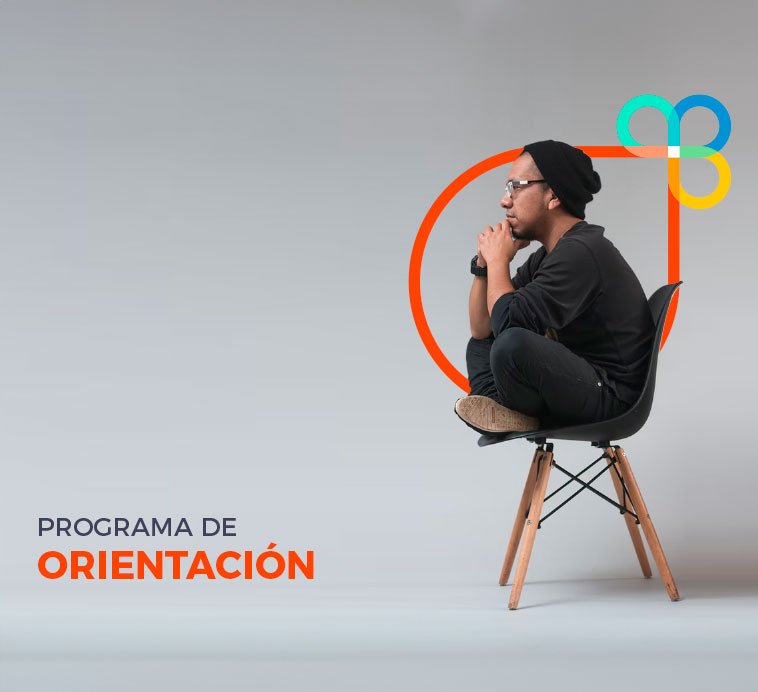
FERMAD had long been developing numerous guidance and support programmes for people and families with addiction problems, and for volunteers and social entities working in this field.
In terms of branding, they only had a flat logo and one colour (blue) for the purposes of all communication pieces. The logo was stuck in the past, as it looked like a rigid pictogram of people (more like a powerpoint clipart) than a more flexible branding development. They were looking for several renewal actions: A logo redesign, A Corporate Identity Manual and a Corporate website.
The best results are achieved by working as a team
Our clients’ objectives are also our objectives.
As well as looking to make a leap in image, we wanted to create not a ‘new logo’ but a graphic system that would link the 4 main programmes of voluntary action and support for people as well as show the network of people who support people, and the different entities that collaborate united under the same objective.

APPROACH:
What does Fermad do?
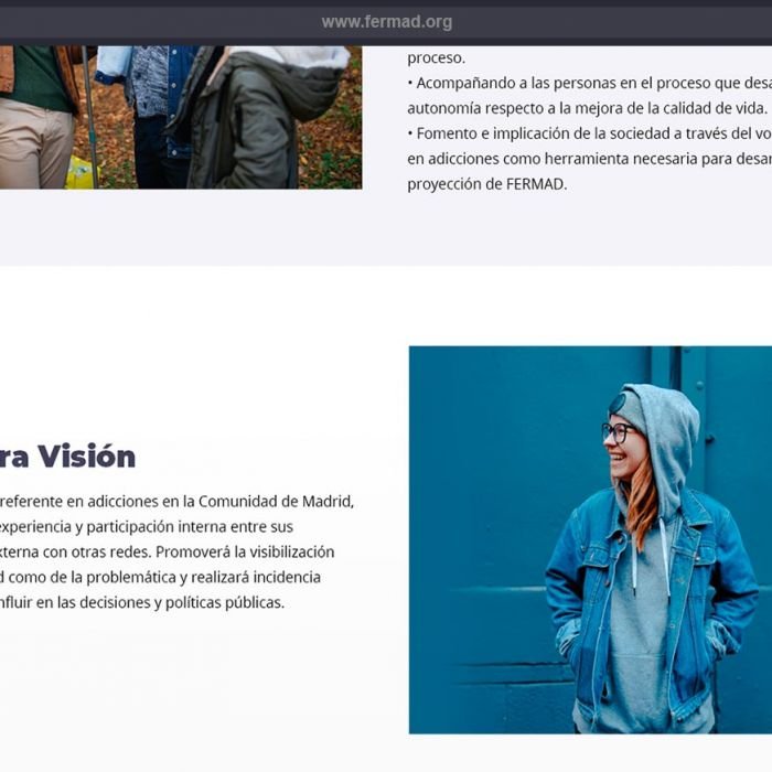
FERMAD is a non-governmental and non-profit Organization integrated by 23 different entities with a common purpose: to seek a response to the needs detected in the field of addictions (originally, attending the various substance addictions and, since 2013, including attention to social addictions, adapting to an emerging reality in society). Its mission is the comprehensive and quality approach in the field of addictive disorders in the Community of Madrid, being a reference based on our experience and participation among our entities and other networks.
They promote the visibility of both the network and the problem and we carry out political advocacy to influir in public decisions and policies. All this thanks to the work developed by a great team of professionals, composed of psychologists, social workers, lawyers and the volunteers, with extensive experience and training in the field of addictions.
The challenge:
FERMAD approached Brandesign after 30 years of trajectory in search of a renewal of its brand image, (it had a long time with only a logo as the axis of communication) .. from here we faced a major challenge: EVOLVE.
A Rebranding project: Their logo, although it conveyed a message of group, family and unity, perhaps lacked all the demands that contemporary brands have: being able to adapt perfectly to the current omnichannel between web, networks and mobiles. In addition, we wanted to create a graphic system to capture its branding in different media and channels, recreating a more visual brand experience that would reinforce brand recognition.
Brandesign’s proposal:
With a deep understanding of FERMAD’s goals and values, the Brandesign team embarked on the challenge of creating a new logo and graphic system that captured the essence of the organization. An approach based on the metaphor of intertwined loops and rings was proposed, symbolizing the union and diversity of the different entities that make up FERMAD.


LOGO DESIGN:
In addition to wanting to see “the next level” of the organisation’s corporate identity, to see a clear evolution of the brand, FERMAD was very interested in our brand development processes.
From the previous isologo:
We found many problems with the old logo, (we have already said that branding is not just about having a nice logo.) One of its problems was that it was very static, it was badly distributed, it was very difficult to centre because the visual weight went to the right because of the elongated stick that made up the F and it was a pity that this arc could not even be organically centred on a sheet of paper. Here are the construction lines of the logo to see if you can identify the problem.

Brainstorming and study of the evolution or legacy of the old logo:
To take as legacy of the old isologo we saw that the message it conveyed was of union for people, either because Fermad is integrated by different entities, people and collaborators or because its Target is to unite families with addiction disorders. The purpose is that we wanted to rescue this concept of union.
We wanted to leave them a thematic graphic system with ties that simulate support arms between the different entities that make up and creating different circles of union: one for different areas of services, also because we wanted to create a ‘butterfly’ as we speak in FERMAD of transformation. Being able to reach a family that sees them all gray because they are being affected by a member with severe addiction dependencies, they do not find the solution by themselves and come to FERMAD, where there is a process of transformation, volunteering, renewal and support from people for people. Call us corny, but yes, we saw in their work processes a metamorphosis from chrysalis to butterfly in many of their cases. And when you work in volunteering, you hold on to that idea: that a change is achieved, a transformation.
So we saw bonds tightening, we saw caterpillars transforming into butterflies, we saw a communion of people, a group of people accepting each other, support. Can you imagine how special it was to participate in this project?
The consolidated idea:
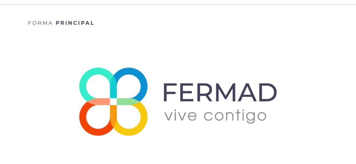
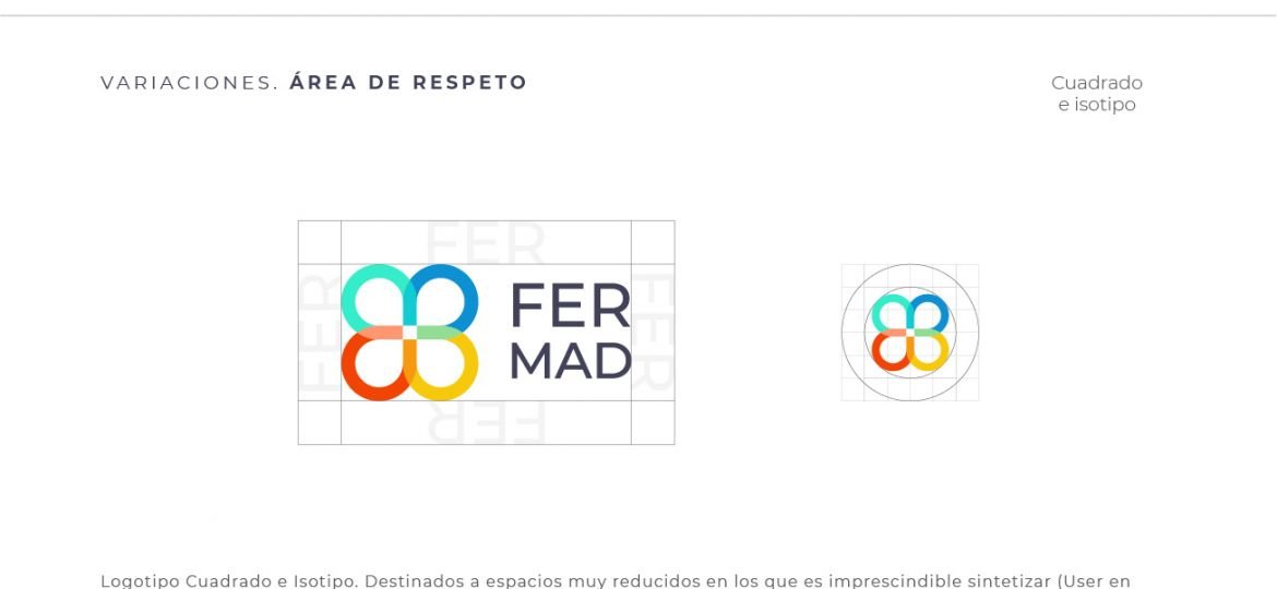
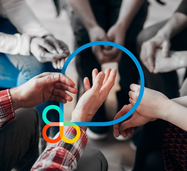
The logo we designed consists of a system of four coloured rings that connect and intertwine their transparencies with each other. It is a structure of 4 rings, it is a lucky clover, it is a butterfly, it is an embrace, it is a cycle in constant movement, it is abstract and figurative at the same time.
Each ring represents a different area of action within FERMAD:
- Orange: People with addiction problems.
- Green: For training days.
- Blue: For the voluntary sector
- Yellow: For the associative movement
El anterior isologo de FERMAD

La construcción base del viejo isologo

El nuevo imagotipo de FERMAD

La construcción base del nuevo imagotipo

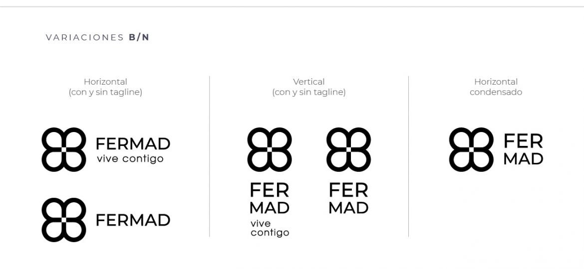
Flexibility and versatility:
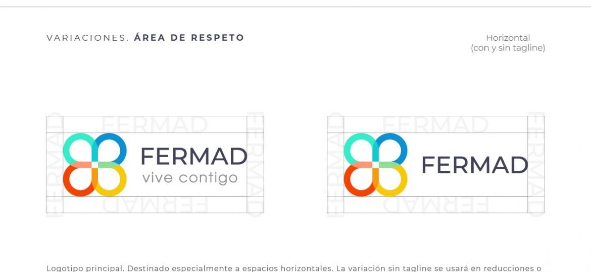
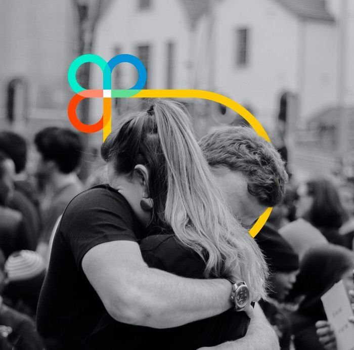
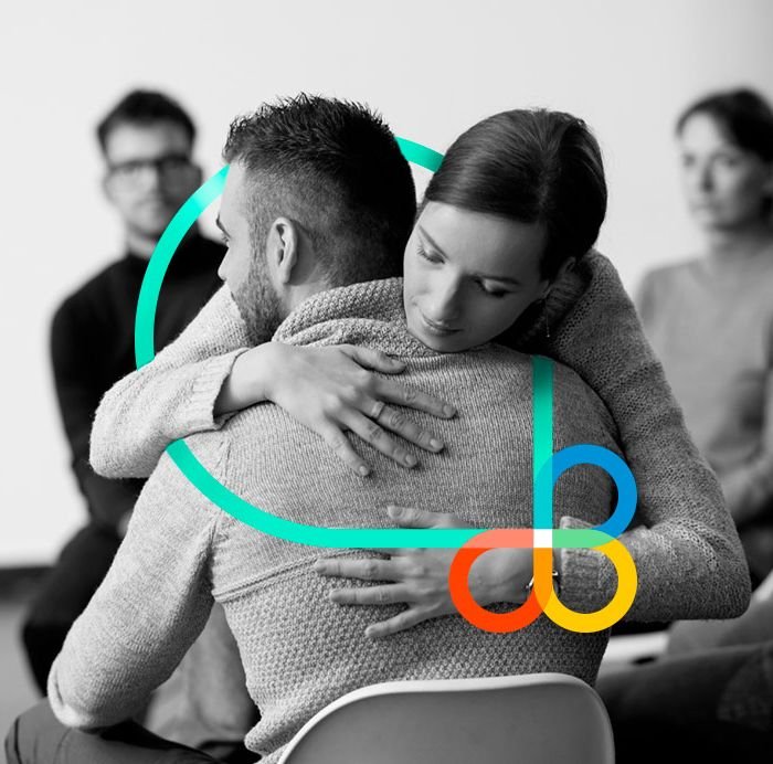
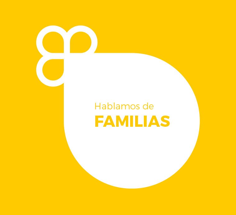
One of the strengths of the new logo is its flexibility. The interlocking loops and rings allow for different colour combinations and adaptations, giving FERMAD a wide range of possibilities for its visual communication. The identity can be adjusted and adapted according to the needs of each campaign or initiative, allowing the arches to grow and embrace other figures and elements. It is not a rigid brand, as we stipulated a series of graphic resources that would allow FERMAD to be very visually dynamic and versatile. So that each arch or ring can graphically grow and ’embrace’ any element within the composition of the message. An idea that reinforces the values of integration, union and active participation.

CORPORATE IDENTITY MANUAL:
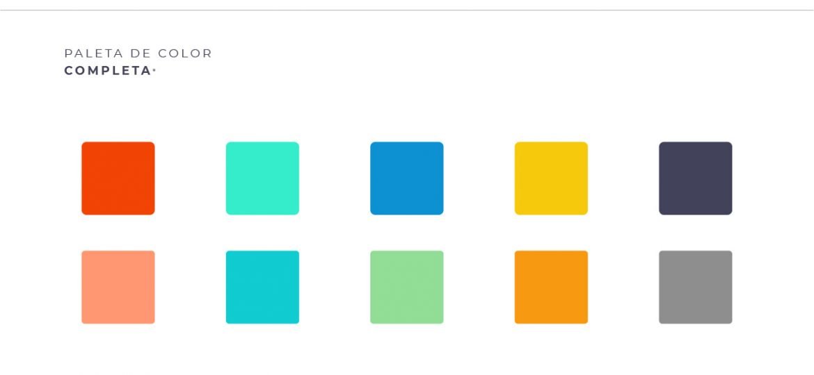
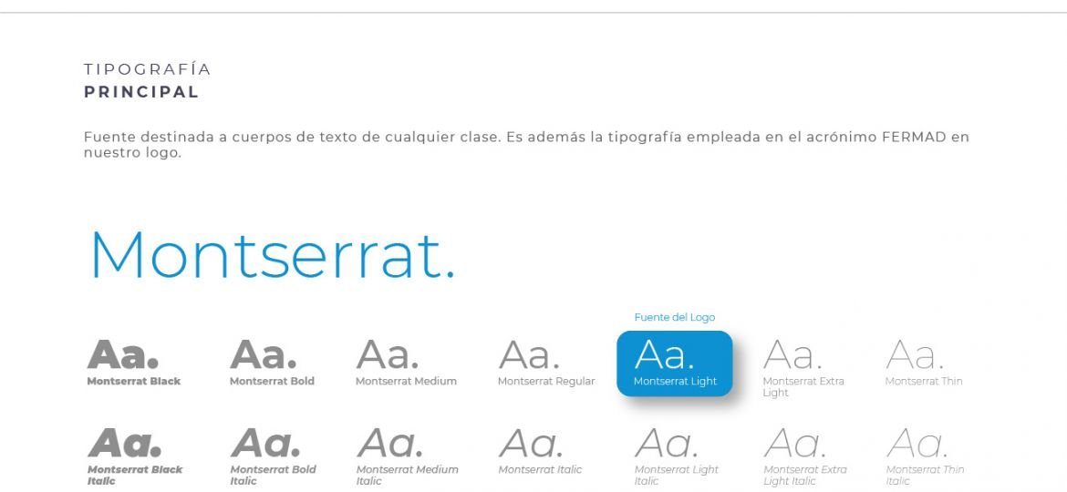
Once the entire brand strategy for the company had been defined, we proceeded to set out the technical guidelines for applying the logo in different scenarios: The use of colours for print and digital media, the range of typefaces ideal for communication pieces, and we established a visual theme around flat modern illustrations where we could develop the different sustainability scenarios: illustrations of smartcities, people moving around on scooters, charging their electric car, making responsible use of renewable energy.
As you can see, it has been a luxury to be able to propose and shape the whole new brand strategy hand in hand with the client.
In the chapters of this corporate identity manual, the following were defined:
Colour palette Typographies and text hierarchies Logo Variations, applications and uses as a graphic resource Communication tone Coexistence with the other logos of the entities.


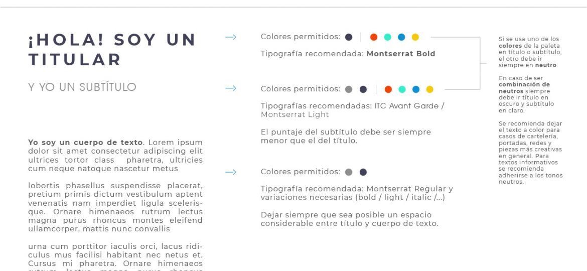


A graphic system is a coherent set of visual elements, such as colors, typefaces, shapes and patterns, that is used consistently in the visual communication of a brand. These elements are strategically combined to convey an organization’s identity, values and messages in a visually appealing and recognizable way.
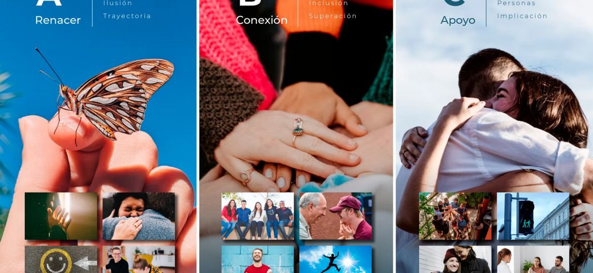
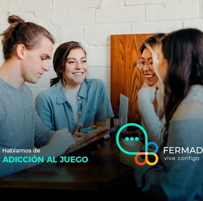
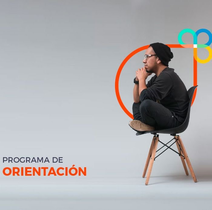
For FERMAD Vive Contigo we wanted to create these visual resources where you can appreciate part of a flexible graphic system where the isotope can be transformed (and de-formed a little) to play a fundamental role in its branding.
Next, we place how the isotype of this brand can grow, become flexible and interact with photographs, icons, people, and visual elements within the brand’s communication pieces. What we are looking for is:
- Coherence and consistency.
- Brand recognition beyond the logo
- Transmit more emotional messages
- Projecting Flexibility and Adaptability
Allowing the brand to adjust to different formats and sizes without losing its distinctive identity. This is especially important in the digital era, where brands must play with social networks (even more so if it is a social platform to help citizens and their families) to recreate various games with the brand’s compositional elements in its communication.
Graphic system


DESIGN OF YOUR CORPORATE STATIONERY
Having laid the foundations for the design of its identity and the corporate identity manual We proceeded to make the branding applications on letterheads, folders, sheets of paper and so on.
Corporate stationery helps to establish the brand image created for employees, customers and entities that make up and manage communication in isolation. Well-designed corporate stationery with strategically placed design elements can help reinforce and communicate your brand. This creates a strong and cohesive image that is directly associated with the brand, generating trust, officialdom and fostering identification of the organisation with the people.


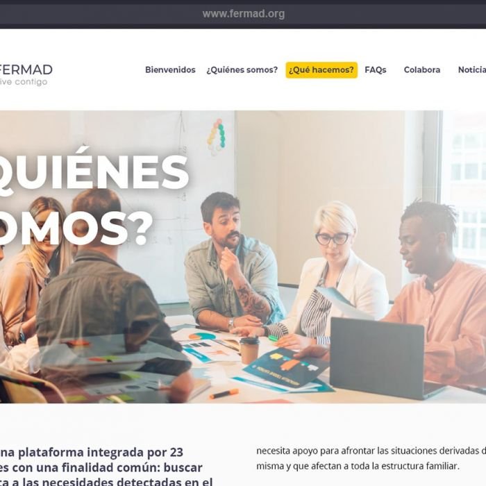
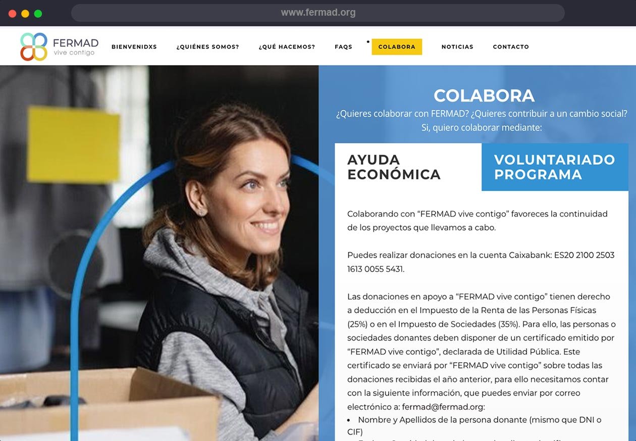
DESIGN OF YOUR CORPORATE WEBSITE
At the end of the design of your logo, plan de marca,the client gave us the opportunity to carry out the development of their website.
Delegating to a branding agency the responsibility of shaping the entire identity strategy of a brand and the design of its website is of utmost importance to maintain coherence and achieve a solid digital presence on the Internet.
With the knowledge and experience of the branding project, applying the brand’s communication criteria was very easy. By relying on the same agency, you ensure that the right visual elements such as logos, colours, fonts and styles are used consistently across all aspects of the brand, including the web design.
You can visit their website at www.fermad.org


IMPACT
The change was not only visual, as we helped to shorten the name of the organisation from “FERMAD – Plataforma Madrileña de Entidades para la Asistencia a la Persona Adicta y su Familia” to “FERMAD vive contigo”. Emphasising the continuous and close work they do with people and their families on a daily basis.
As for the renewal of the corporate identity, it was very well accepted throughout the organisation
, especially among the people and entities that make it up, feeling an emotional connection more in line with them and the endless work they do.
By adopting a more flexible, dynamic and representative image, the brand is able to transmit a message of innovation and adaptability.This not only improves their external communication with customers and stakeholders, but also has a significant impact on employees’ sense of belonging.
When FERMAD Vive Contigo members see their corporate identity evolving and being renewed, they feel that they are part of a growing and progressing company. This can increase their motivation, commitment and loyalty to the organisation, which in turn contributes to better performance and positive results in terms of communication and professional image. For this case study, we were more interested in gratitude and compliance than other metrics. We hope you also enjoyed seeing the result.


DO YOU HAVE AN EFFECTIVE BRANDING PLAN?
Does the presentation of your service not communicate its key features and unique value proposition? You don’t have 2 chances to communicate your company well. The current market demands authenticity and a lot of innovation. At Brandesign we design brand strategies so that they become your company’s most valuable asset. We do it from research, preparation and with excellent care to creativity, because your company cannot afford not to stand out. Shall we start?

I worked in P&G building global brands with branding strategies for regional markets according to each consumer. I complemented my 360º profile working in media agencies to analyze campaigns after the click.

I’ve always been with a pencil in my hand, scribbling ideas to design professional projects in the environment of digital arts, graphic design, animation and 3D. I love to see how step by step my creations come to life.


Versatile, decisive and productive. Throughout my career as a journalist and digital marketing specialist, I have done reports, articles, interviews, public reports, creating content for brands on social networks and portals.

I like to thoroughly understand the client’s needs and translate them into digital solutions, the Internet is growing every day in a diversity of formats and digital resources and we always find the tailored IT solution that best suits the users.

Some call me a designer, others an art director, even my mother says I’m an artist and the truth is that I only like labels to design them.

I always try to give an answer and a solution every time you call me, I answer the calls and the Brandesign chat from the customer service.