
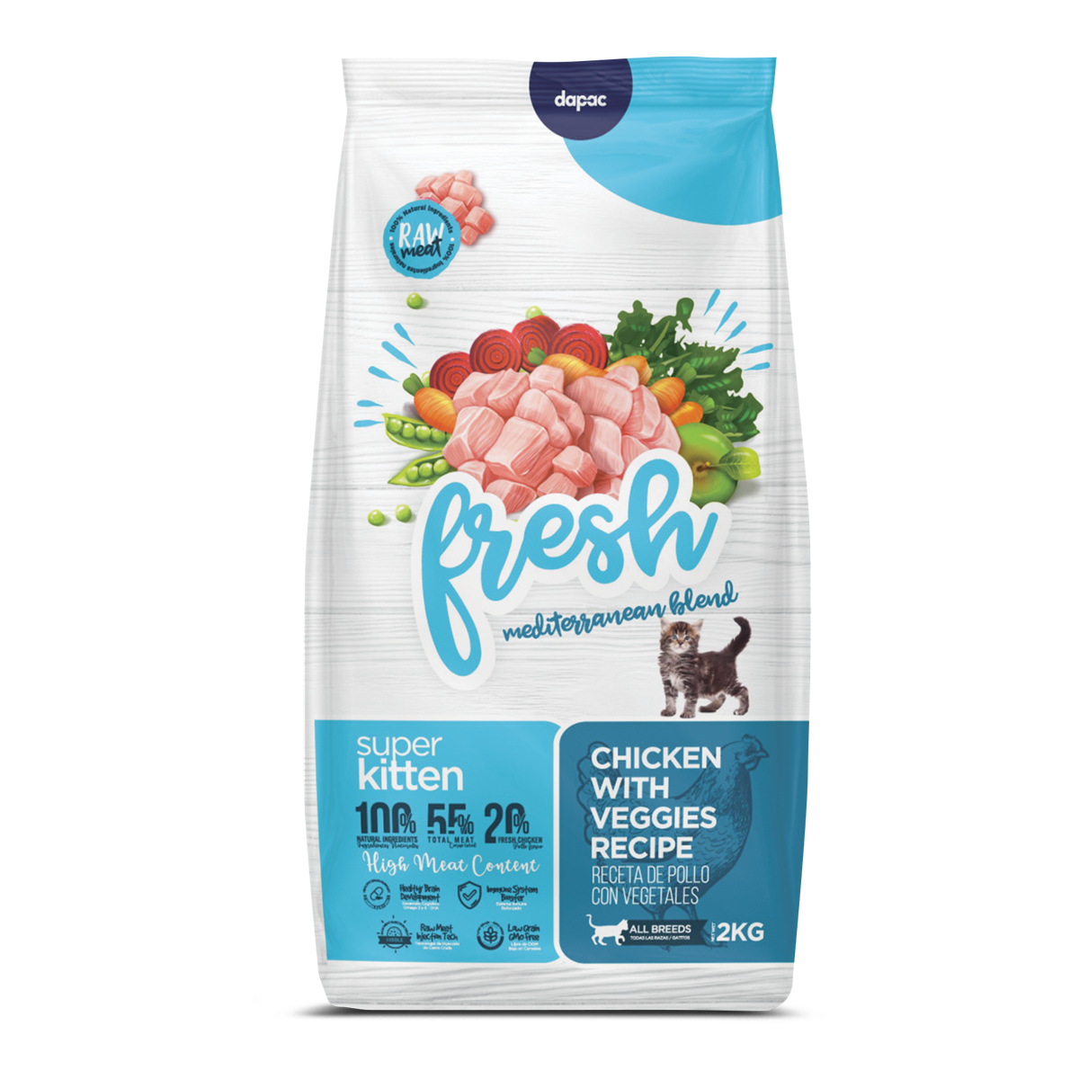
Designing the 360º brand experience Fresh Mediterranean
It has been 4 years since Central de Compras Dapac opened its doors to us as a service provider to actively participate in the design of its products.
The success story we would like to present to you today is about the flagship brand, the company’s flagship and most extensive range, which for us was one of the biggest and most fun challenges to face.
We work daily with the client to understand all the market and briefing needs and today we are more than a supplier: we are a strategic partner.
The challenge not only involved a comprehensive renovation of the brand (renaming, nomenclature, logo redesign, packaging) but also to consider how the entire line of products and by-products of the best-selling brand of the fifth largest pet food producer in the country would look like. The need for change was due to several factors, they already had many years in the market with a very traditional design, they wanted to make a refreshing of the image, but the change was not only physical exterior, but improved products incorporating many more fresh ingredients to the recipe. The fear: that the change was too big and the product too recognisable.
Implicarte e involucrarte con tu cliente para obtener los mejores resultados.
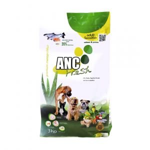
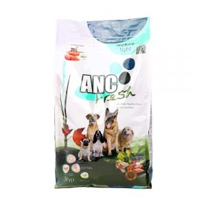
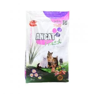
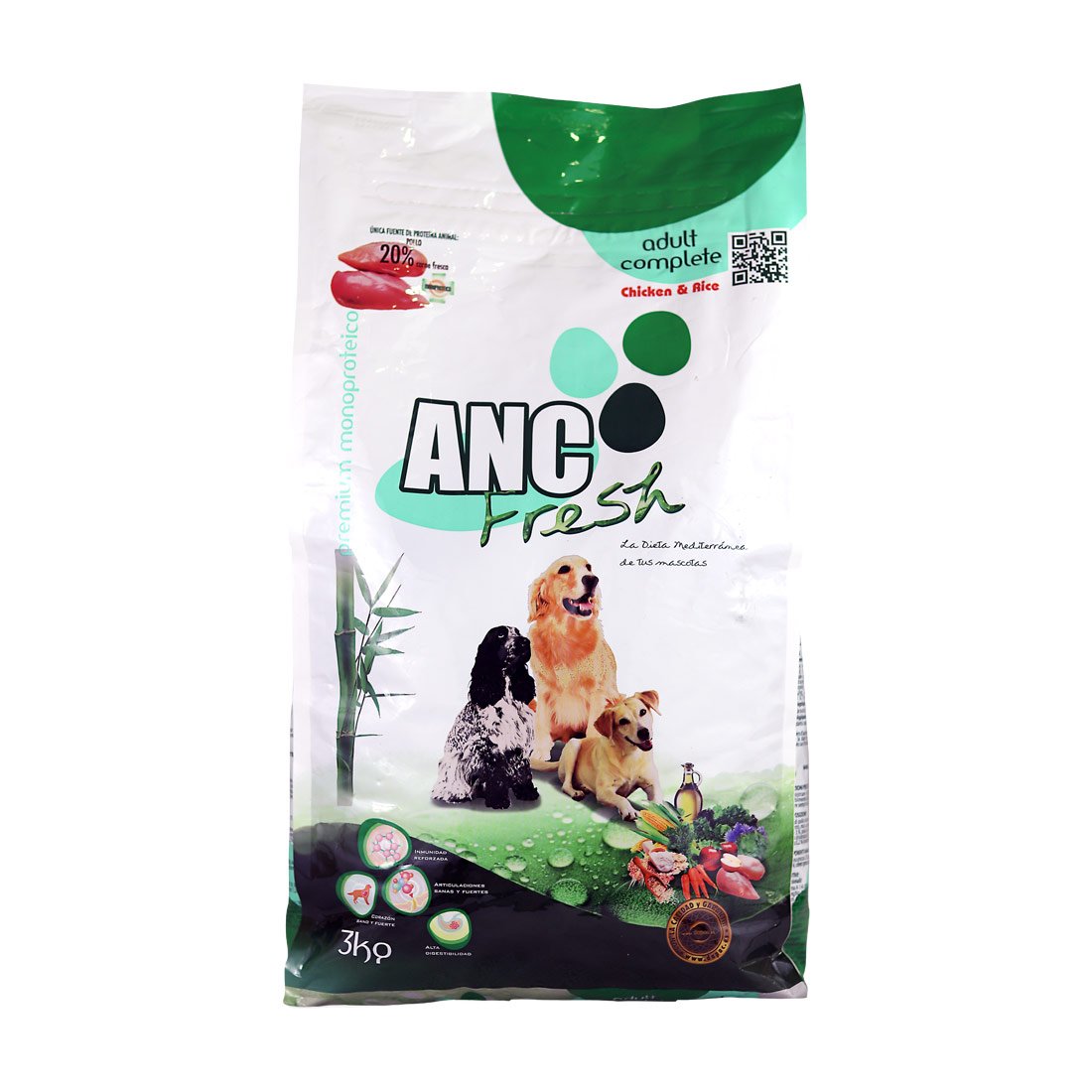
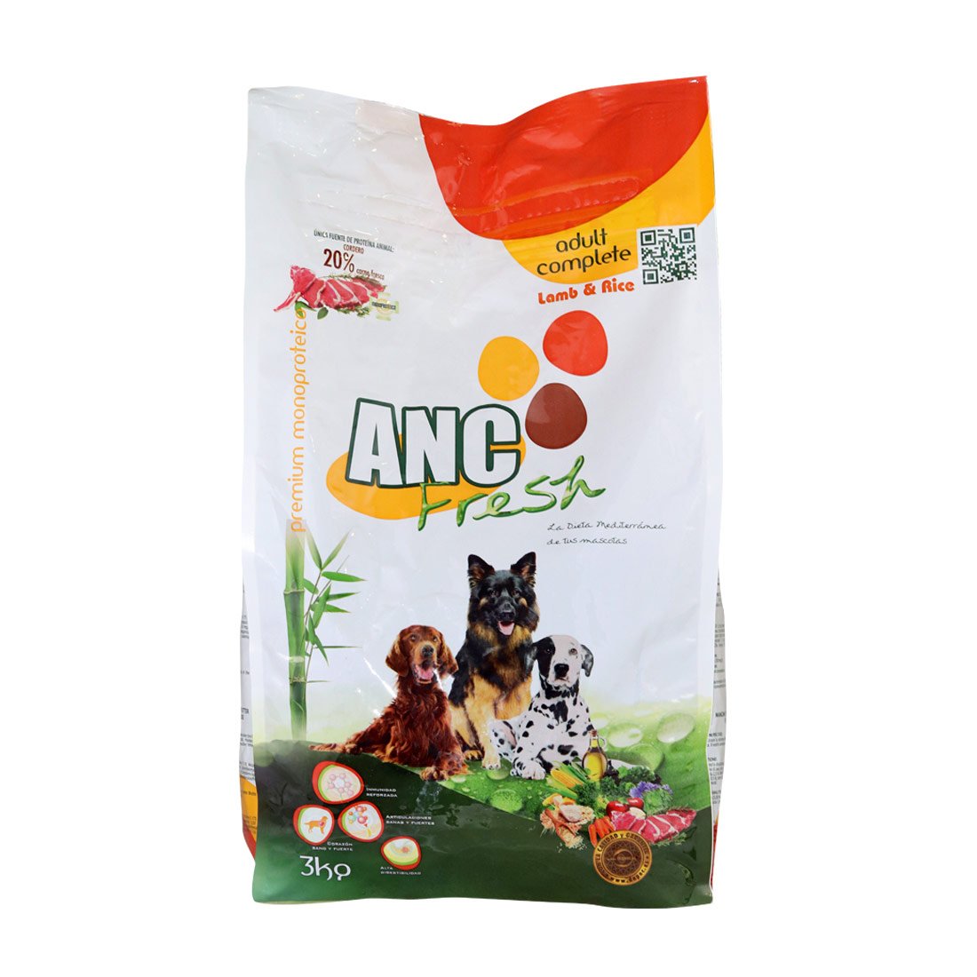
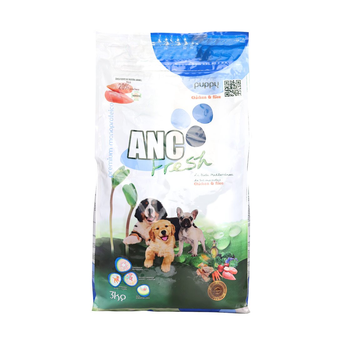
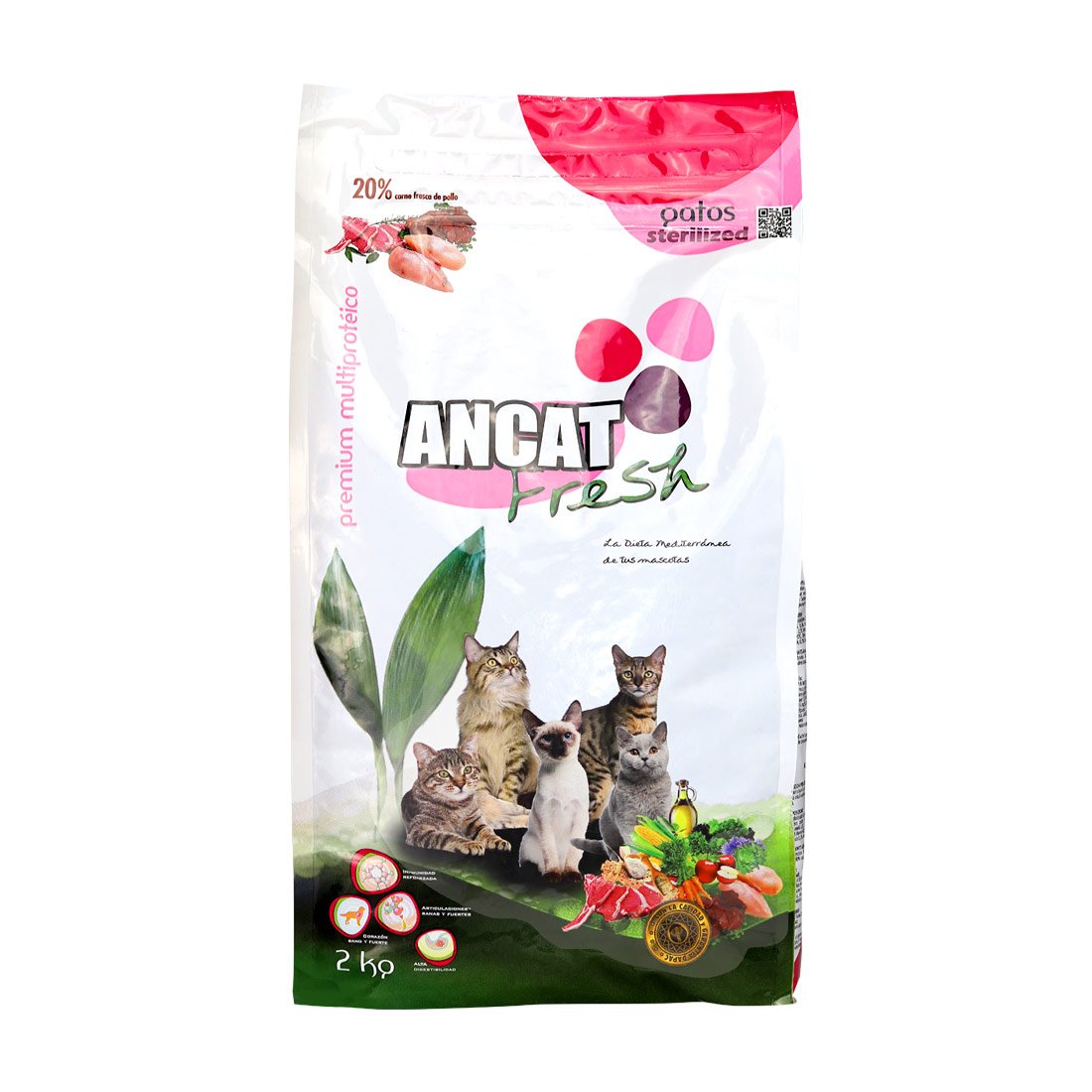
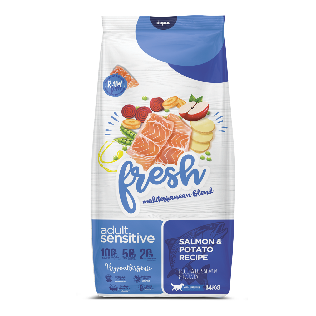
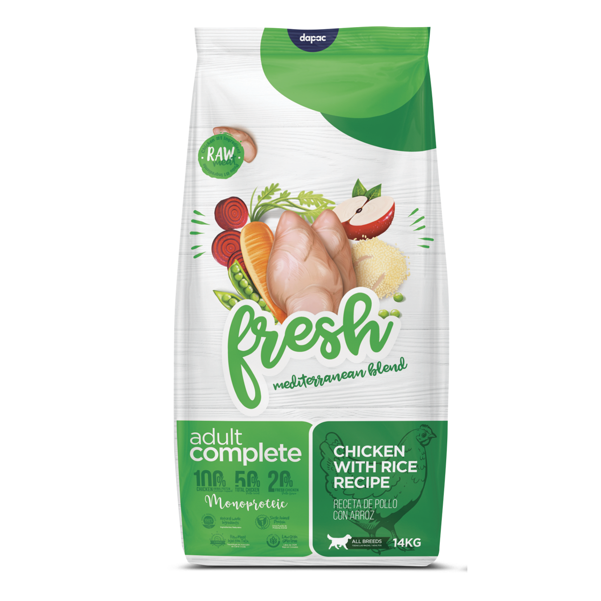
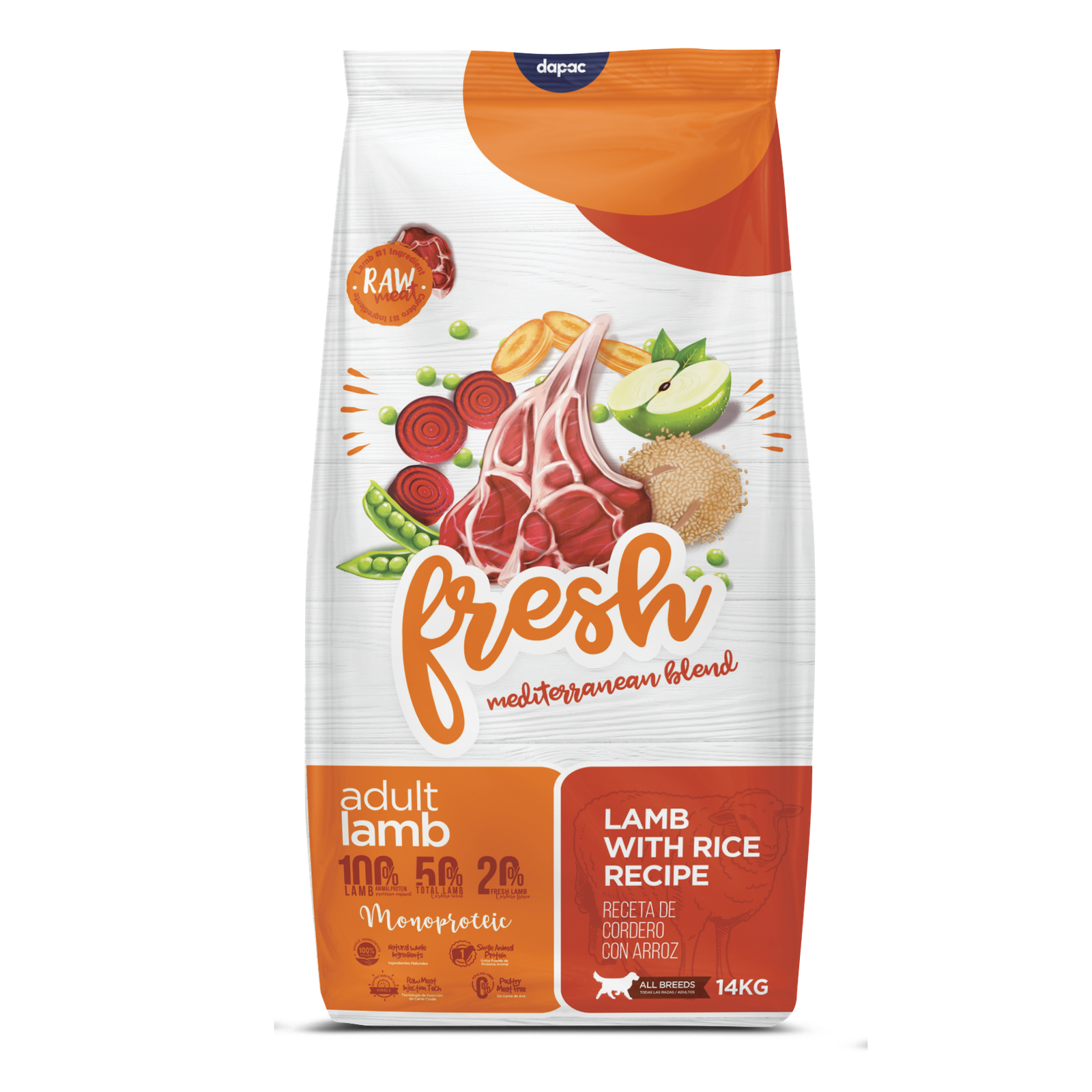
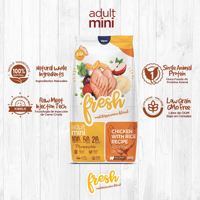
Our client gave us the opportunity to study their entire product line, in order to recognise the differences between a dry food (high or low grain), others composed of fresh ingredients, others free of cereals such as the Zen Grain Free range (their premium line) and the Zen Grain Free line.Dog#1 for the basic or economic sector. In addition to looking at the differentiation of a range of more than 10 products, the project would not end with the packaging designdiseño de packaging, but rather commissioned us to manage all of the brand’s media: social media, outdoor advertising, retail support, and the website.

APPROACH:
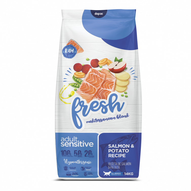
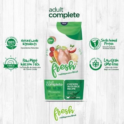
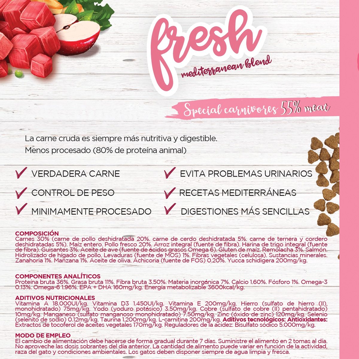
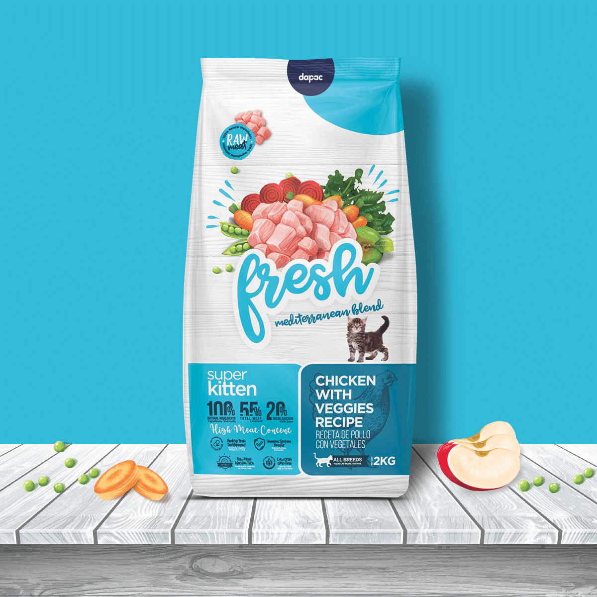
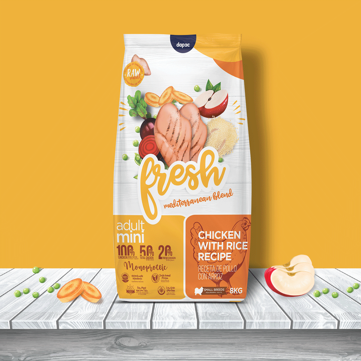
Before approaching any design, we like to know the reason for the change. Is it a change of formula or recipe? Has the market changed? Has the type of consumer changed? In this case, as we mentioned, it was not only a refreshment of the image, but the recipe was improved by including fresher foods in its elaboration, hence the name Fresh. We did notice why the naming of the brand was ‘ANC Fresh’ but after talking to several store owners and retailers few knew that the acronym belonged to ‘Complete Natural Food’ so we decided to undertake a new brand registration and logo renewal to just ‘Fresh’, as a claim we left only the Mediterranean blend to do justice to the new ingredients of the formula. In addition to a previous visual audit of the products, we understood that this Pet Food category has colors to follow as standard. If the main differentiating asset of a product with respect to others in its family is color: rethink: are we really using the right colors?
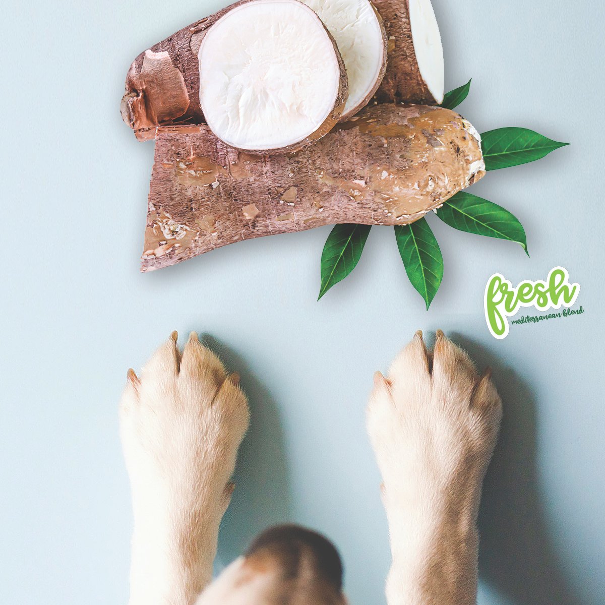
From the previous design We never really understood why images of life-size dogs appeared on top of a gigantic green leaf with water droplets. Certainly there is in our subconscious the smell of fresh grass and we associate it with ‘Freshness’ but we have to be very careful with what we ‘paint’ on the packaging because not all artistic licenses are valid. In many of the previous designs there were elements such as bamboo or aloe vera used in the background composition, and the truth is that none of them are present in the recipe.
So why not innovate with ingenuity but also being faithful to the product? Let’s not deceive the customer by painting decorative elements that are not present in the real composition of the product. Let’s be authentic.
Also they had ingredients floating as stamps on top, but then repeated below, we found many things without order or sense, but we did want to keep the colored balloons of their headers as a heritage for the new design, being these elements recognizable to keep in line with the new design. The client gave us license to really reinvent the design without losing the essence of ‘Fresh’.


LOGO DESIGN:
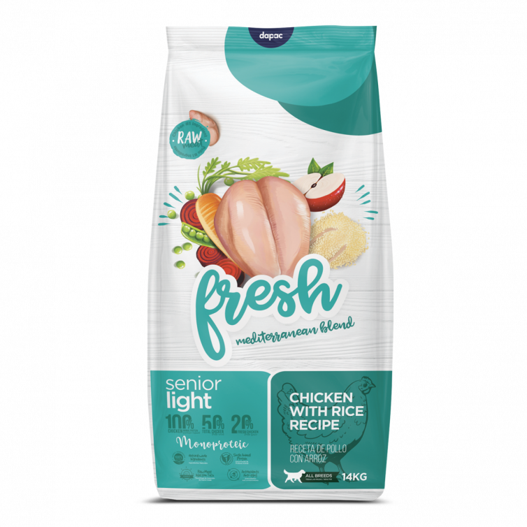
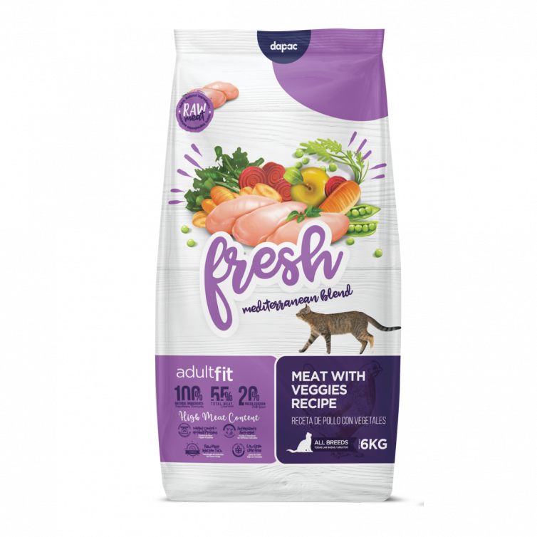
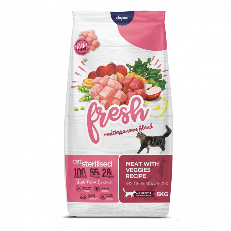
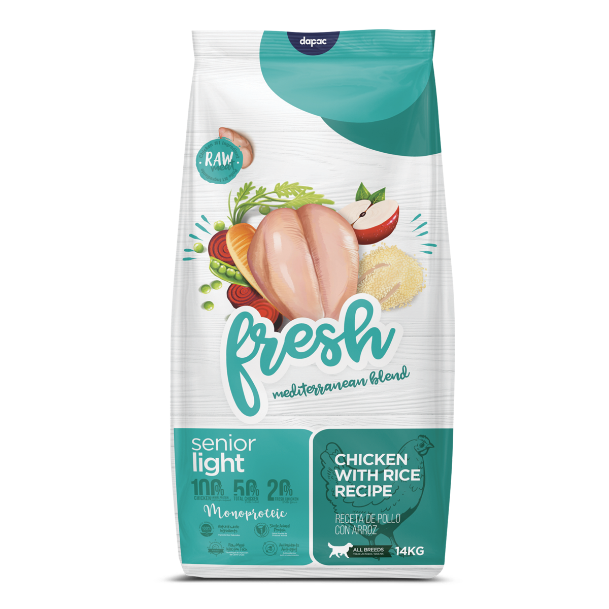
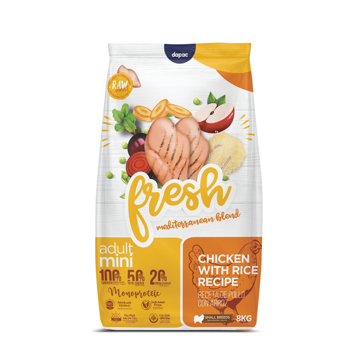
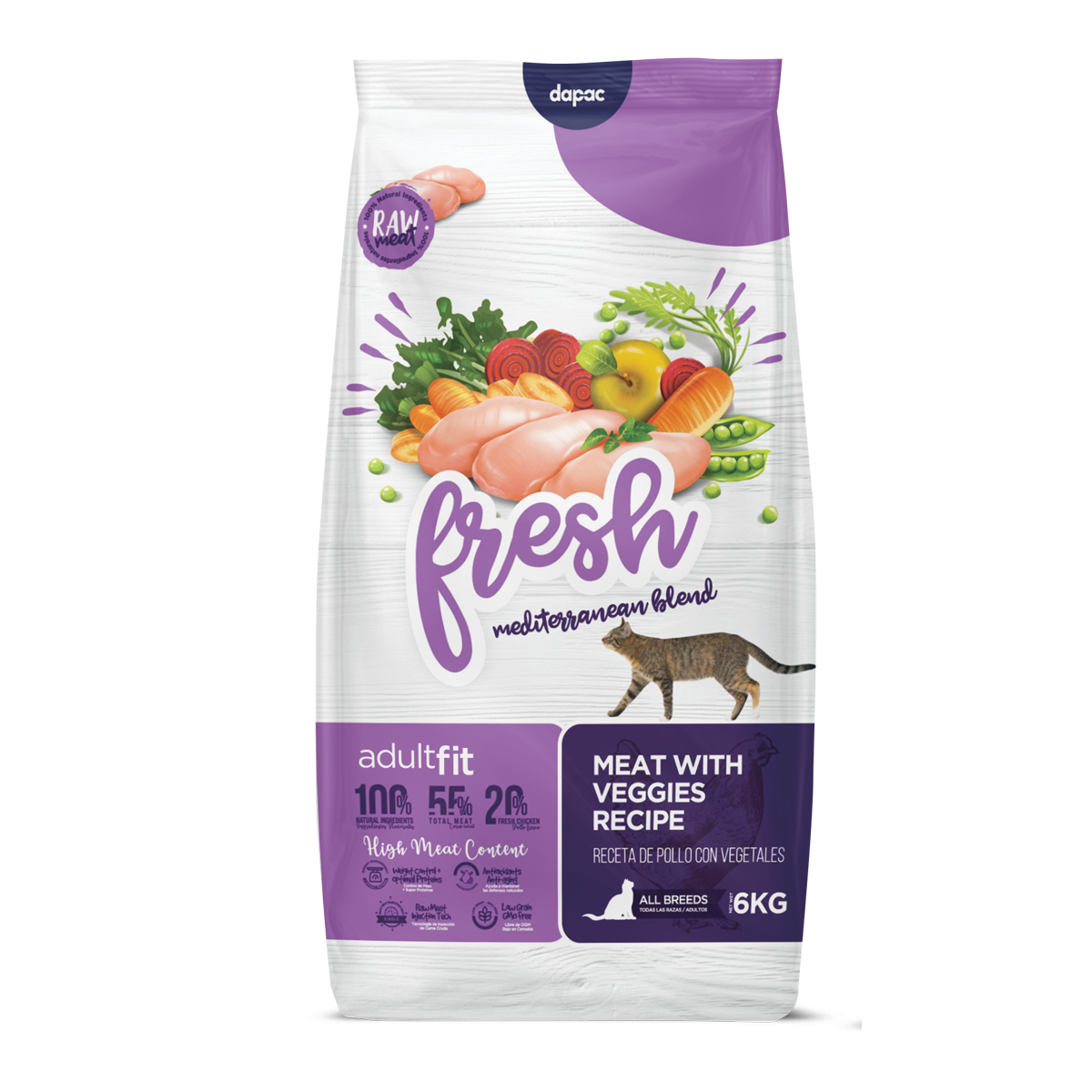
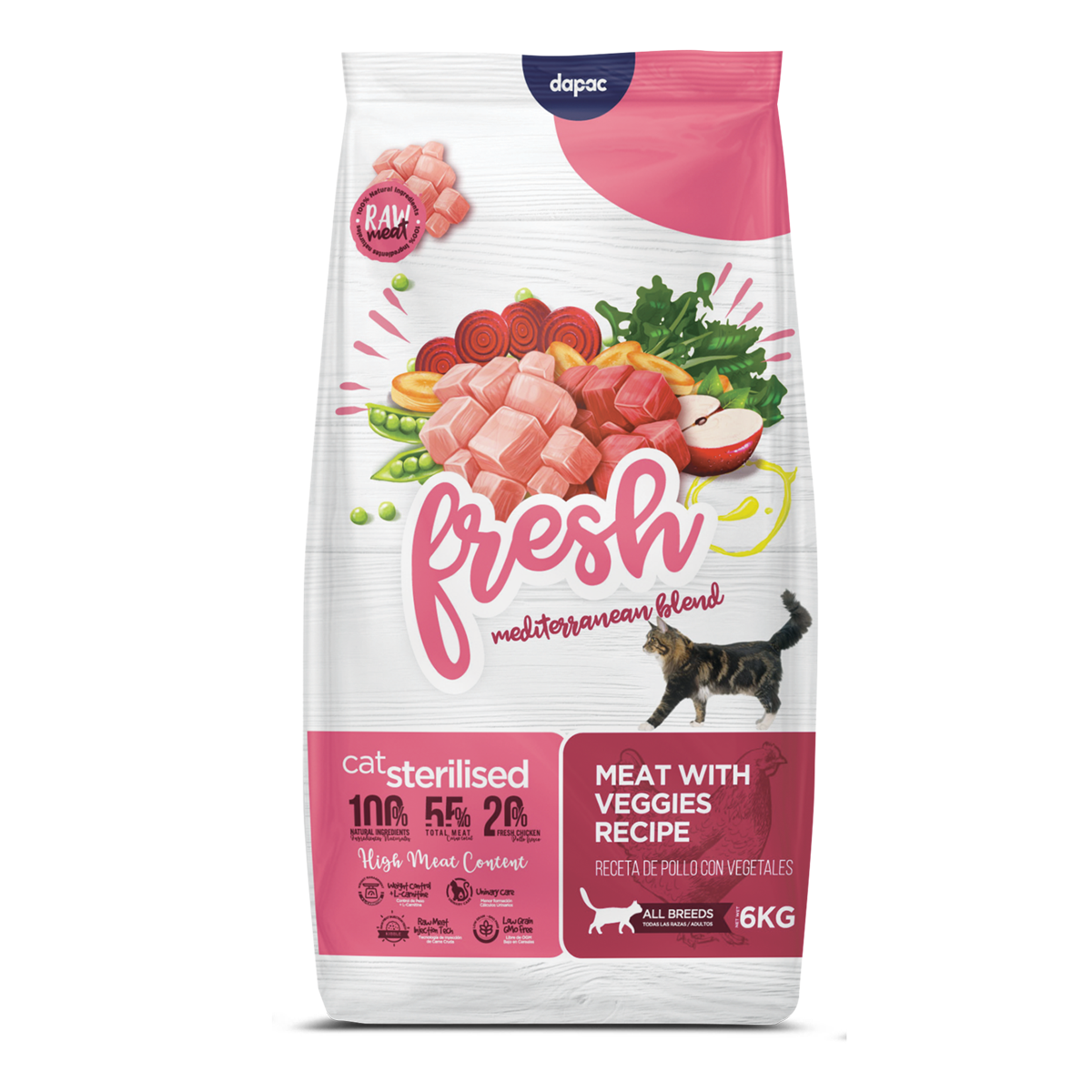
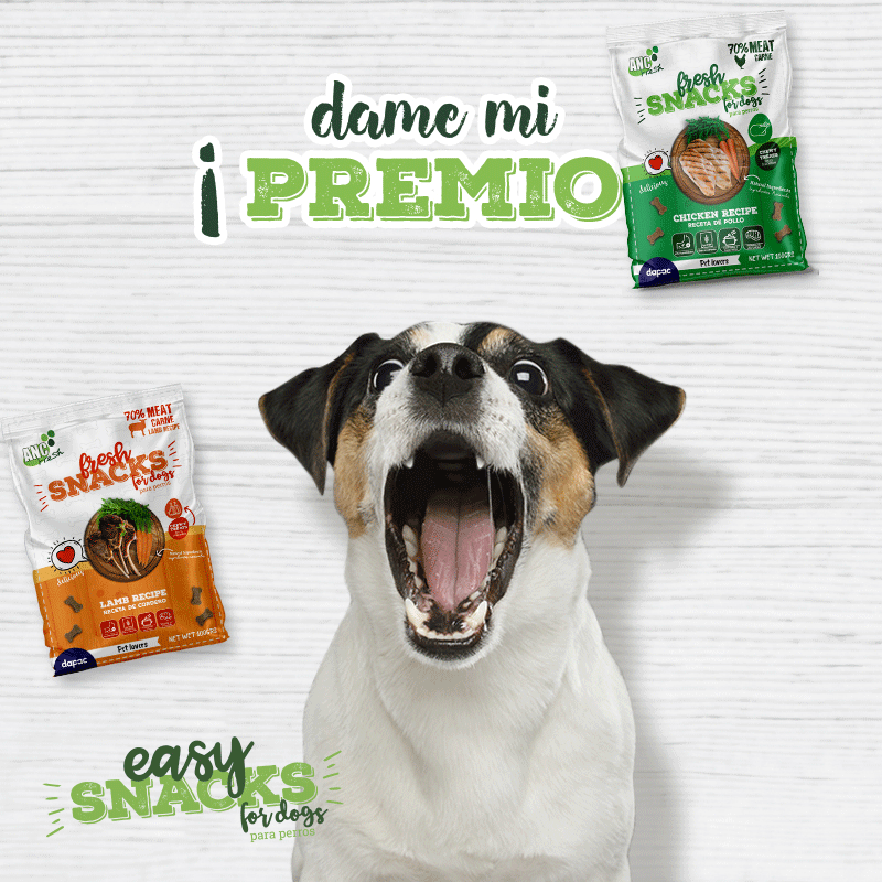
El color in a packaging is not a designer’s whim, the colour on a feed bag in this Pet Food category is an identification strategy. Dog food consumers already associate blue-coloured packaging with foods containing fish, red colours are associated with recipes with a predominance of meat such as lamb or beef and green colours more towards chicken. It is at least interesting to define a colour strategy not only to differentiate yourself from the competition but also to help the specific product connect with its specific consumer or buyer. Pastel colours are associated with the puppy range and pale colours with the senior range. Interesting, isn’t it?
The change of ANC Fresh’s logo to simply ‘Fresh’ was motivated by a desire to simplify the message and create a shorter, easier-to-remember name. The rebranding was also accompanied by a study of colour palettes and pantone numbers to identify each product according to sector category and market trends. We were also looking for a fresh and colourful palette to represent the product family.
We carried out many ISO certified colour tests on the spot colours and pantones we wanted for each packaging. To ensure vibrant colour in the final print.


PERSONALISED ILLUSTRATIONS:
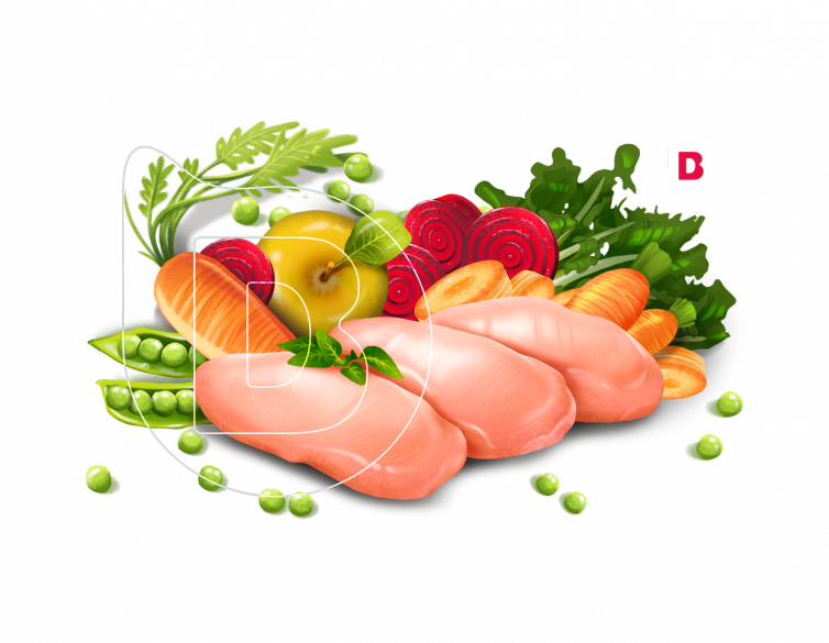
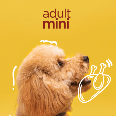
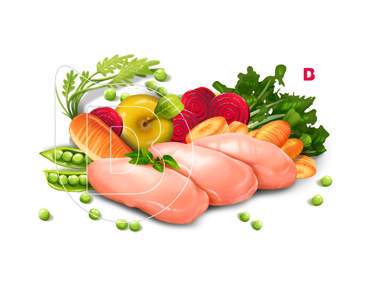
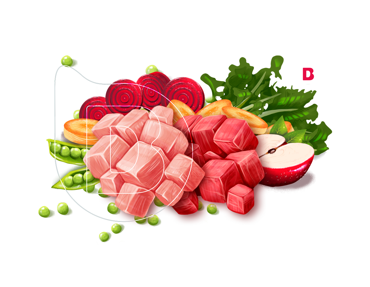
One of the phases prior to the conceptualisation or elaboration of designs was to go to the different shops where the product was sold, we liked to analyse the display shelf and compare it with other products. If you read us and have a pet you will have noticed that the vast majority of pet food packaging displays a picture of a dog or cat on the front. This is a device we designers use to inform you that this is a pet food. But you are certainly already in a pet shop. So: how necessary is it to emphasise with a picture of a dog that this food is for dogs? So our conclusion was: let’s get out of the herd and not use pictures of dogs. We wanted to reinvent these ANC Fresh designs a little bit, but in general, having carte blanche for the design, we wanted to reinvent the packaging design for pets.
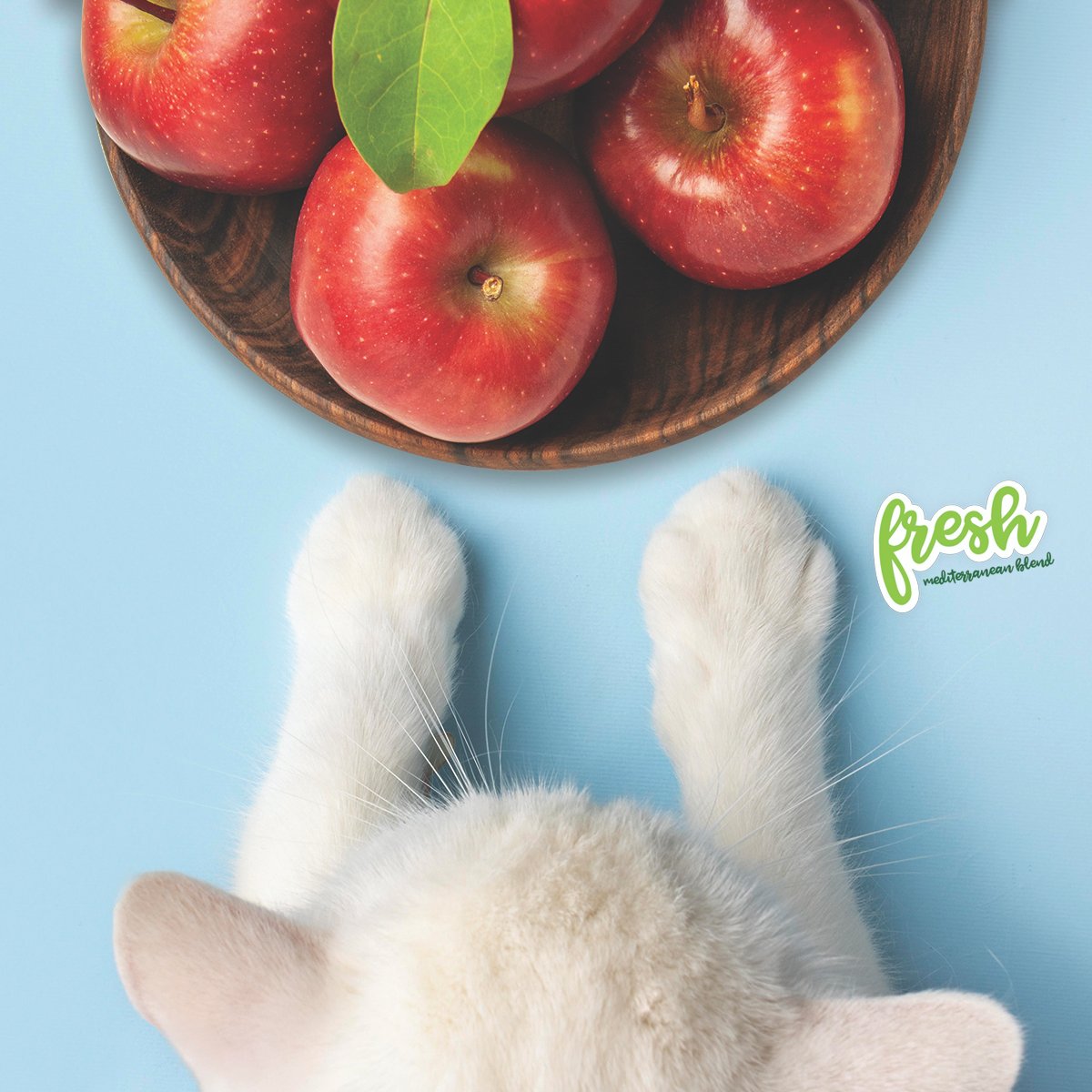
With the client’s GO! we came up with personalised illustrations instead of photos of pets, which is often counterproductive because a salmon feed can serve as food for many breeds of adult dogs. And when you use a picture of a Weimeraner or a Boxer, you are segmenting your product too much. You are unintentionally excluding other breeds.
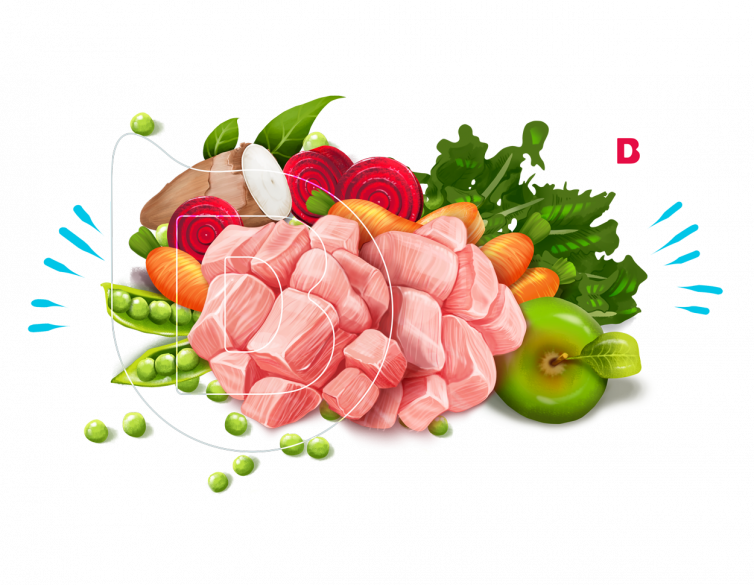
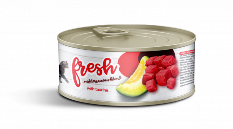
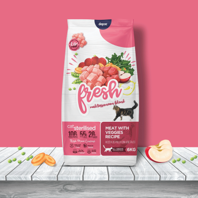
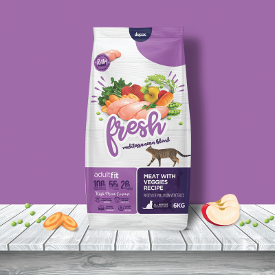
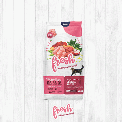
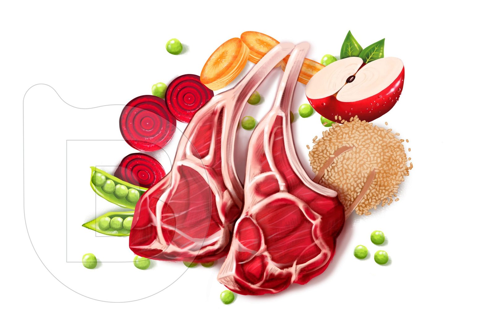
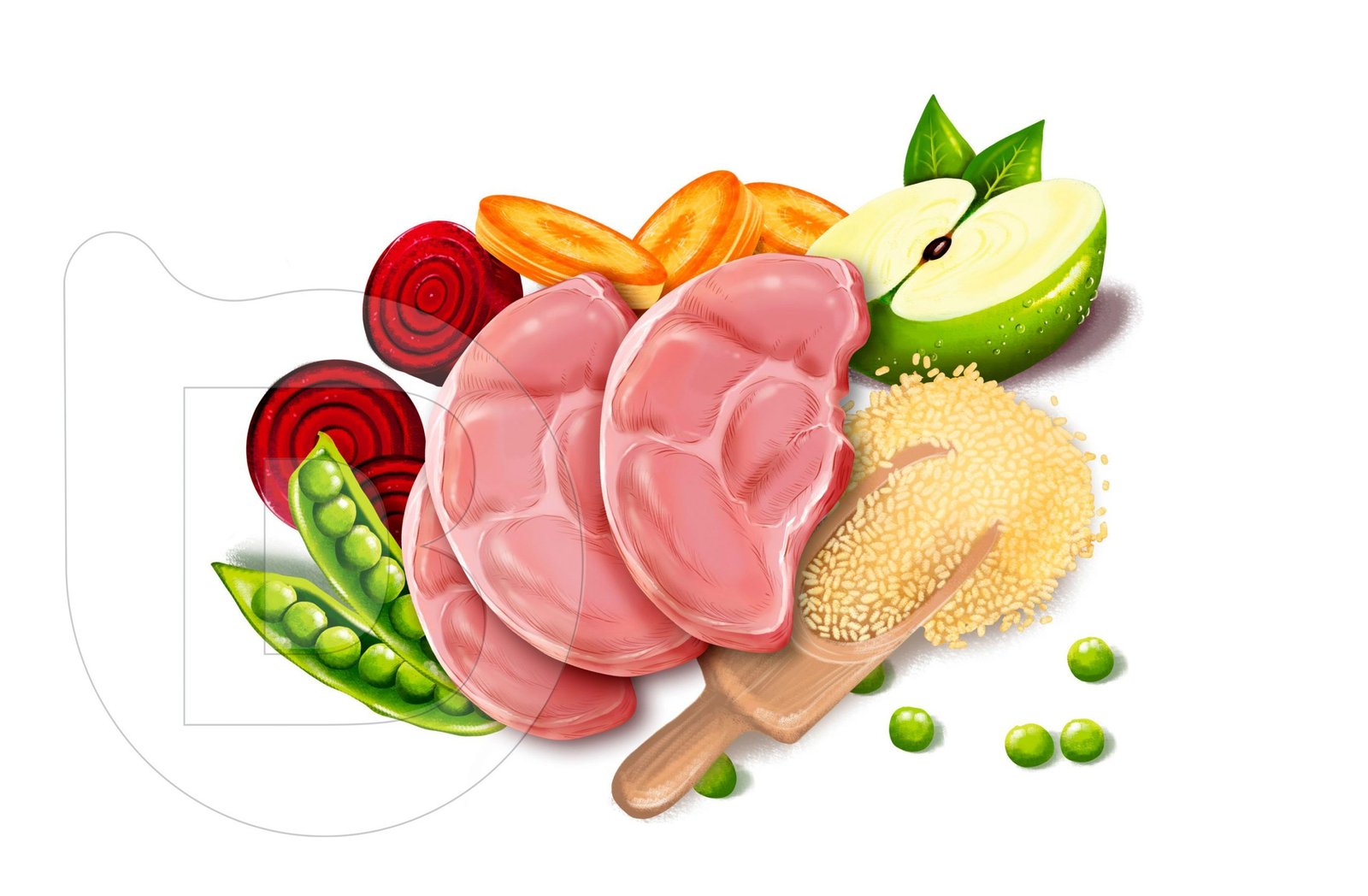
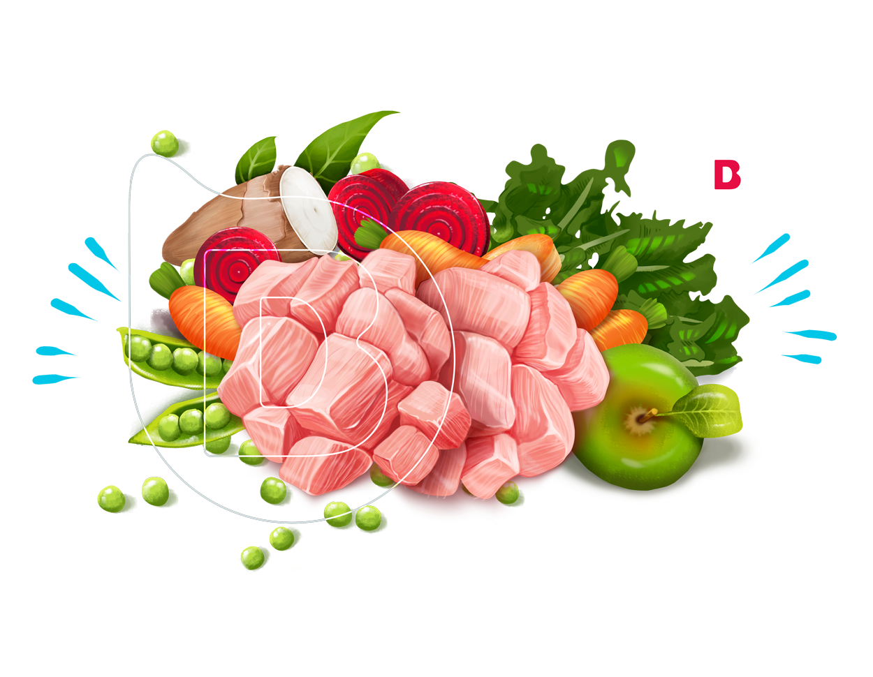
Our decision: to go with customised illustrations of the product still life, i.e. to put the real food included in the recipe on the front of the packaging and put them in the front row. Our design team presented several illustration styles from the most hypermarket realistic to the flattest vectorial, voting on which would look best with the concept of ‘Fresh’.
After a vote with the client’s team, this ‘Free Hand’ style won with a lot of work to detail the texture of the food, keep the colouring characteristic of the product family and be 100% honest and true to the product and the customer.


PACKAGING DESIGN:
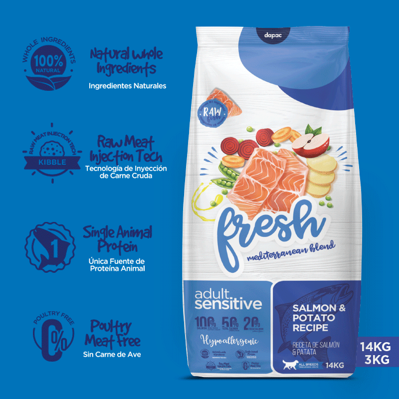
Our objective: As we mentioned, it was not only a change of image on the outside, the change of product came with a change of recipe, including fresh ingredients in the elaboration, in the diversification of product we went from 4 references to 6 to offer a greater variety of product. It was a big change, but of an existing line, so we wanted to amaze the buyers of the old Fresh, but maintaining a certain line or graphic legacy with respect to the previous one.
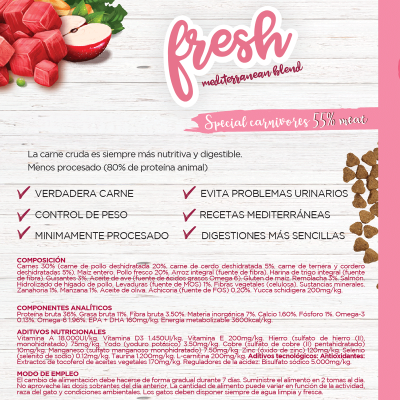
In addition to fleeing from the typical clichés of placing a picture of a dog on the front, and making our own illustrations, we wanted to make a fresh design, informing on the back panel with a highly illustrated infographic of the components of the recipe, informing the new product properties and validating with the client each color used, creating a pantone color strategy for the 6 references or packaging sku’s of dog food plus 3 references or packaging su’s for the line of cats. The result is a wider family of products, a differentiating design that communicates without external support the properties of the new fresh line, since the packaging is the most direct relationship between the product and its buyer.
DISEÑO DE SU GAMA DE ALIMENTACIÓN SECA (PIENSOS PARA PERROS Y GATOS)


LABEL DESIGN:
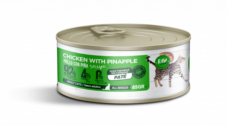
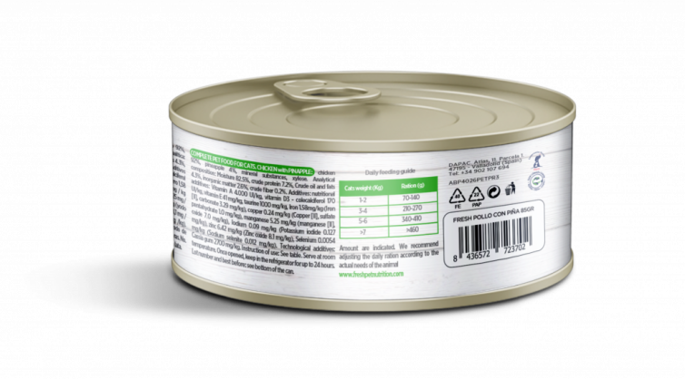
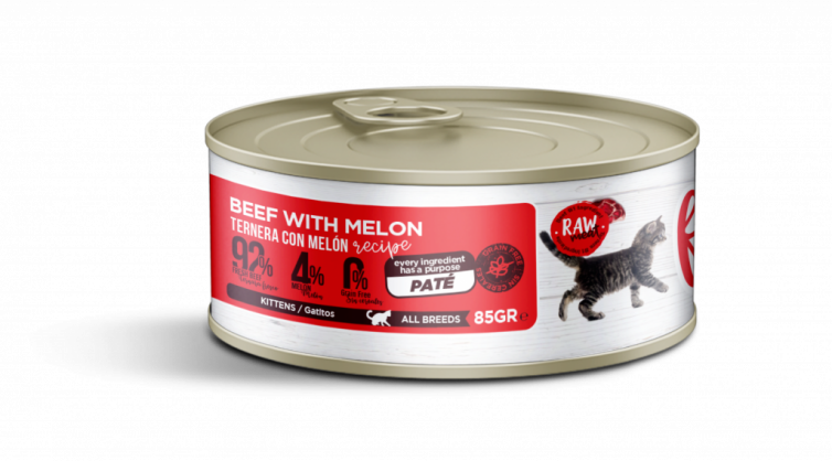
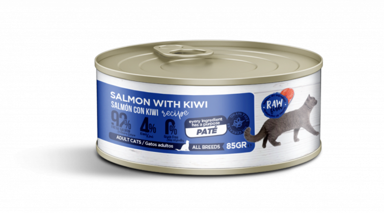
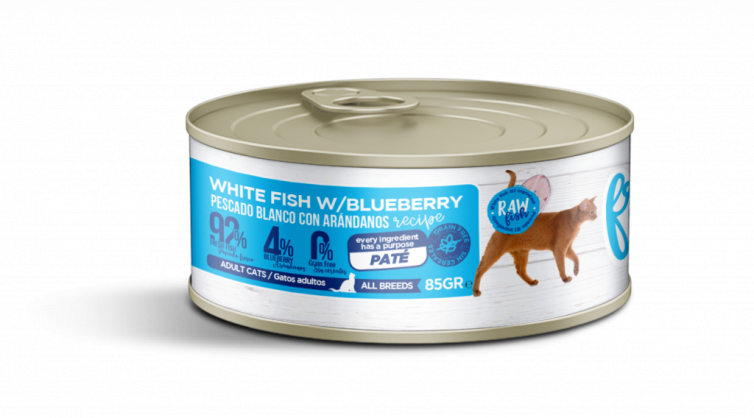
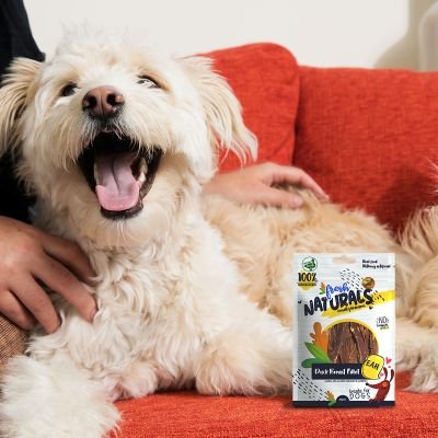
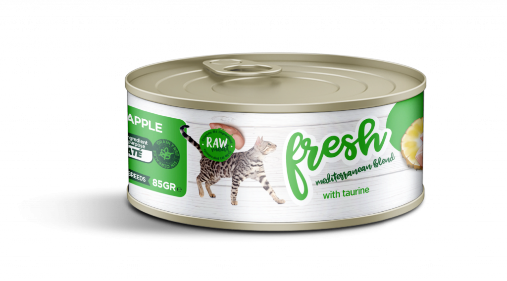
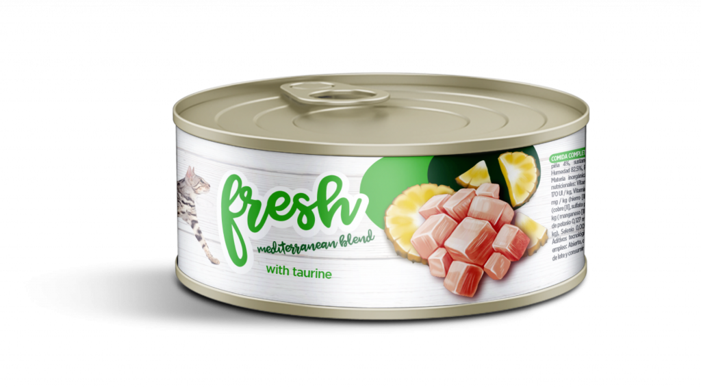
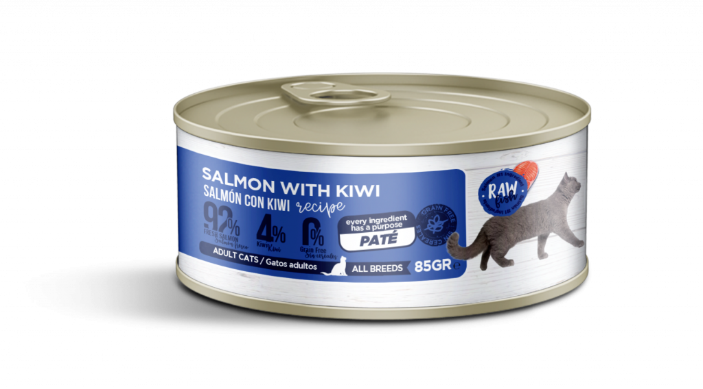
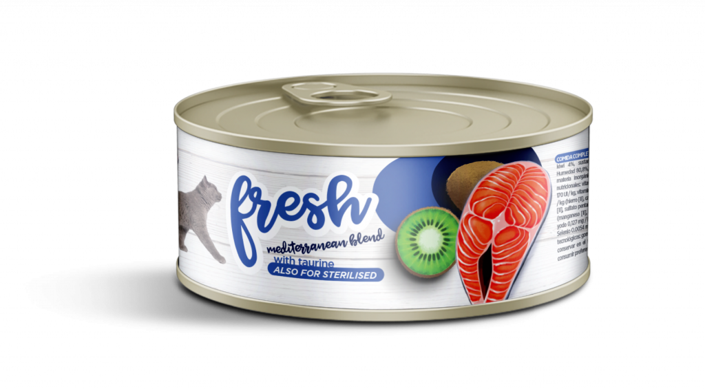
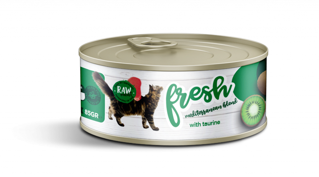
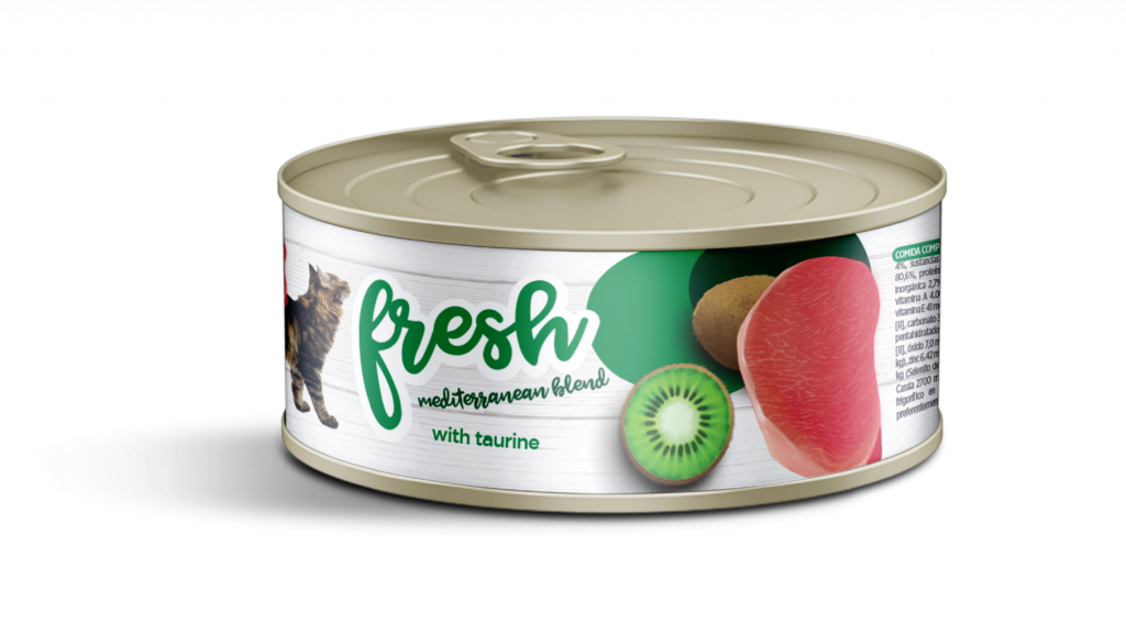
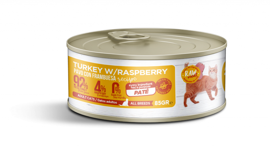
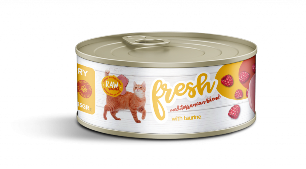
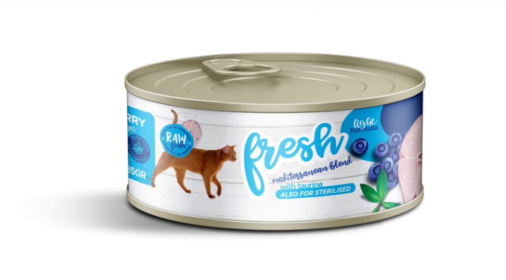
And after the success of the design of the entire line of Fresh dry feed, the brand wanted to open up the food complement for the first time by launching a line of wet feed. To do this, we designed six new labels for the range of wet pâtés, which, although we did not have all the space available in the 4kg and 15kg feed sacks, we put the same graphic emphasis of Fresh with its colours and eye-catching illustrations on its labels.
We share with you the label line for the Fresh Mediterranean Blend wet feed line cans.

DISEÑO DE SU GAMA DE ALIMENTACIÓN HÚMEDA (PATÉS PARA GATOS)


OUR SOLUTION:
The result of this work could not only be measured in brand awareness on the shelves, where the product stood out for its quality and homogeneity, a product family with a clear differentiation in its versioning. It also increased in-store demand by 24% in the first year and remains the company’s best-selling product range.
As a learning experience, it taught us how to packaging design agency that we cannot focus on designing a single tree without keeping in mind the forest. That is to say that although we are asked to design a single packaging, we always keep in mind the projection, diversification and growth that it may have over the years.
Part of our team had the opportunity to train at Procter&Gamble, one of those lessons learned was the ‘Nail Challenge’, a strategy based on the idea that if all the small brands or products you have under the same category unite and ‘bid’ in the same point and direction, they can break the competitive barrier with the big ones and win at the point of sale.


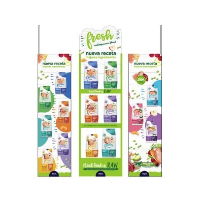


RETAIL SUPPORT CAMPAIGNS:
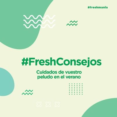
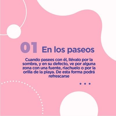
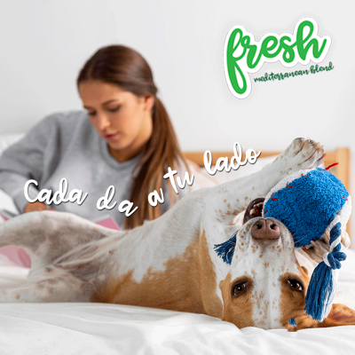
In addition to managing the entire rebranding and design of their packaging, we manage the social networks of @freshmediterranean, the design and development of its official web site of www.freshpetnutrition.com and we support the shops with the design of promotions to activate sales in retail with synchronised promotions on social networks and in shops, we echo their corporate social responsibility in digital channels. This is a 360º branding management experience for this brand, an action that we do hand in hand with the manager and his Marketing department. #TeamWorking.


Is Your Brand Aligned with Your Product?
Does the design of your packaging or the presentation of your product not communicate its key features and unique value proposition? You don’t have 2 chances to communicate your product well. The current market demands authenticity and a lot of innovation. At Brandesign we design brand strategies so that your brand becomes your company’s most valuable asset. We do it from research, preparation and with excellent care to creativity, because your product must be unique. Shall we start?

I worked in P&G building global brands with branding strategies for regional markets according to each consumer. I complemented my 360º profile working in media agencies to analyze campaigns after the click.

I’ve always been with a pencil in my hand, scribbling ideas to design professional projects in the environment of digital arts, graphic design, animation and 3D. I love to see how step by step my creations come to life.


Versatile, decisive and productive. Throughout my career as a journalist and digital marketing specialist, I have done reports, articles, interviews, public reports, creating content for brands on social networks and portals.

I like to thoroughly understand the client’s needs and translate them into digital solutions, the Internet is growing every day in a diversity of formats and digital resources and we always find the tailored IT solution that best suits the users.

Some call me a designer, others an art director, even my mother says I’m an artist and the truth is that I only like labels to design them.

I always try to give an answer and a solution every time you call me, I answer the calls and the Brandesign chat from the customer service.