How to design a successful children’s fashion brand:Very Merry Berry
It all began in the spring of 2018, when Cristina and her partners contacted us to support them in corporate identity for their new venture: a new luxury fashion brand for children with high quality materials but at affordable prices. As well as being entrepreneurs, they were also mothers and had a subtle taste for design and a high sense of fashion and styling.
It was clear to them that they wanted to take advantage of the high reputation in the UK for raw materials made in Spain. So their designs and styling of clothes were made here in Spain but the market was British. So a tienda online and a strategy of emailing campaigns y campañas de display as well as social media was a MUST in this venture and branding project.
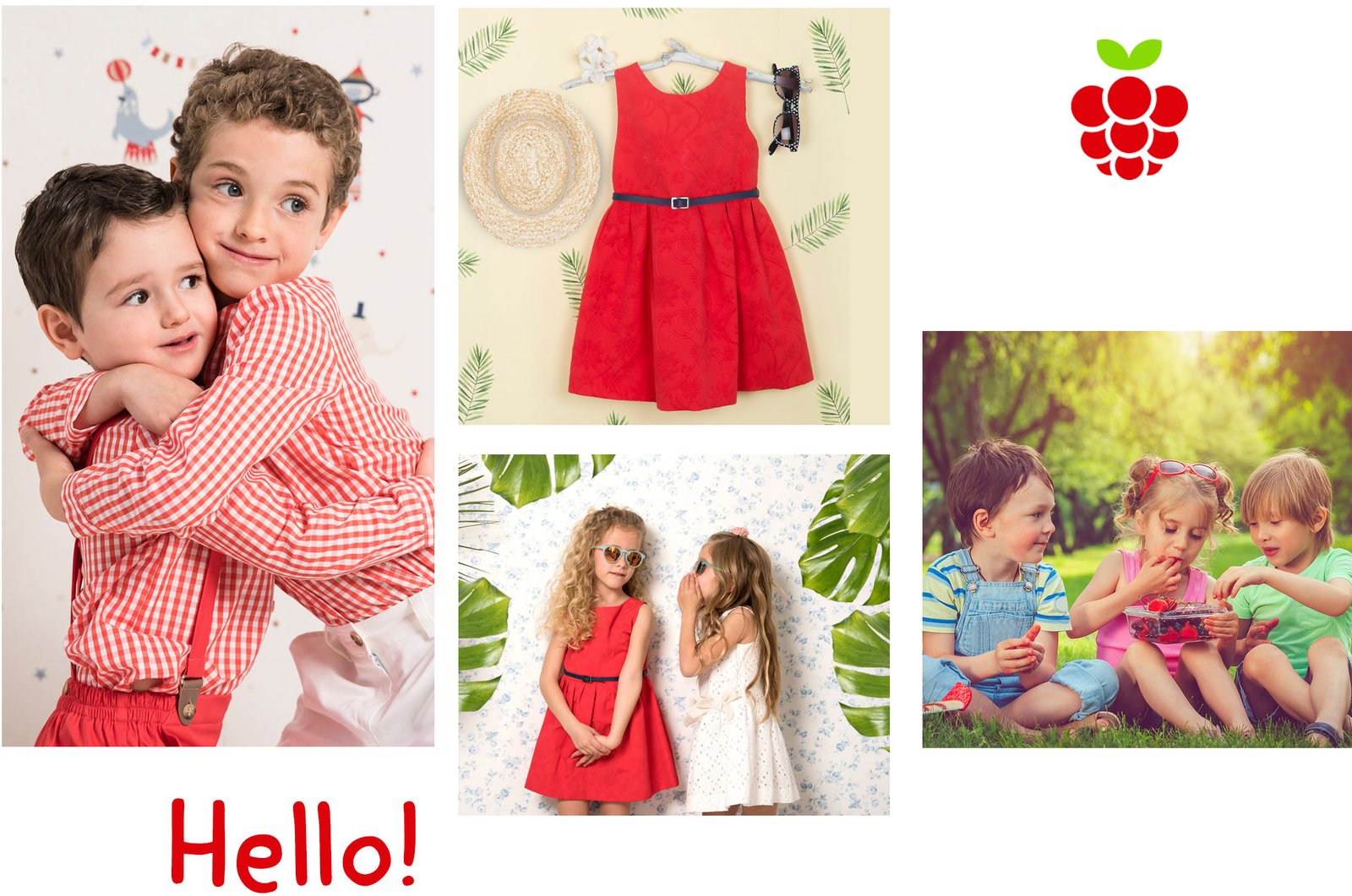
They wanted to launch Very Merry Berry, (although that was not the initial naming idea) a clothing line for children and babies from 0 to 8 years old, made in Spain with high quality materials, comfortable, flexible, durable and with an elegant design,… very ‘English countryside style’.
The objective was to introduce the brand in the UK market, taking advantage of the Spanish textile know-how. However, they needed to define Very Merry Berry’s corporate identity and brand image in order to differentiate themselves in such a competitive sector.
Shaping the identity, creating visual brand assets to support them with their marketing, eCommerce and social media campaigns. It is an enriching project that was done with great care and attention to detail.
APPROACH:
At Brandesign we carry out a thorough research process to identify the needs and personality of the brand. We like to analyse who we are designing for (as well as for our client, to know what the end client’s references are), whether we should impregnate this brand with hybrid concepts in English and Spanish, or only English,… what other positive and negative references (from which we want to position ourselves or disassociate ourselves) we should follow.
We all liked the phonetic uniqueness of ‘Very Merry Berry’, i.e. the alliteration of the name. ‘a very merry berry’. Alliteration is one of the techniques of the Naming which we applied and consists of the repetition or reiteration of certain words or sounds within the name, in order to obtain a peculiar sound impact.
After defining the name, it was obvious that we had to draw the “go”, (we ruled out caricatures as the brand characters as they were outside the desired positioning). Instead we designed a stylised raspberry as the isotype. The minimalist raspberry brings elegance, freshness, delicacy and refers to the “Berry” in the naming. In addition, the red colour stands out for its energy and ability to captivate children’s attention.
LOGO DESIGN:
Our creative team is inspired by the latest visual trends to design contemporary brands destined to last over time. Although this brand maintains a classic cut, we look for innovative solutions that make them unique.
To create a successful children’s fashion brand, it is key to deeply understand the sector, the little ones, what they like, how they behave and how to convince parents as well.
Our methodology is based on visual audit techniques and branding trends. It is also a luxury to have a client like this because when dealing with fashion designers, they participated with ideas, they had a very clear version of what they were looking for in their look books. This allows us to work better, since there is a fashion and creative expertise on both sides: agency and client.
For example, for Very Merry Berry we focused on curious children, with a great inner world, adopting the introverted and fun personality of British children.
As we were clear about the prominence of the color red in the brand, this helped us to design a vibrant, playful and stimulating identity, with a round raspberry with its leaves tilted like a smile, primary colors and shapes as central elements that capture the attention of the little ones.
This is how we managed to create this brand ‘Made in Spain’ although its market is the UK.
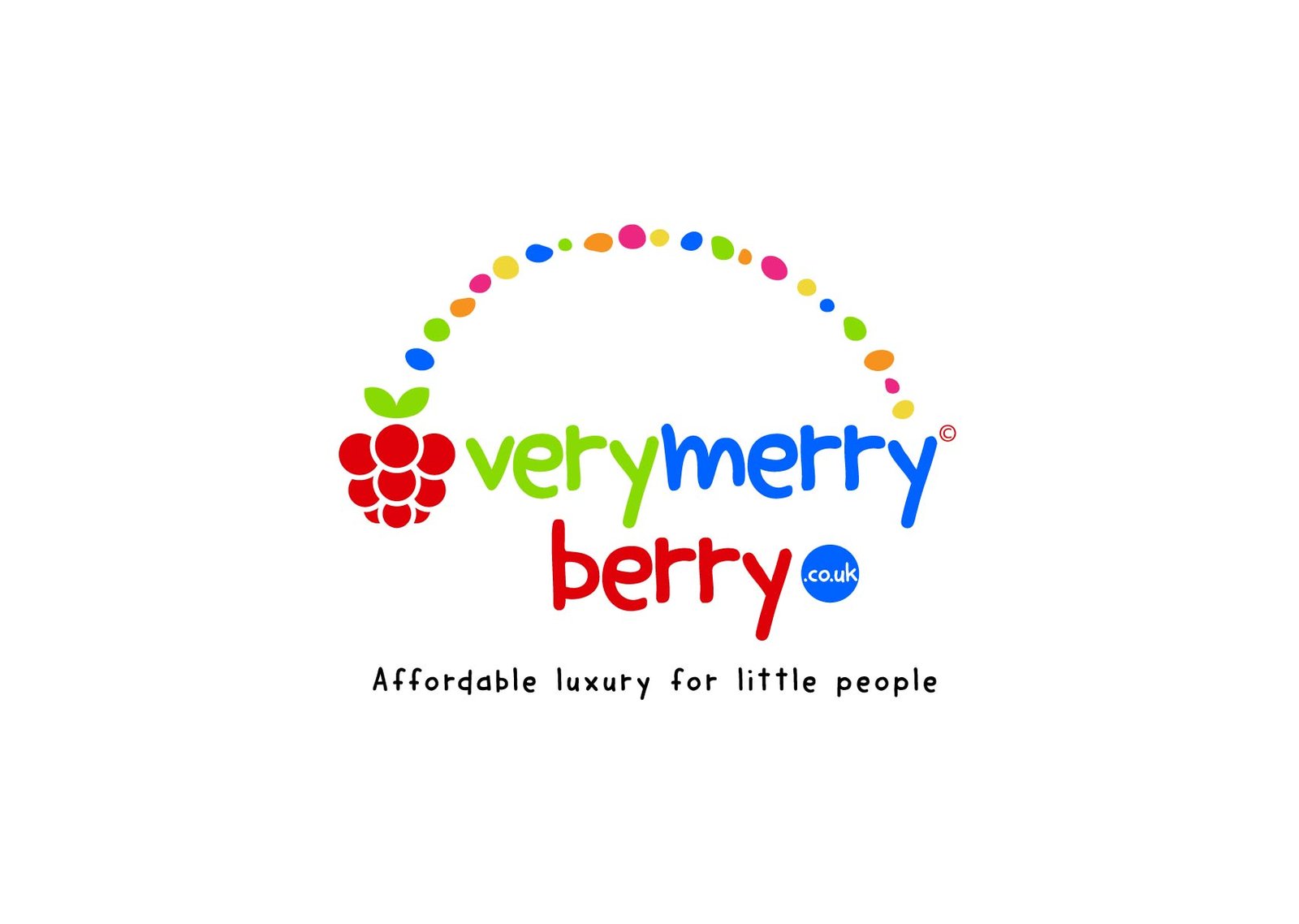

The consolidated idea:
The logo design for Very Merry Berry consists of a minimalist, geometric representation of a raspberry, which conveys elegance and visual balance to the brand. The raspberry was chosen because of its ability to connect with children and because its colour is present in many of the fashion brand’s look books.
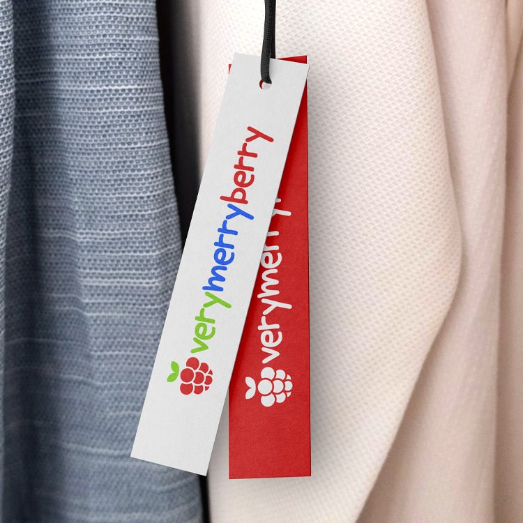
In addition, this ‘logotype’ (or imagotype) has the advantage of being highly adaptable and responds optimally to the different spaces and media where Very Merry Berry’s identity should be applied. We carefully designed optimised versions of the logo to maintain visual balance in all formats, from small labels on the side of clothing, hangers, even on a button, to larger spaces such as the delivery box and stickers where we created a more illustrative ‘Rainbow’ version as well as vertical and horizontal versions for webs and social media.
Definición del Brand Equity como Estrategia de Plan de Marca y Producto
CORPORATE IDENTITY MANUAL:
Once we had defined the whole corporate identity strategy for the children’s fashion brand, we proceeded to set out the technical guidelines for the application of the logo in different scenarios:
How it should be printed on small surfaces such as the external labels that come off the babies’ clothes, how the internal label is printed and often embroidered on fabric, how many colours we would use for each scenario. Looking for the greatest variety of adaptations because sometimes we had to apply the brand on fabric, screen printed for buttons and hangers, embroidered, printed or embossed on leather.
Designing a children’s clothing brand can have an endless number of branding applications on many surfaces, many printing systems that can go from a favicon in the online shop to stickers or decals on gift boxes.
As you can see, it has been a luxury to be able to raise and shape the whole new brand strategy hand in hand with the client.
In the chapters of this corporate identity manual, the following were defined:
Colour palette
Typographic fonts Logo
adaptations and scales
Applications on clothing labels
Pattern for wrapping paper
Corporate Stationery
DESIGN OF YOUR CORPORATE STATIONERY
Having laid the foundations for the design of its identity and the corporate identity manual
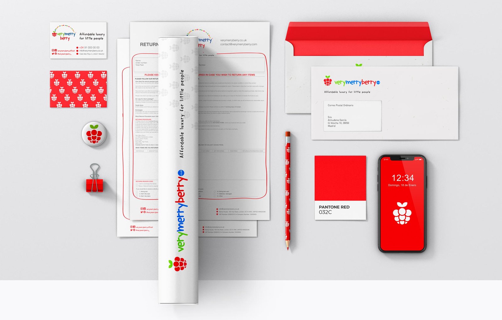
We proceeded to make the branding applications on letterheads, folders, sheets of paper and so on.
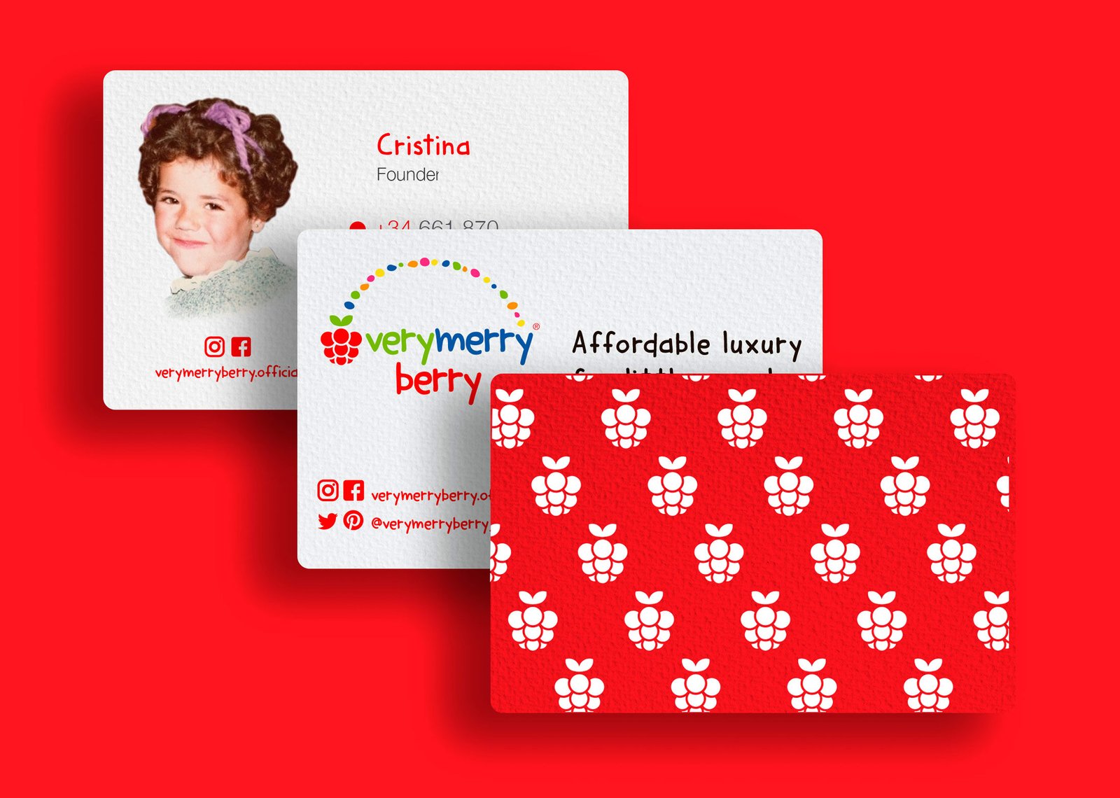
Corporate stationery helps to establish the brand image created for employees, customers and entities that make up and manage communication in isolation. Well-designed corporate stationery with strategically placed design elements can help reinforce and communicate your brand. This creates a strong and cohesive image that is directly associated with the brand, generating trust, officialdom and fostering identification of the organisation with the people.


DESIGN OF YOUR EMAILINGS AND CRM TEMPLATES
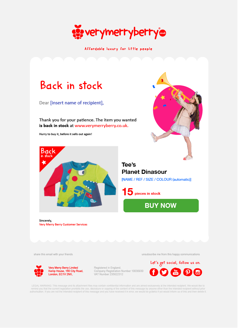
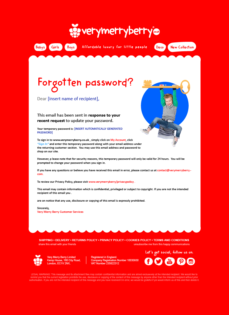
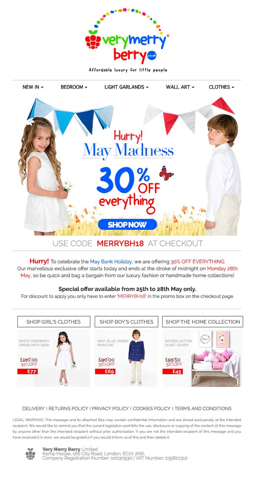
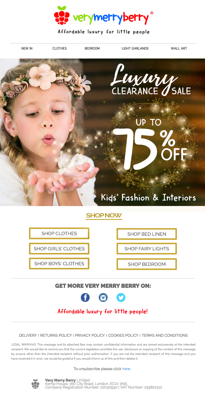
Attractive email design is key to captivate your online subscribers and get them to click and buy from your store, especially if your eCommerce is your only store. At Brandesign we help you by creating email marketing templates that connect emotionally with your customers.
We thoroughly analyze your audience to understand their motivations and interests. We design and layout visually appealing emails, with high quality images that reflect your products and the essence of your brand. Persuasive headlines that arouse desire and effective calls to action.
We optimize all texts and images focusing on generating engagement, with a close language and brand tone. We also adapt the content for mobile devices, where most emails are currently read.
Our templates are responsive, with the right spacing and visual hierarchy to look impeccable on any screen size. We make the most of the available space.
We include featured buttons with call to actions to buy or explore your products, with vibrant colors and persuasive copy. We facilitate the key actions you are looking for from your subscribers.
We also technically optimize templates to ensure maximum visibility in inboxes, with clean HTML structure and good email marketing practices. Looking for irresistible designs for your campaigns? Count on us.

RESULTS
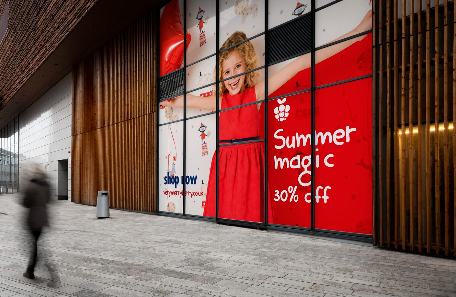
After 3 months of hard work, Very Merry Berry was ready to shine!!!. We delivered to the client an eye-catching children’s fashion brand as well as a complete corporate identity manual with applications on clothing labels, stationery and digital assets, all ready to deploy.
The launch was extremely successful, with a great reception from the British public. They even went on to win an innovation award. The email marketing campaigns and automated CRM templates worked perfectly to build loyalty and keep the consumer captive to their online store.
Unfortunately, after 3 years of entrepreneurship the brand was forced to close due to Brexit. High import duty rates made the business uncompetitive. A pity, given the initial success and how well received the proposal was, which was a great example of entrepreneurship done with passion and excellence.
Although its time was short, Very Merry Berry managed to position itself as a premium children’s fashion brand, on a par with the big global brands in the sector and the high demands of the British public. The visual identity and the unstinting commitment of the clients who put in hours and hours was crucial in this achievement.
This case demonstrates our ability to build irresistible brands and our commitment to our clients’ efforts. And if you are thinking of starting a business: Contact us! Choose well your branding agency that will accompany you in the process. You don’t have two chances to create a good first impact. Our creative team can make your next project a reality.
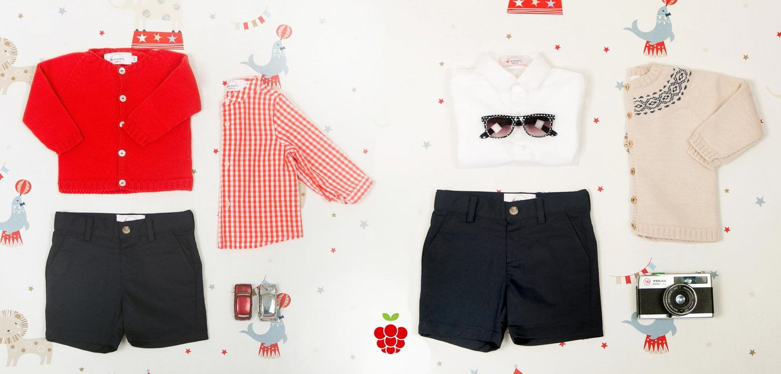
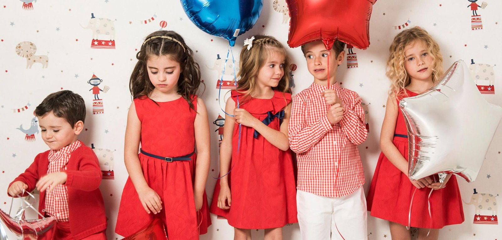
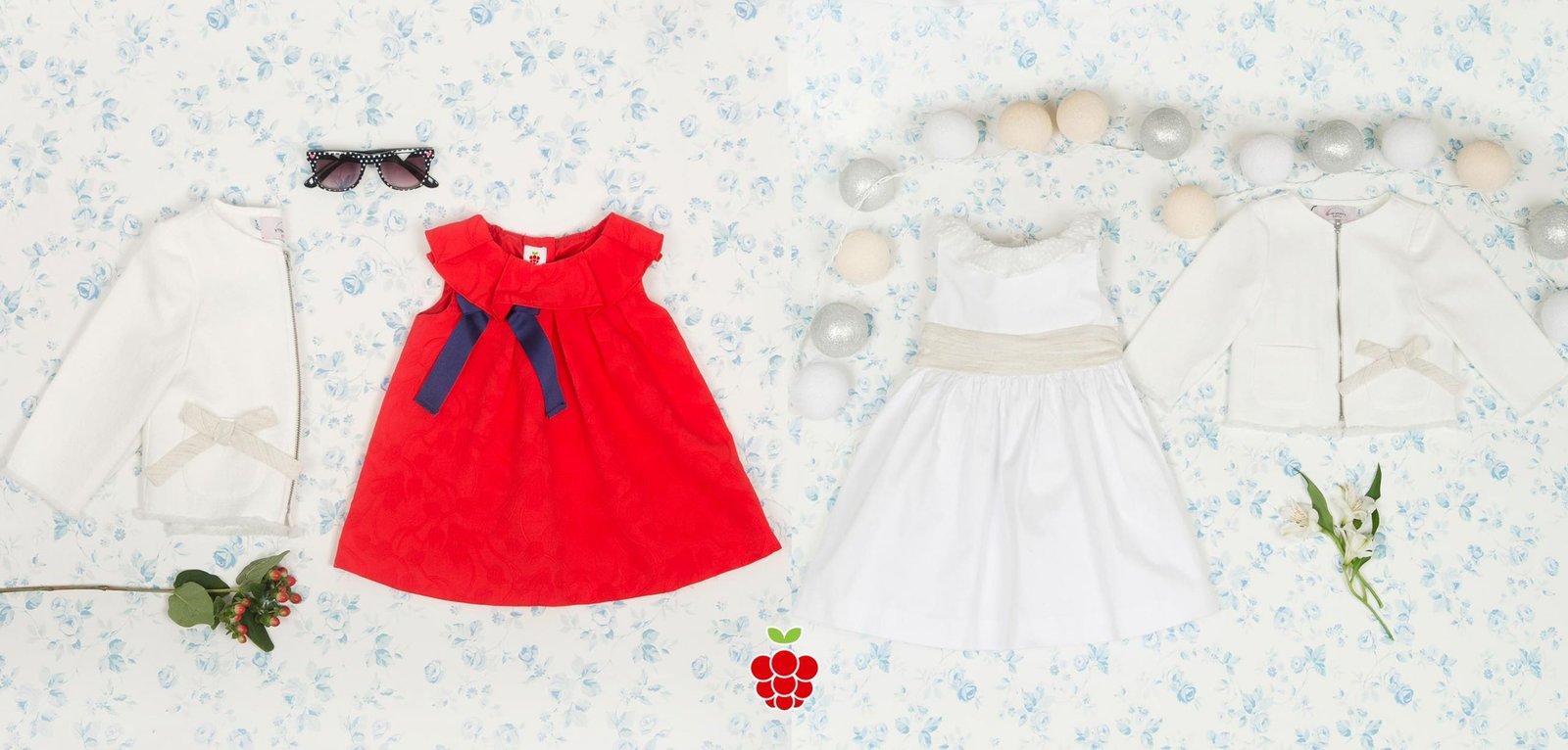


© Copyright todas las imágenes son propiedad de nuestro cliente Very Merry Berry Limited
ARE YOU STARTING YOUR OWN BRAND?
Choose the agency that will accompany you in the beginning very carefully, because you don’t have two chances to create a good first impact. Whether you set up a fashion or consumer brand, your customers will not only evaluate you on the features and prices of your products, but they will also make a value judgement on the visual aspect of your business and your way of communicating with them. We would like to be your creative team in this key moment of starting your own brand.

I worked in P&G building global brands with branding strategies for regional markets according to each consumer. I complemented my 360º profile working in media agencies to analyze campaigns after the click.

I’ve always been with a pencil in my hand, scribbling ideas to design professional projects in the environment of digital arts, graphic design, animation and 3D. I love to see how step by step my creations come to life.

Versatile, decisive and productive. Throughout my career as a journalist and digital marketing specialist, I have done reports, articles, interviews, public reports, creating content for brands on social networks and portals.

I like to thoroughly understand the client’s needs and translate them into digital solutions, the Internet is growing every day in a diversity of formats and digital resources and we always find the tailored IT solution that best suits the users.

Some call me a designer, others an art director, even my mother says I’m an artist and the truth is that I only like labels to design them.

I always try to give an answer and a solution every time you call me, I answer the calls and the Brandesign chat from the customer service.


