REBRANDING FOR TECHNOLOGY STARTUP SEMMINER
DESCRIPTION
SEMminer is an emerging technology startup based in Madrid but with a global presence. The 3 creators of the company launched an online tool to measure ads and keywords in 3 main areas: SEO, SEM and SMM with the aim of finding an ideal solution for advertising agencies and digital marketing experts.
With a group of experts in SEM campaigns, SEO and web analytics, and more than 10 freelance collaborators around the world, SEMminer has developed a perfect tool for all types of companies to optimally manage SEM and SEO campaigns.
This is a SaaS with which you can:
Examine your competition.
Detect positioning strategies of other brands.
Find investment opportunities.
Detect incidences in your web or campaign.
Monitor organic words and paid media campaigns.
In addition to having won an innovation award in Spain, the brand needed to renew itself after its first 3 years. They were gaining visibility and were looking to define their corporate identity beyond the logo.
RETOS
The team has a tool that “extracts relevant data from your competition, web or market” analysing 3 big sectors: SEM, SEO and SMM, so they wanted to visually represent how the tool “extracts the value of your campaigns from the analysis of “Big Data”.
Draw the “Big Data” concept of the tool. Keep the recognisable blue colour of its three previous years. Create a slogan among the whole team. Develop creative identity pieces for their presentations.
SOLUTIONS
We strived to design a new corporate identity through the recreation of elements that represent the filtration of big data that makes the tool in a visual way, we came up with a system of “Data Map” drawing as a “wireframe” or system of quadrant cables of large and small lines, as defragmenting blocks going to the epicentre of the key information drawn with dots (mines).
We changed the logo to a modern, up-to-date logo, ready to respond to the demands of the digital market, we explored “web-responsive” typographies that can be readable in small or large formats.
The isologo has 3 components:
A search field A magnifying glass A diamond
The outer border frames the isologo in the same way as the fields in the search forms do, to identify the search engines, leaving the diamond inside the magnifying glass as a result of extracting the best result from a search or query.
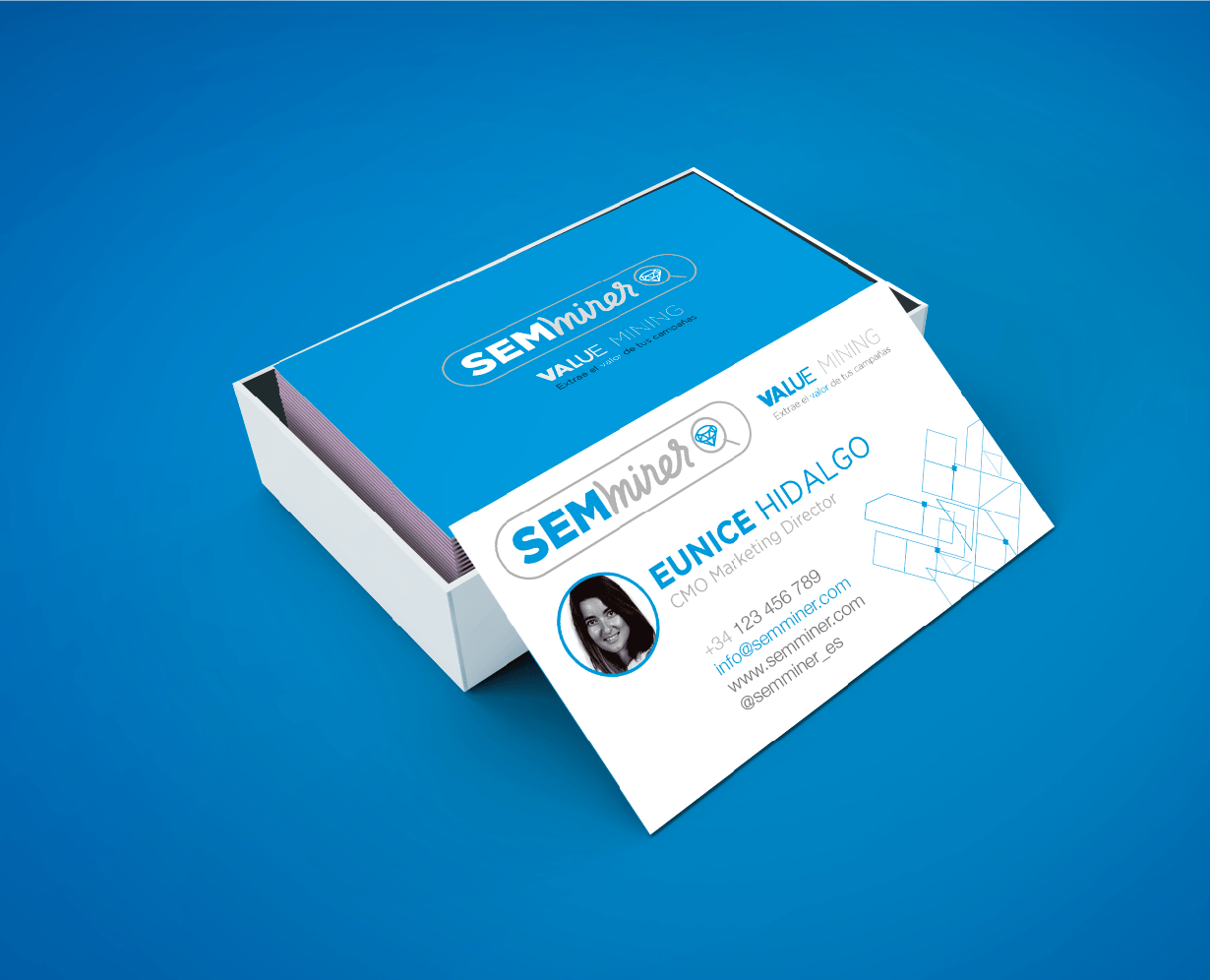
For the rest of the corporate image and stationery we continued with the same white and blue tones, to give the brand a serious and professional image.
A NEW CLAIM
The slogan or claim chosen to describe the abilities of this tool is linked to the brand image: “Extract value from your campaigns”.
Devised in a very productive brainstorming day between all participants: agency, clients, employees and friends.
RESULTS
Increased brand awareness
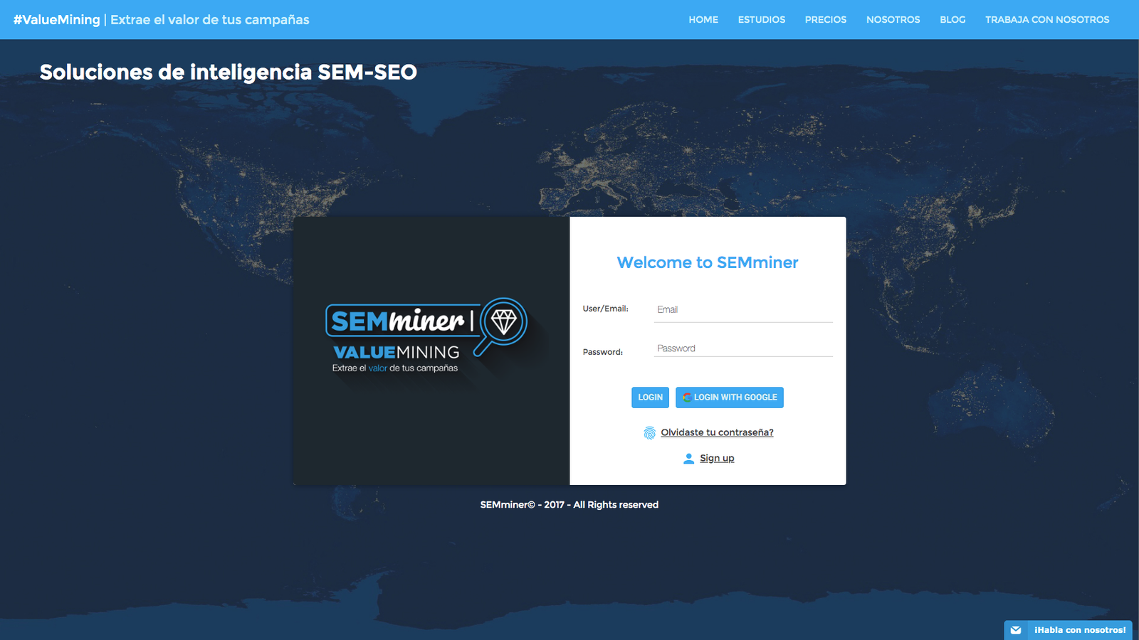
Before, the brand was only identified with the logo, we created a system of data planes that added a new “livelier” blue color to provide a new set of visual assets applied to their website, banner campaign, presentations and stationery.
The distinctive blue color was kept in a more vibrant shade to transmit innovation, it is a technical, cold, analytical cyan blue.
The visual concept is based on data planes interacting with each other, connected by points (values) representing the management of large volumes of information. The abstract shapes of the planes suggest data processing.
The tagline developed as a team was “Extract value from your campaigns”. It conveys how the tool can extract useful insights from large data sets.
For presentations, dynamic compositions of the moving, rotating and interacting data planes were created. This adds dynamism to the concept.
On the web, banners and stationery, patterns based on the planes were applied to maintain visual coherence.
The new unified visual system between color, planes and slogan brings a consolidated identity to the Big Data brand, increasing its notoriety and recognition in the market. The creative assets developed reinforce the desired positioning.
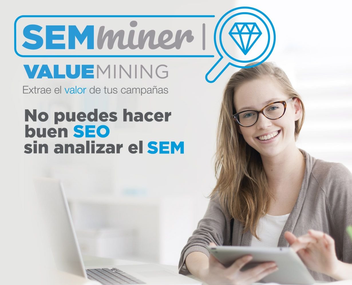
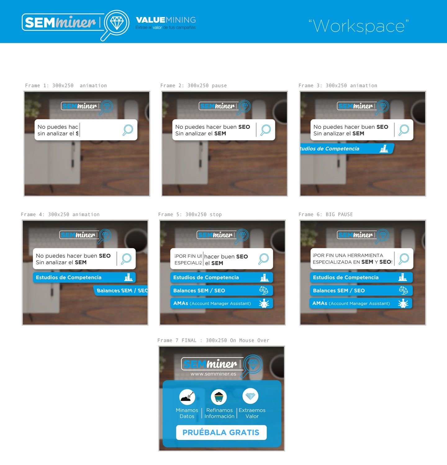
DESIGN OF HTML5 DISPLAY / BANNER CAMPAIGNS
With a more relevant and digital brand, the
BRANDING AND DIRECT RESPONSE BANNER CAMPAIGNS ON THE GOOGLE GDN CONTENT NETWORK FOR SEMMINER WERE MUCH MORE ASSERTIVE, AS MESSAGE, BRAND AND TARGET ALL CONVERGED IN THE SAME DIRECTION: A MORE TECHNICAL AND DIRECT COMMUNICATION FOR BOTH THE TOOL AND ITS USERS.
s.
DO YOU WANT YOUR BRAND TO STAND OUT?
Are you looking to renew your brand? We can help you! At Brandesign we design brands that stand out from the rest through design. HOW they see and appreciate you visually establishes a direct line in the way they buy and value you.


