Integral product and packaging design
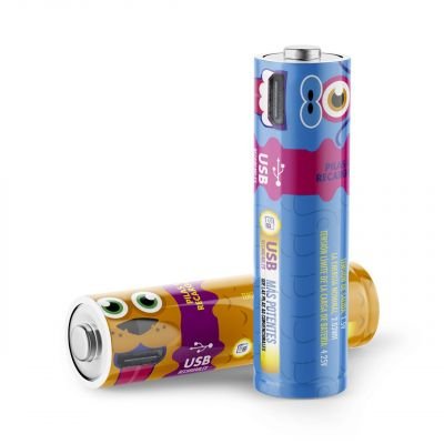
Juan David is one of those people who never sit still, he is always inventing things, flying drones or thinking about what new business unit he is getting into. And in 2015 while we were sharing an office in the early days of Brandesign in Rivas, he thought of a new business opportunity: importing from China (via AliExpress) some batteries to sell in some convenience stores in Madrid, smart batteries with a unique feature: they could be recharged directly using a micro USB-B cable directly on one of the sides of the battery.
While there are many rechargeable batteries on the market, the vast majority require a charger, which opened up the opportunity to sell these batteries without the need for a base, you could insert the USB cable directly into a hole in the side of the battery. Bearing in mind that many of us always have a cable to hand in the drawer where the mobile charger, pens and paper clips are kept.
Observe to create
We were asked for a complete branding project: from name exploration, logo design, product design and the creation of the final artwork for the labels.
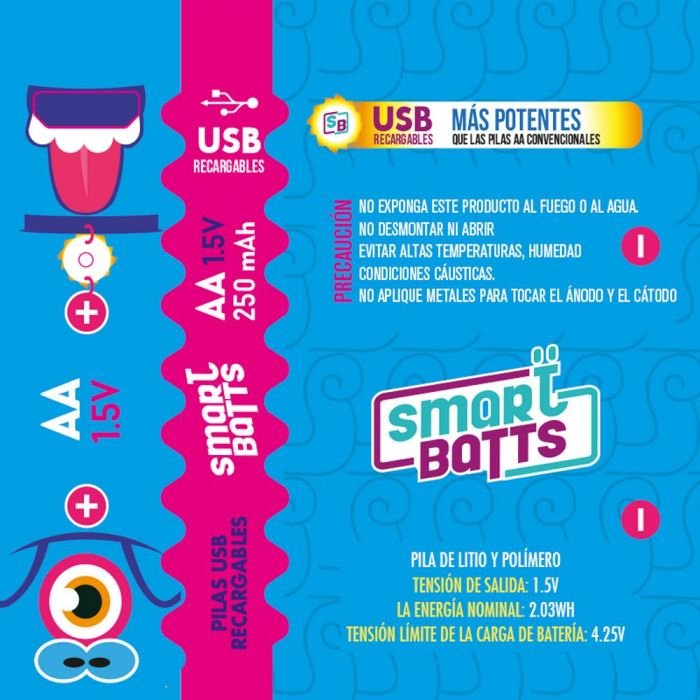
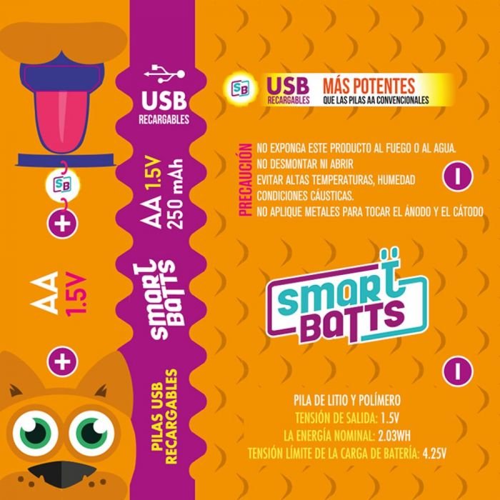
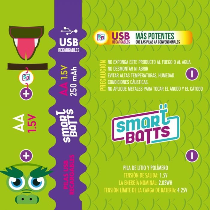
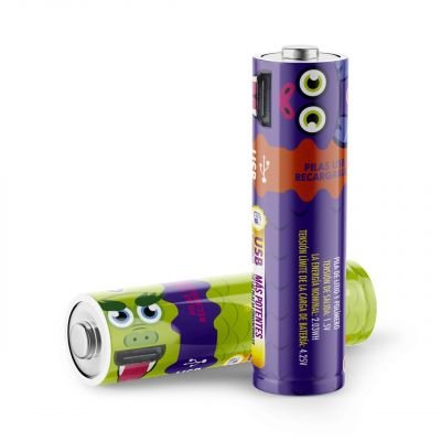
We realised several things when proposing a design for Juan David, from the peculiar mouth shape of a USB ‘female’ port on the side of the battery, which we could use as a mouth to humanise or caricature the product, and the other is the sales opportunity, as if the product was being dispensed from convenience stores, it had to create an impact. Many of the batteries that are bought in a convenience store go into many portable video game terminals for children and young people, others for bicycle lanterns and toys.
NAMING OR BRAND NAME:
The objective: To come up with a descriptive name that was free at a national level (SPTO), was powerful and could stick in the minds of many people. A type of naming that would describe the product based on the function it performs. We wanted to refer to its brand promise: Smart Batteries, Rechargeable Batteries, a product aimed at young people and children and many ideas came to mind, but the one we liked the most: SmartBatts (Baterias Inteligentes) and the name could then give us the game of painting bats, among other characters.
LOGO DESIGN:
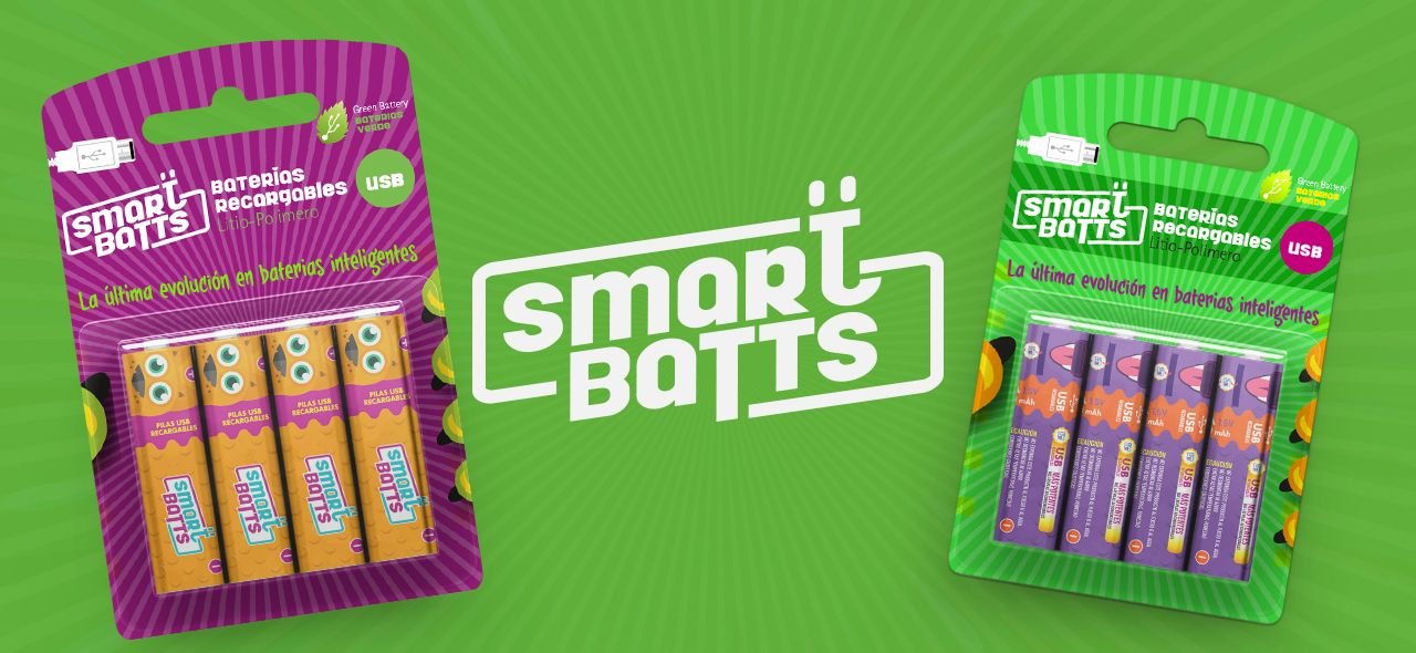
Since the name was descriptive enough, we wanted the logo to be descriptive too, so we started drawing a myriad of shapes, silhouettes and contours of batteries. The client also liked the idea of the logo itself being the product. Observing that the product has a USD port hole, we saw that many bold typographies (black) also had holes in the inner space of his letter, so we decided to play with this hole had the shape of this mouth or female USB port.
So we thought of playing with an external border with rounded edges containing a bold typography with holes in the letters. Playing with these elements, we put the negative spaces of the letters ‘a’ on top of the ‘t’ to indirectly simulate a face. The result is a very dynamic logo, a border in eternal movement (to also bet on an ECO product to recycle, reduce and reuse). The colors to play with: Green (ECO), purples and oranges to keep a saturated palette of secondary colors.
PACKAGING DESIGN :
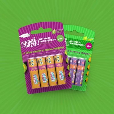
Well, we are not going to deny that we had a lot of fun with this project because the client gave us a free hand to design this product. So taking into account that the product from convenience stores (usually gas station stores are crowded with products near the cash register), we knew that the product because of the small size of the box containing 4 units had to be very striking. At the beginning we wanted fluorescent and vivid colors, but the supplier in China (who included personalized printing in the price) was only committed to a four-color production, so we saw vetoed the door of special inks such as metallic, fluorescent or vivid pantones.
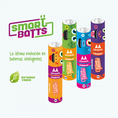
We started with the development of four characters, since the box had capacity for 4 batteries, we decided to make mixed packs with 4 characters and monographic packs with only one character. So with license and carte blanche to design we proceeded to design the packaging and labels for four ‘beastly’ characters to go in line with the value of ‘power’, high performance, more powerful than conventional batteries and the subsequent tagline ‘The latest evolution in smart batteries’. You may laugh, but we came up with a cyclops pig, a dragon, a bat and a guard dog, each with a vibrant color, a texture of hair, fur or scales and taking great care to a modern and very legible typography.
Another point to take care of was to create a die line for the production line to fit the hole that would be plugged by the mini USB port, and set up a technical meeting with the supplier in China to establish cutting guidelines, colors and a certified color proof, as many suppliers in China launch into production without looking back at the print quality, so it was key to ask them for a chromakey before starting with the first batch to ensure the final quality.
THE OUTCOME:
The set: Labels and packaging are very powerful and visually appealing.
The product went on to be traded at several petrol stations as a pilot product. The product is currently in the production line. We have given it the boost the client needed to attract the attention of business angels and investors.
DO YOU WANT TO IMPORT A PRODUCT FROM CHINA AND CUSTOMISE IT FOR SPAIN?
Choose very well the agency that will accompany you in the beginning, because your product does not have 2 chances to create a good first impact. Whether you are importing a product or starting a small local production, you will need a label. This will be a key piece to be valued from the outside in. It will be the face of your product at the moment of truth: when it is compared to others on a shop shelf. Choose Brandesign as your strategic partner to create a valuable impact.

I worked in P&G building global brands with branding strategies for regional markets according to each consumer. I complemented my 360º profile working in media agencies to analyze campaigns after the click.

I’ve always been with a pencil in my hand, scribbling ideas to design professional projects in the environment of digital arts, graphic design, animation and 3D. I love to see how step by step my creations come to life.

Versatile, decisive and productive. Throughout my career as a journalist and digital marketing specialist, I have done reports, articles, interviews, public reports, creating content for brands on social networks and portals.

I like to thoroughly understand the client’s needs and translate them into digital solutions, the Internet is growing every day in a diversity of formats and digital resources and we always find the tailored IT solution that best suits the users.

Some call me a designer, others an art director, even my mother says I’m an artist and the truth is that I only like labels to design them.

I always try to give an answer and a solution every time you call me, I answer the calls and the Brandesign chat from the customer service.
