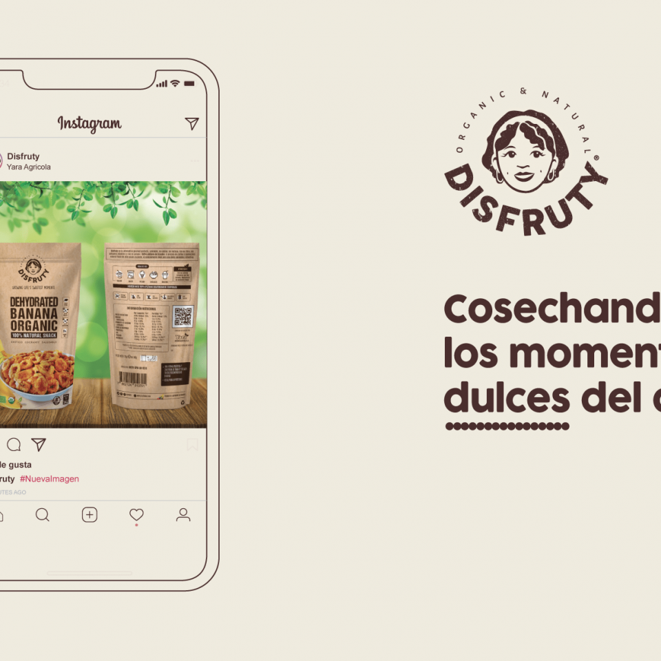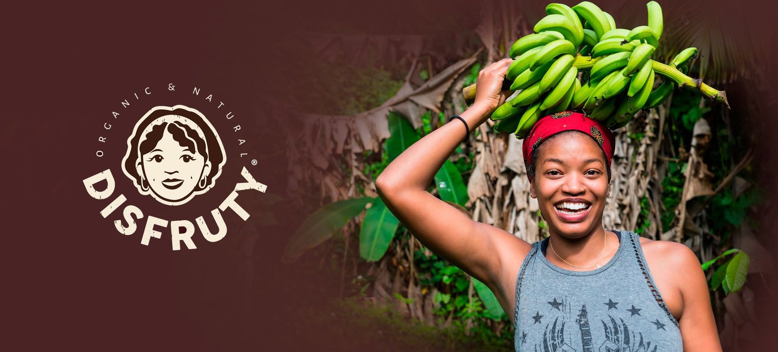
PUTTING A FACE TO THE DISFRUTY BRAND
Mario contacted us in 2020 in the middle of Pandemic to offer us what could be the most motivating project that a Branding agency can do remotely: a restyling of a food brand that supports many banana families in Ecuador, this is the story of Disfruty. When in March last year the premise was to stay at home, many of us who work at Brandesign thought: goodbye to the office, and to the Brainstorming group sessions, so many of us stayed at home teleworking until the situation was regularized, at that time we were contacted from Ecuador to do a Branding and Packaging project.
The magic of working behind a computer is to be able to work for anyone, anywhere: we only need a good internet connection and a good connection with the client, to understand in depth their needs, their current situation and why they need your design services. When you are commissioned to design a logo or convey the image of a brand, you must empathise with the client and soak up a lot of information, whether or not it is in the briefing, it is essential to make those discoveries that can only be made through a good interaction with your client.
Research, experiment and engage with your client to get the best results.
Disfruty was already an established brand in Ecuador before we started working with it. The client contacted us because he found it interesting that we have two offices in our agency: one in the United States (Miami) and the other in Europe (Madrid), the two main markets where he wanted to introduce his product.
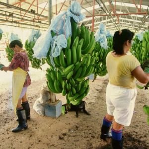
After much preparation, the brand was preparing to launch an entirely organic plantation. After much tilling of the land and many controls and achieving 100% organic certification for Europe and the United States, for the first time Disfruty was going to be able to offer a product produced entirely on a 100% organic plantation, this meant not only a treatment free of chemical components of their land treated with natural fertilisers, the complete elimination of pesticides and preservatives from the soil and fruit but a very careful selection of the best fruit and a hand-picking of each of their fruits. Mario also told us that the vast majority of the plantation’s workers are women, and that women are the breadwinners in many families in Latin America.

ANALYSIS OF THE SITUATION:
Before tackling any identity project, we do a little background research, making a brief brand audit, We analysed the WHAT, HOW, FOR WHOM the previous communication pieces had been designed, and if they had had results touching it only with chopsticks, but the problem we found was that the current logo did not transmit any of this whole story, In order to sell a 100% organic product in the United States and in Europe you must permeate this process, these characteristics and this quality, you have to tell this story of handpicking, of an integral care of cultivation, land, trees, 100% natural water and of something that interested us much more: Most of the pickers were women and most of the people who consume this kind of products are also women and children: so we proposed to the client to humanise the brand. Disfruty had to be that strong, hard-working, natural Latina woman.
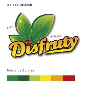
The original logo we came across didn’t help much either: To describe it to you: the isologue wasn’t bad, (it didn’t tell any particular story), but for us it had a lot of basic errors:a lot of discordant elements. If we at Brandesign are a bit picky about these things, we notice it, sometimes we see things…
For example: the dot of the ‘i’ of Disfruty was a cherry, when they don’t produce that fruit in their plantation, and when we found out the type of leaves that their logo had, we saw that they had used tea leaves (like those of Nestea) but none of the peach fruits, pineapples or bananas that they produce have that shape. So visually it was attractive, but the logo is not representative of the product. Not that the logo should always be the product, but it should at least be true to its values and specifications.
LOGO design:
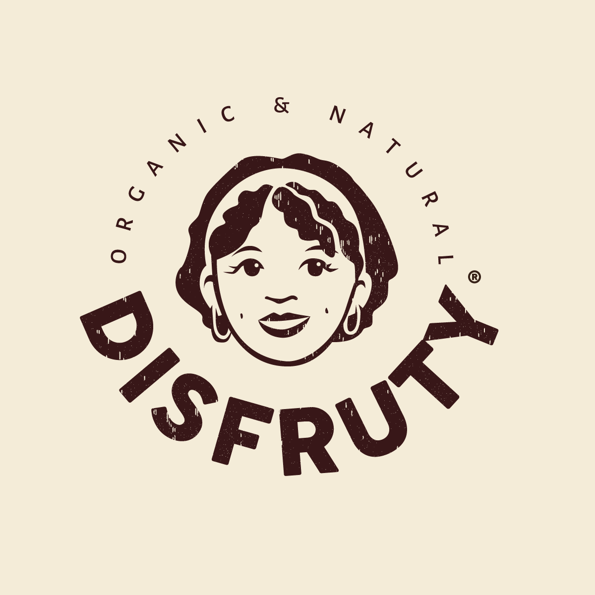
The project consisted of the design of its corporate identity and the art direction of its packaging after a previous assessment of the American and Spanish markets, entry points for this organic range of mainly its flagship product: dehydrated bananas. After drawing many ‘Buyer personas’, the US team and our team here in Madrid prepared 2 different proposals, coincidence or not, both creative teams concluded in drawing a Latina woman, a picker, a hard worker who puts a smile on her face every day. From this creative brainstorming came ‘Diana’.
While the Plantain or Banana Logo was very descriptive, we went with a face. The face of a Latina woman who provides for her family and knows that life is a lot of work, but it’s worth it for those brief moments of natural flavor. Wait, I think we hit the tagline! Like a manifesto: we harvest life’s sweetest moments.
It couldn’t be any other way! Disfruty is natural, it’s life, it’s a smile. It is a moment of the day to enjoy.
So, what could be our differential value in an American market oversaturated with dried fruits? If everyone sells dried fruits, we would support this brand in that Disfruty is worth for its taste, but also to support the mothers of families in Ecuador who make a careful selection of the best that mother earth gives us: its fruits.
Disfruty is a woman because mother nature is. Disfruty is a story of overcoming, tradition and yes, a lot of flavor. That’s why the story of this brand is told by Diana, and not a banana isologo with cherries .
We want Diana to walk the streets of America! We want her to reach schools and food pantries.
BRAND APPLICATIONS:
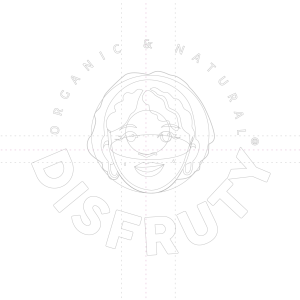
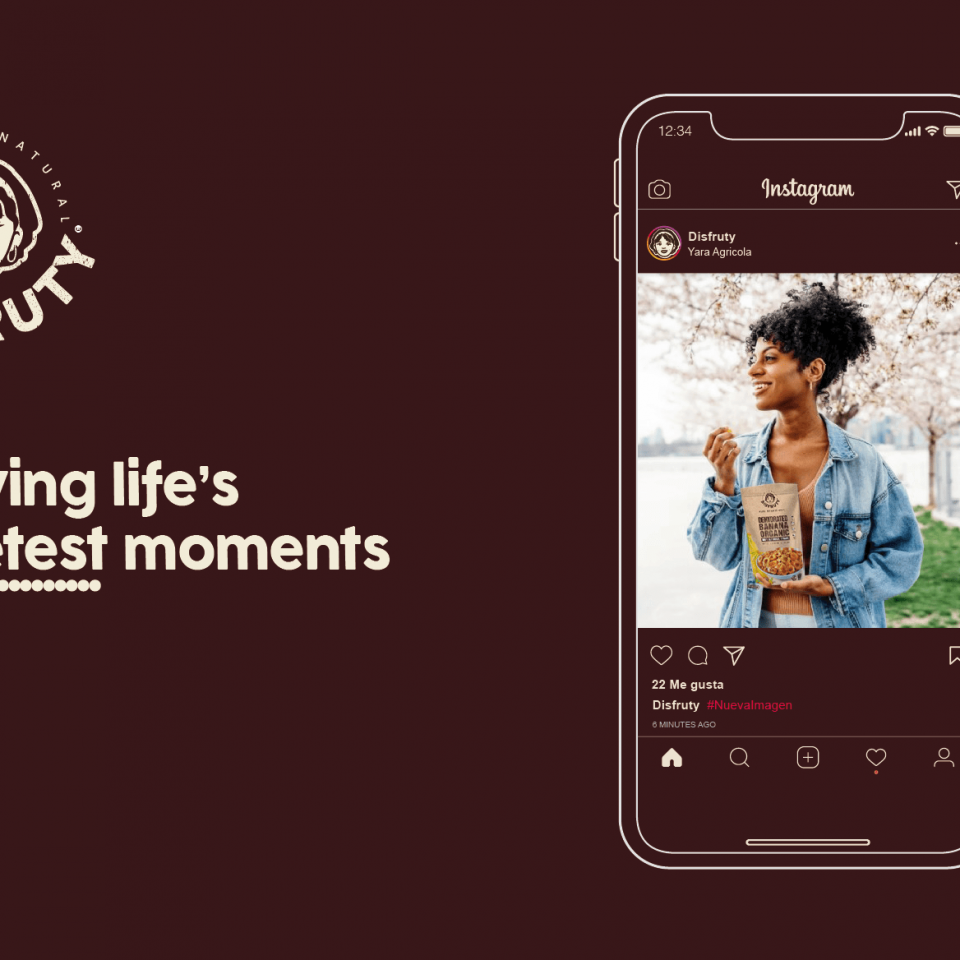
The implementation of a brand is one of the things we most enjoy at Brandesign, because once the corporate identity has been designed and the brand book has been created, it is when we put the brand to the test with executions. This is when branding is enriched and we can play with the adaptations of the logo in digital or traditional environments. This brand, besides betting on a smile, bets on a palette of organic colours: the brown that calls to the earth, its cultivation and its roots, as well as the beige colour extracted from one of its flagship fruits: the banana, also present in a saturated shade as in the pineapples. These are some examples we made as brand guidelines.
Siempre tenemos presente el hábitat de la marca, es decir donde será visualizada: Sobre una furgoneta de repartos (este cliente apuesta por una flota de reparto para entregas de sus productos a colegios) además de venderlo al retail y en la web, por lo que teníamos que tener en mente cada soporte: tanto en offline como el online: Contemplando que la ejecución del logotipo pueda ser desde serigrafiada hasta vista en entornos digitales como las redes sociales, buscando siempre una imagen de marca Responsive que se adapte a cualquier requerimiento técnico.
PACKAGING:
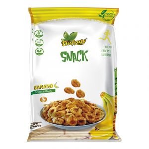
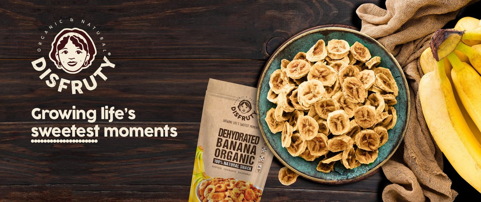
The design of the packaging. of this product also evolved by updating the brand’s colour palette, abandoning the yellow, green and red colours of the previous packaging (there is an indirect association between the very saturated colours with the presence of artificial colourings in this sector of natural foods), so applying the brand’s new guidelines, the packaging took advantage of the brand’s neutral brown and beige colours as well as taking advantage of the natural and recycled supports of the product’s primary doypack. We leave you the applications of the brand, we hope you liked this case of Rebranding for Disfruty in Ecuador.
IS YOUR BRAND NOT TRUE TO YOUR PRODUCT?
Does the design of your packaging or the presentation of your product not communicate its key features and unique value proposition? You don’t have 2 chances to communicate your product well. The current market demands authenticity and a lot of innovation. At Brandesign we design brand strategies so that your brand becomes your company’s most valuable asset. We do it from research, preparation and with excellent care to creativity, because your product must be unique. Shall we start?

I worked in P&G building global brands with branding strategies for regional markets according to each consumer. I complemented my 360º profile working in media agencies to analyze campaigns after the click.

I’ve always been with a pencil in my hand, scribbling ideas to design professional projects in the environment of digital arts, graphic design, animation and 3D. I love to see how step by step my creations come to life.

Versatile, decisive and productive. Throughout my career as a journalist and digital marketing specialist, I have done reports, articles, interviews, public reports, creating content for brands on social networks and portals.

I like to thoroughly understand the client’s needs and translate them into digital solutions, the Internet is growing every day in a diversity of formats and digital resources and we always find the tailored IT solution that best suits the users.

Some call me a designer, others an art director, even my mother says I’m an artist and the truth is that I only like labels to design them.

I always try to give an answer and a solution every time you call me, I answer the calls and the Brandesign chat from the customer service.
