Integral packaging design for a Pet Care product
When you are fortunate enough to work closely with a client every day, you have an incredible opportunity to learn from them and their customers and validate your design bets at a sales level. It becomes even more rewarding when you don’t just design one piece but think about the entire product line or family of products. Like the popular saying of working on a tree while keeping the holistic view of the forest.
When 4 years ago we were asked to design the first line of nappies which we decided to call ‘dodoggies’ out of sympathy, our client always kept us informed that years later he would diversify the product portfolio in the PetCare sector, we did not understand at first why we should design something today to leave a ‘gap’ for a tomorrow that would be four years away.
Safeguarding quality from start to finish.
This design project involved a thorough understanding of the variants of their product line for this range and even the related ones to establish a differentiation or versioning between their different presentations.
After designing the first Dodoggies dog nappies, our client asked us to design the entire product line of their PetCare catalogue called ‘PetSana’ and we started to establish visual guidelines for each of the products in it, and more importantly: to know the visual criteria by which the market is governed when you talk about a Hypoallergenic product, Absorption Technology, or a product free of tests on animals.
NAMING AND LOGO:
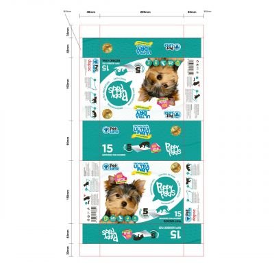
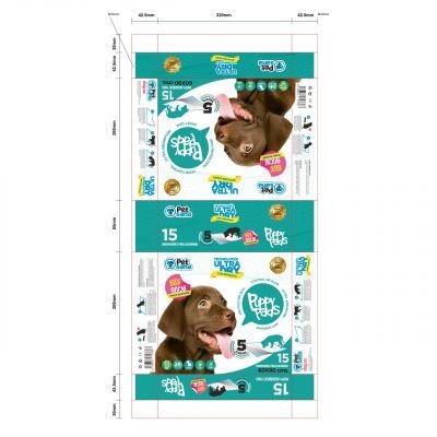
The product design project consisted of the assignment of a name or nomenclature We also wanted to design a logo, a packaging design for 2 and 3 of its versions or formats and an art direction as a print supervision since the sacks would be printed for logistical reasons in the Spanish war.
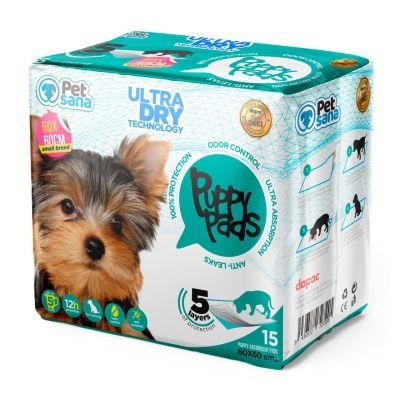
For the logotype we thought of a flat isologo as we wanted to give all the volumetry to the design of the bag or packaging of the product. We looked for a turquoise colour (present in all PetSana’s graphic line as well as being the reigning colour of the Pet Care category).
The line to be designed would include 2 presentation formats:
60×60 cms for mini-breed puppies 60 x 90 cms for large breed puppies.
PACKAGING DESIGN:
For the packaging design We first thought of formatting all the product’s trust seals and values such as its absorption capacity, its 5 layers of laminated protection, the estimated duration of the product’s resistance, its anti-bacterial characteristics and to reinforce the product’s purpose. We have illustrated absolutely all the icons in vectors because part of the production process with the supplier we understood that there were areas where they could be printed in four-color, but to optimize a correct reading of the texts and icons we were going to do it under flexography. The technical packaging project was quite complex because the final artwork had 12 spot colors, white areas of reserve to create a base bed for photography (only space in CMYK) the rest were very well selected spot colors and not in Pantone, because this supplier worked with DIC another specific color library for Flexo and there were many technical meetings and certified color proofs to pre-align very well with the PPM Print Production Manager.
OUR RESULT:
FAITHFUL DESIGN from the initial sketches to the final product
At Brandesign we think first about the final process: how the product will be produced and where it will be displayed or sold before designing a sketch. We do this to avoid surprises along the way. We try as much as possible to know all the technical and marketing requirements to create an impactful and producible design without losing anything along the way. And although the printer often denied us that what we wanted ‘can’t be done’, we understand why not in order to come up with a graphically and technically possible solution without ever giving up.
DO YOU HAVE A FAMILY OF PRODUCTS AND WANT TO CREATE A DESIGN LINE?
The product design has to talk a lot about the product and communicate in a retail environment without visual or multimedia support. It has to communicate alone and at the same time communicate as a family, because it probably has or will have variations of the product based on its demand. At Brandesign we are aware of the diversification that products have in order to establish a clear strategy in their packaging so that the consumer recognises it instantly. We like challenges: Shall we get going?

I worked in P&G building global brands with branding strategies for regional markets according to each consumer. I complemented my 360º profile working in media agencies to analyze campaigns after the click.

I’ve always been with a pencil in my hand, scribbling ideas to design professional projects in the environment of digital arts, graphic design, animation and 3D. I love to see how step by step my creations come to life.

Versatile, decisive and productive. Throughout my career as a journalist and digital marketing specialist, I have done reports, articles, interviews, public reports, creating content for brands on social networks and portals.

I like to thoroughly understand the client’s needs and translate them into digital solutions, the Internet is growing every day in a diversity of formats and digital resources and we always find the tailored IT solution that best suits the users.

Some call me a designer, others an art director, even my mother says I’m an artist and the truth is that I only like labels to design them.

I always try to give an answer and a solution every time you call me, I answer the calls and the Brandesign chat from the customer service.


