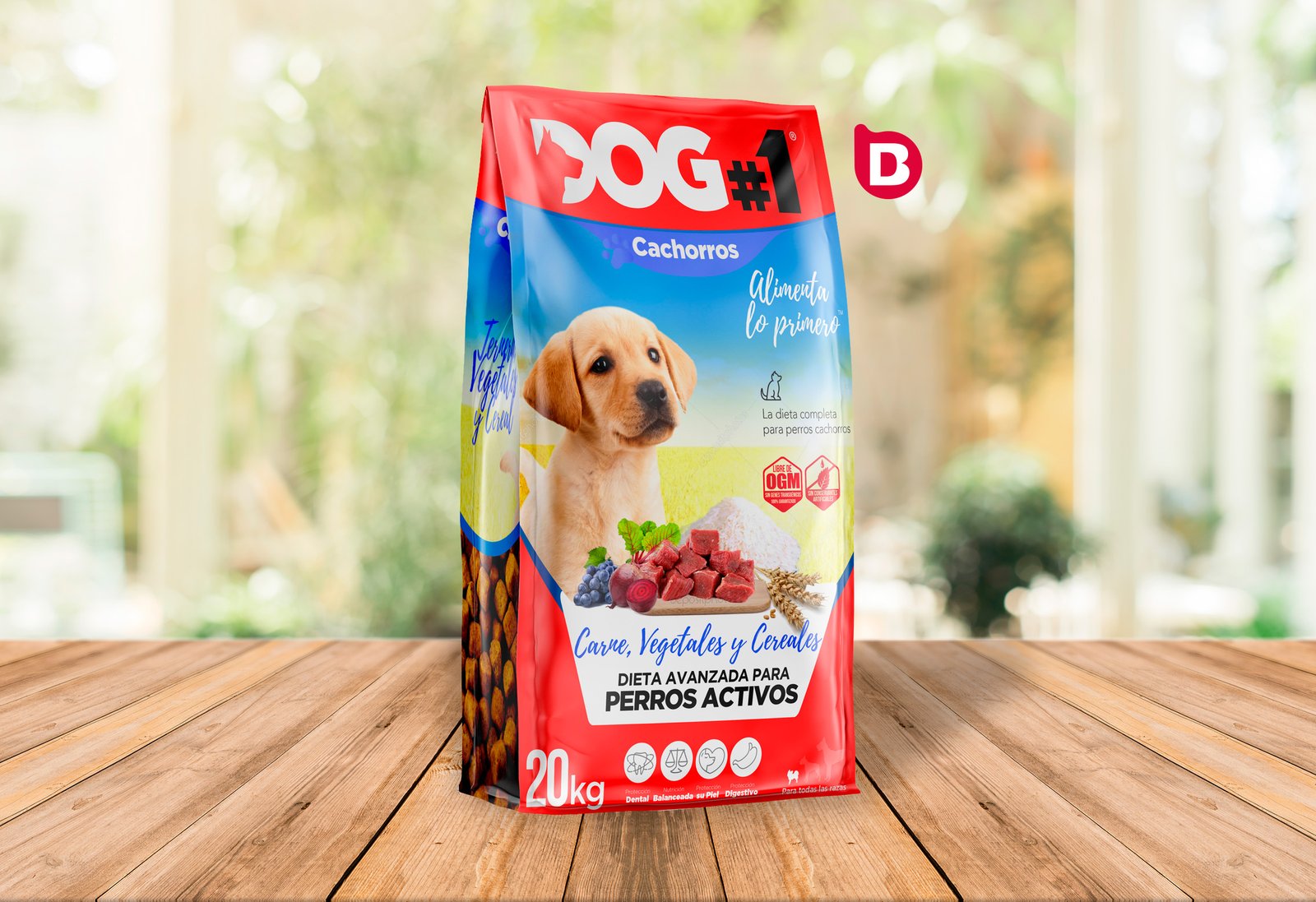
DESIGN OF THE BRAND’S FEED LINE DOG#1
BRIEF
Dapac is a company specialising in the creation of mass consumption products specialising in products from the world of pets and farm animals for sale in its shops and establishments.
The experience of more than 20 years in the pet sector makes them the 3rd largest pet food brand in Spain.
Within their various brand and product segments, Dapac was in the
strategy of creating a new brand of products at very affordable prices while maintaining the excellent quality of its products and raw materials.
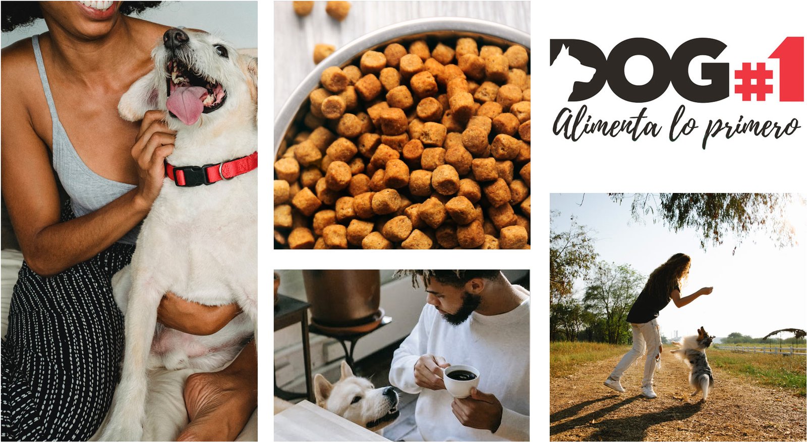
DESIGN CHALLENGES
The challenge proposed by the client was to create a brand and a line of products in 2 different consumer lines and 2 versions specialised in a certain group of consumers.
The challenge was not only to create a new brand of BASIC and ESSENTIAL products that would promote a “low cost” but at the same time “high quality” sector being the first brand to promise low prices and the highest quality in that price range and products, DOG#1® was born.
DOG#1 ® in addition to needing a new brand and corporate identity brought us the challenge of creating 2 lines of dog food products in 2 different tiers:
The tier of basic consumption or maintenance products The tier of specialised products for a specific type of dog.
Logically there would be a price difference between the 2 tiers, and a sub-specialisation and improvement of the product.
the design of the packaging (feed sack) could not be the same.

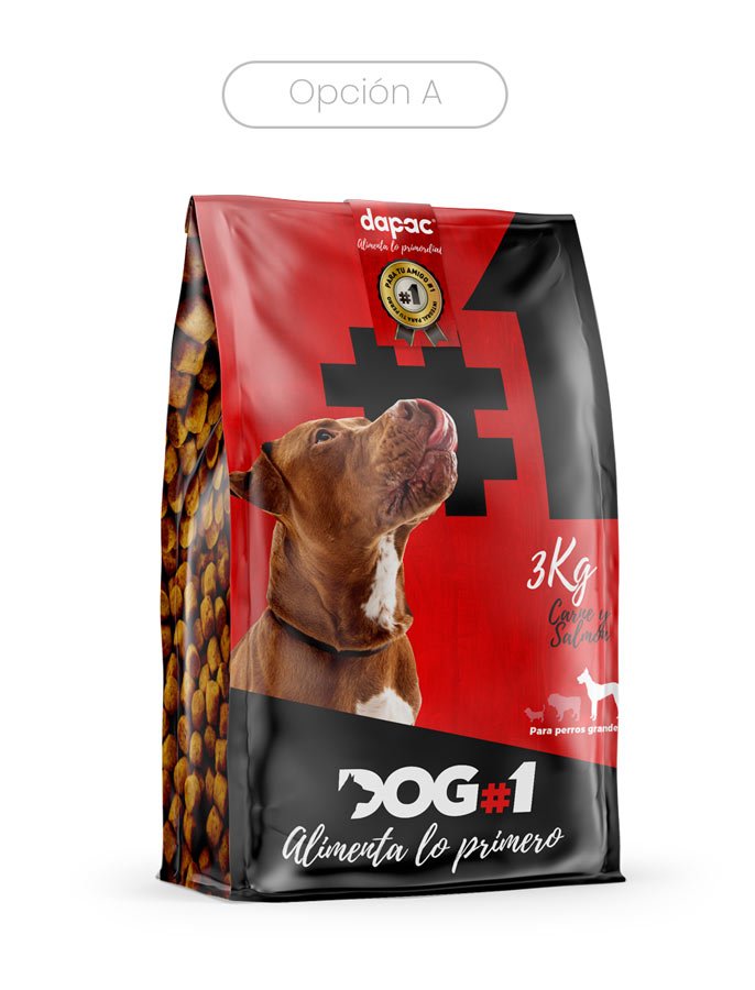
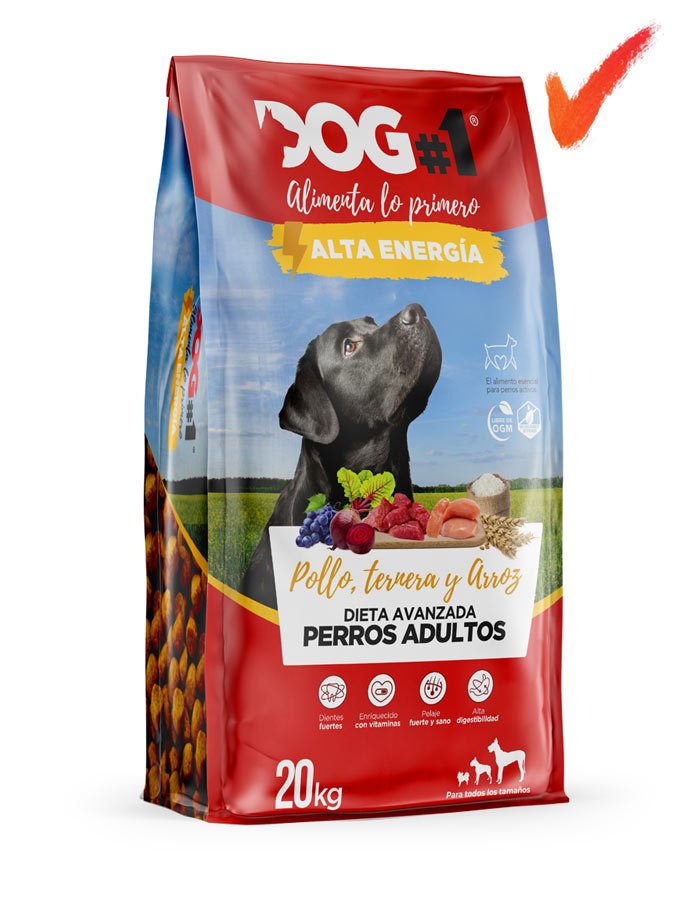
SOLUTIONS
FOR THE DOG#1 BRAND:
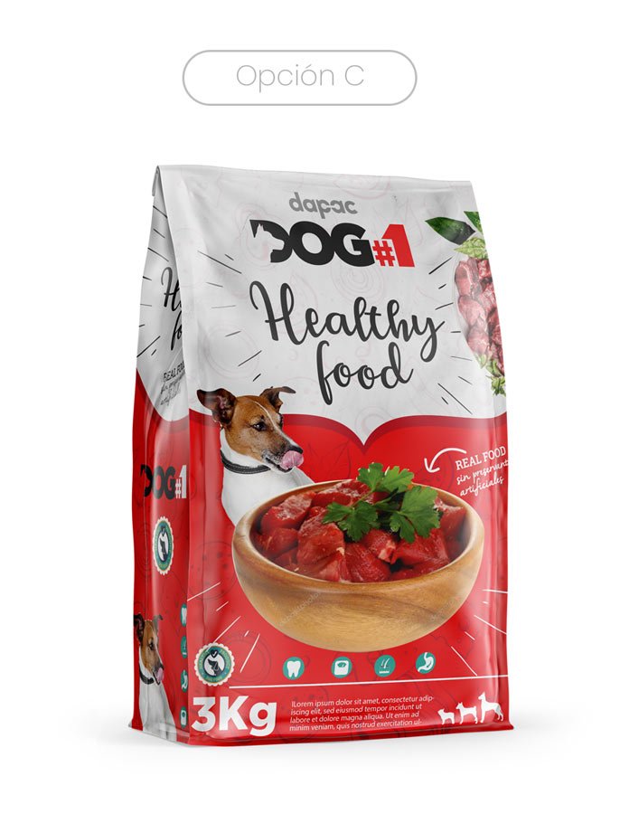
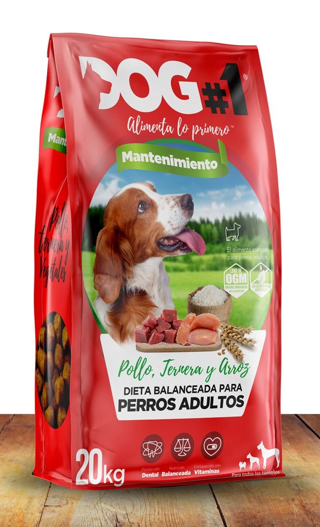
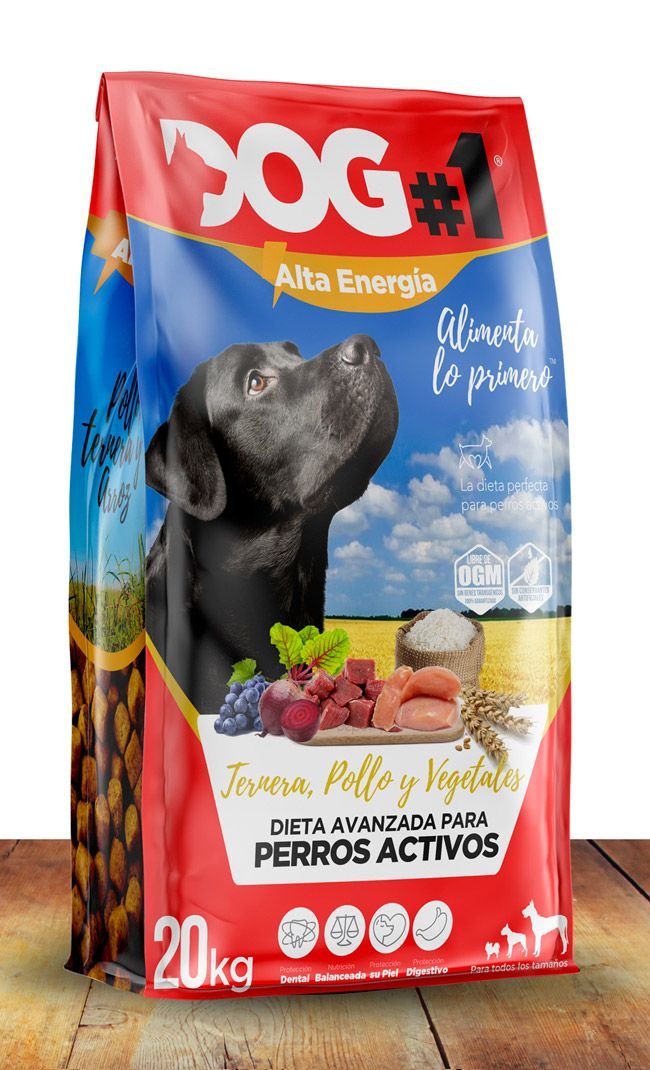
We at Brandesign wanted to support you in the power of the color Red that besides transmitting vitality, strength and movement, is a color that is positioned as a “low cost” color, within this sector prevails yellow and red, so we bet on a full red for the packaging, building that if several differences in the packaging to create the necessary differences between the tier of consumption and specialization of the feed between puppies and high energy dogs.
TIER DIFFERENTIATION SOLUTIONS:
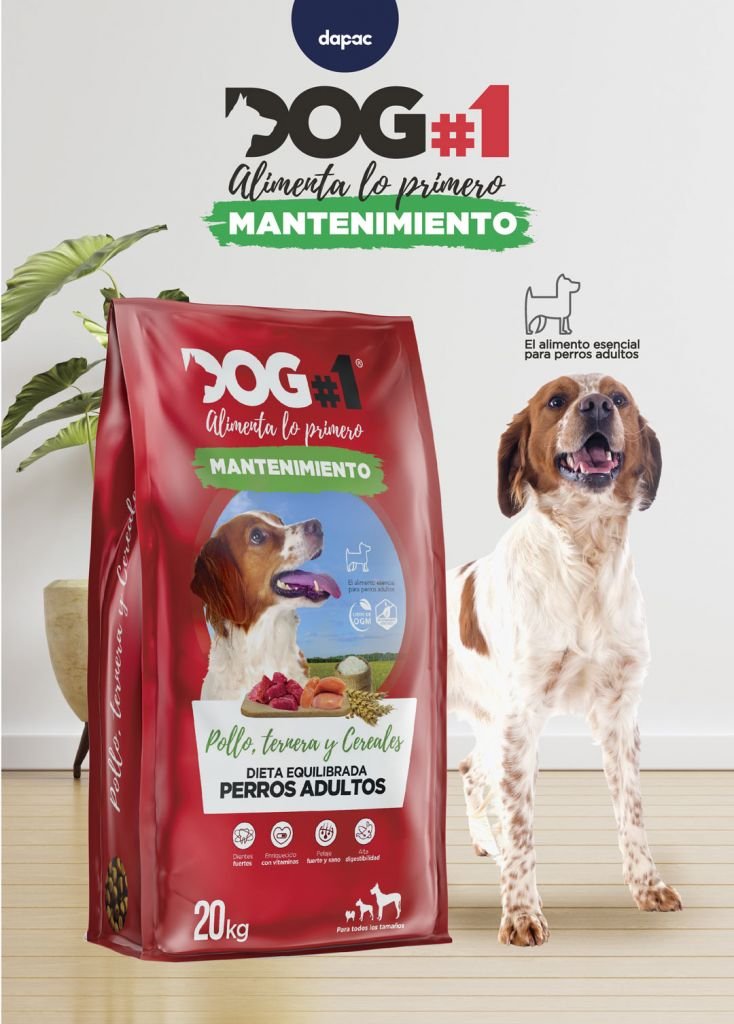
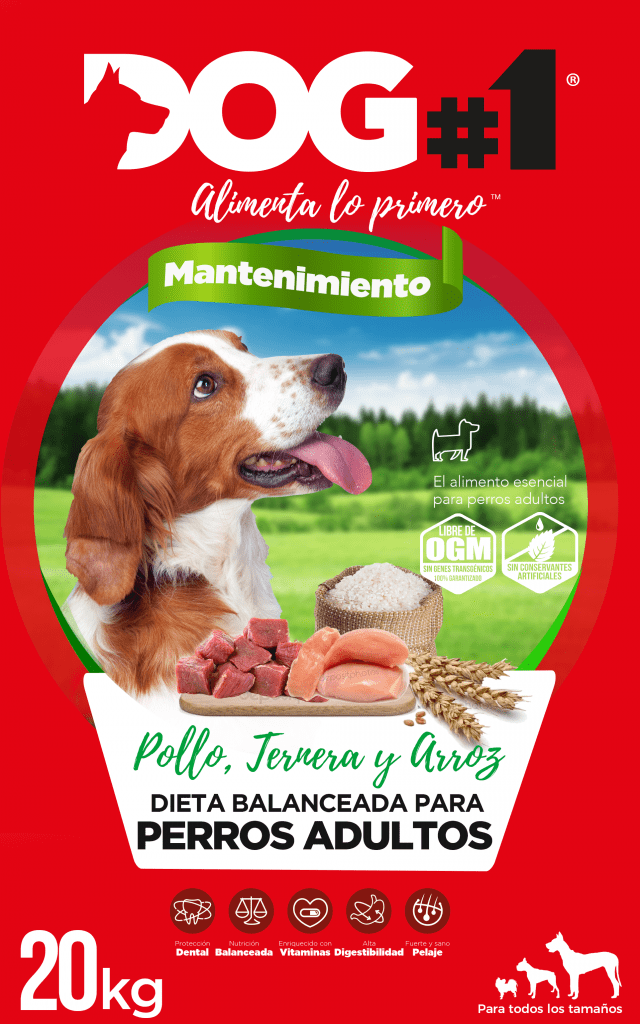
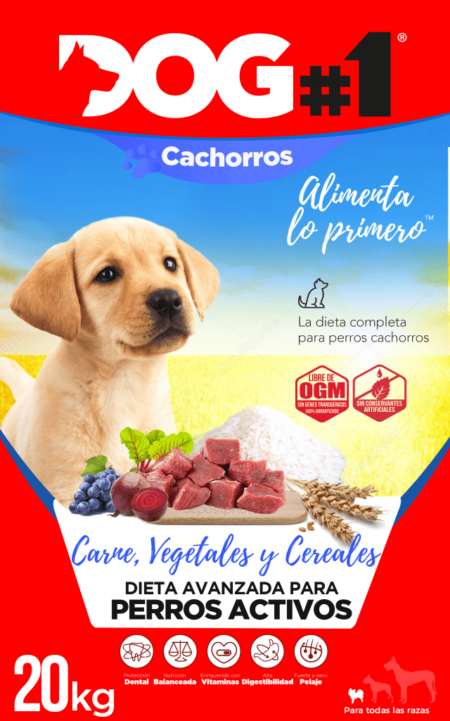
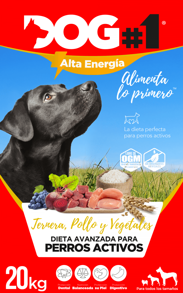
Photography is a very attractive visual resource, and the same production implies more costs for printing more colors, so our solution was to bet on using more photographic areas (greater amplitude of photography within the packaging composition) for products that should communicate greater value, and the application of less photographic area as a value restriction, leaving an equally striking product but with more invasion of solid red color as packaging clothing.
The result is a global positioning of the red color as a branding bet for the 3 products and a differentiation of the perception of the value of the products by the incursion of photography, creating a more visual packaging for the specialized products (selecting very well the full photographs for puppies and competition dogs / or very active dogs) and leaving a greater participation of solid reds for the product of a lower tier.

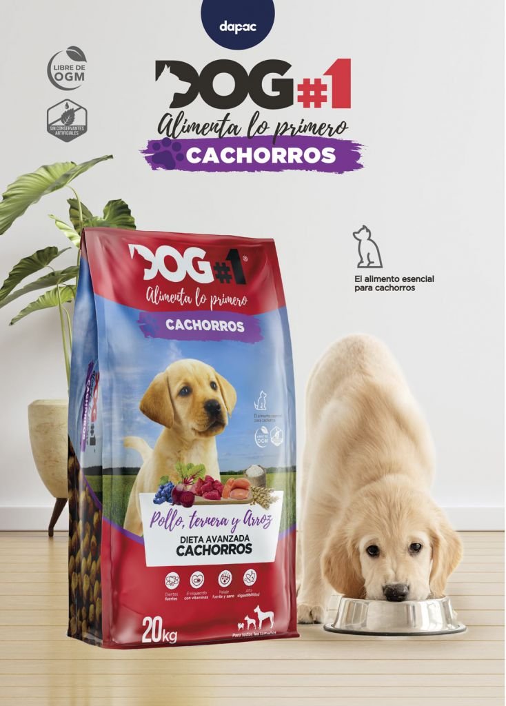
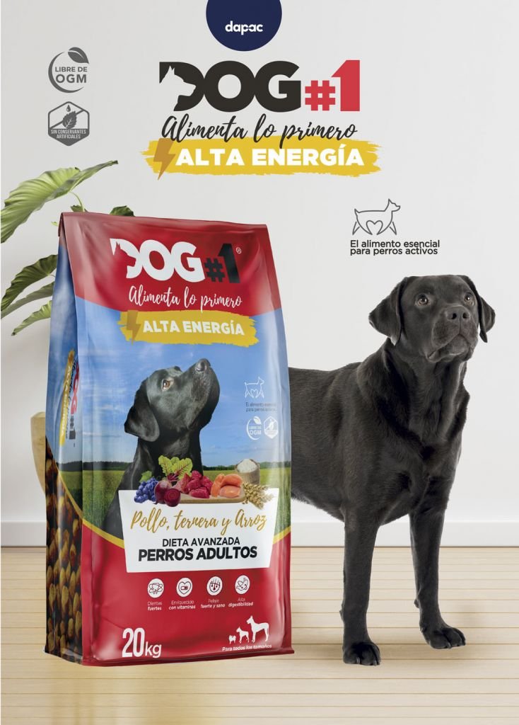
TIERS DIFFERENTIATION
Within our work methodology, at Brandesign we always we research the market before designing anything, because we want to evaluate the market and we do a visual audit to know what visual assets the other competing brands have and we realised that the vast majority of animal feeds only photograph the animal (cat, dog, etc) but many brands avoid really showing the ingredients of the product.
And although the feed bag does not have transparent windows, we came up with the idea of creating “visual” windows by photographing the inner product (feed dumplings) to show the buyer what the product looks like on the inside and creating a still life with samples of the ingredients inside: beetroot, chicken breast, rice, cereals, etc.
Creating a design more focused on the product than just showing the face of the animal, which is what the vast majority of brands in the segment follow.

IMPACTS
The product speaks for itself.
Without the need for support from retail campaigns, the consumer only has to look at the front panel of this packaging to know who it is aimed at, what ingredients the product is made of, what the product looks like out of its packaging, what its segment and possible tier in its market is.
We do not have sales metrics for this product because besides being launched this year is information that we can not disclose, but we have certainly designed a brand that will have a positive impact on this market and we believe that from now on many brands will dare to copy the idea of focusing more on how their products should look from the packaging than simply put the picture of the animal to whom it is addressed.
Thank you for giving us the opportunity to design another brand that connects designed by Brandesign.
We also created a series of identifying flags or banners with the benefits of the product and use of subnomens or subnames in purple stripes for puppies and vibrant yellow for active dog food.

DO YOU WANT TO WIN AT THE POINT OF SALES?
Are you looking for branding? We can help you. At Brandesign we design packaging, labelling and product aesthetics strategies so that your product gains visibility from the shelf.