LOGO AND LABEL DESIGN FOR TRAINING PRODUCTS
Javier contacted us from Madrid to design the first model of his first line of protein products for Price-Workout. This would be the first in a family of pre-workout protein products designed to provide greater stimulation and energy, and take training to the next level with a complete formula.
This pre-workout is designed to provide increased stimulation and energy, along with focus, increased strength, high levels of muscle engorgement and resistance to fatigue.
The project although based on the first recipe of tropical flavours should leave the door open for future product versions. The project consisted of the design of your logo and then the label design proposals.
LOGO DESIGN:
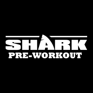
For the logo design, we wanted to do justice to the excellent naming that the client had given us: “Shark”, so we wanted to play with the figure of a shark’s fin with the perfect vowel for it: the letter “A” as well as being ideally placed in the centre of the name. After several readability tests we came up with an attractive organic figure. For the typography we wanted to play with a strong and powerful Black font. We share the results with you here.
PACKAGING DESIGN:
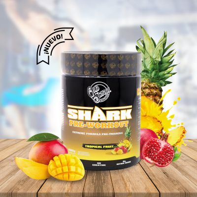
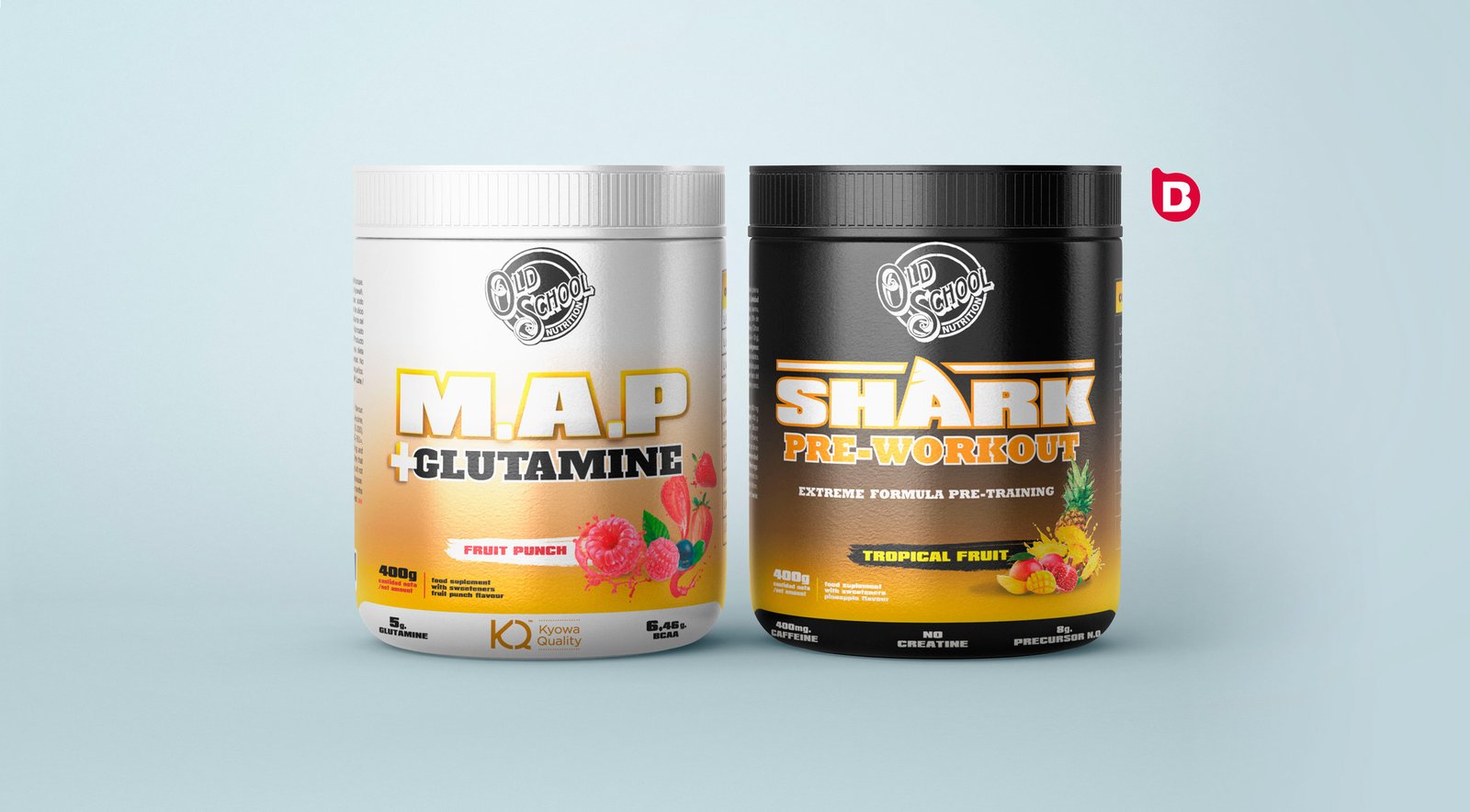
For the packaging design We first thought about recognising all those spaces and formats that could be converted into a line: that is, where to place this and perhaps all the flavours of the line, as well as fixing the name, icon and pictogram sections of this version.
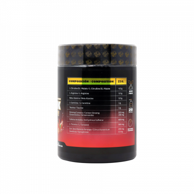
We carried out several measurement tests to see how the label design would look both on the website and on a shelf and we opted for the use of special inks such as gold stamping to create that notoriety and eye-catching appearance at the point of sale.
As the container has a screw-on lid, we had to reinforce the security of the closure of the bottle with a shrink sleeve to guarantee the protection of the product.

DO YOU HAVE A FAMILY OF PRODUCTS AND WANT TO CREATE A DESIGN LINE?
The product design has to talk a lot about the product and communicate in a retail environment without visual or multimedia support. It has to communicate alone and at the same time communicate as a family, because it probably has or will have variations of the product based on its demand. At Brandesign we are aware of the diversification that products have in order to establish a clear strategy in their packaging so that the consumer recognises it instantly. We like challenges: Shall we get going?

I worked in P&G building global brands with branding strategies for regional markets according to each consumer. I complemented my 360º profile working in media agencies to analyze campaigns after the click.

I’ve always been with a pencil in my hand, scribbling ideas to design professional projects in the environment of digital arts, graphic design, animation and 3D. I love to see how step by step my creations come to life.

Versatile, decisive and productive. Throughout my career as a journalist and digital marketing specialist, I have done reports, articles, interviews, public reports, creating content for brands on social networks and portals.

I like to thoroughly understand the client’s needs and translate them into digital solutions, the Internet is growing every day in a diversity of formats and digital resources and we always find the tailored IT solution that best suits the users.

Some call me a designer, others an art director, even my mother says I’m an artist and the truth is that I only like labels to design them.

I always try to give an answer and a solution every time you call me, I answer the calls and the Brandesign chat from the customer service.

