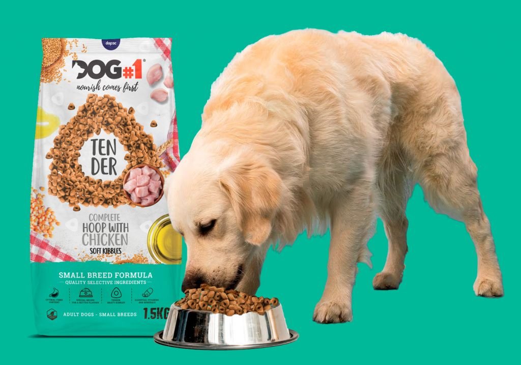
DIVERSIFYING THE BASIC FEED TIER DOG#1 TENDER
APPROACH:
It had been several years since we started our packaging design work for Arturo at Dapac. It was back in 2018 when we were asked by the cooperative Central de Compras Dapac to start our brand architecture work designing the Dog#1 feed sack. This new brand that we designed helped define the basic tier for our client. With the design of the logo and the development of the packaging for their bags of Dog#1 Maintenance, High Energy and Puppies,
we defined the economic dog food category of this feed manufacturer in 3 different references. Then over the years we developed other products from the mid-range or flagship of the company, you can see the success story here: Graphic Packaging Design of Fresh Mediterranean snacks.
This was a challenge because in addition to being the best-selling and most profitable brand for the manufacturer, it had 9 different references, where it was necessary to establish a clear differentiation of value and identification of the product and colour of its category. After the success of Fresh Mediterranean and its Snacks, our client decided to diversify the economic range, to offer customers a product that would be an ‘in between’ or middle ground between the economic range (Dog#1) and the Flagship (Fresh Mediterranean).

CHALLENGE:
Hence the need to create a fourth Dog#1 packaging that would not follow the same ‘red’ line proposed in 2018, which in turn had to be different (as both the price and quality of the product were higher). We had to differentiate it but at the same time become familiar with the Dog#1 brand, as strategically we did not want to create another brand, but a premium ‘spin off’ of Dog#1.
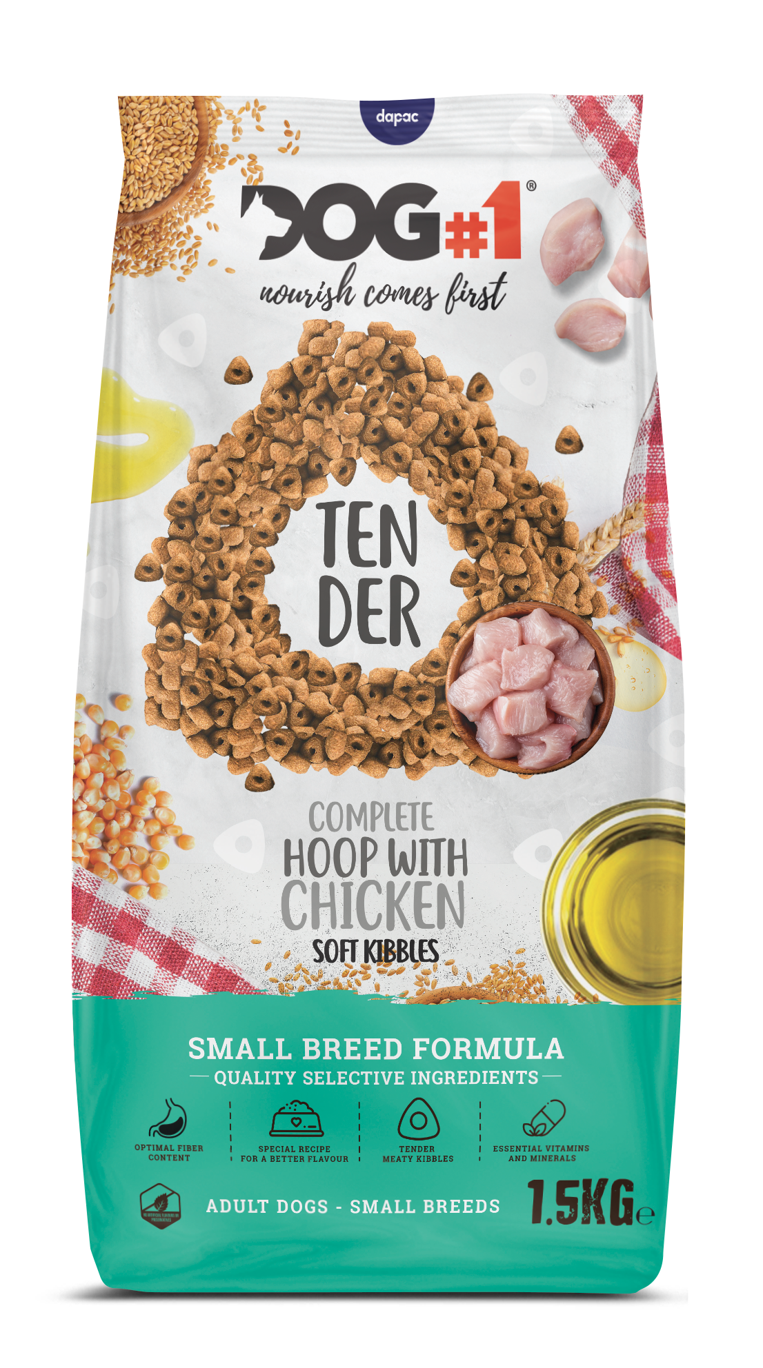
With the premise of creating a product in the Basic-Premium sector, this packaging project to design the DOG#1 TENDER Bites was born: A complete dog food, with better ingredients and with a unique aspect: the shape of its kibble.
DIVERSIFICANDO LA CATEGORÍA ECONÓMICA CON UN PLUS DE CALIDAD

OUR SOLUTION:
Graphic packaging design is one of the most important tools for a brand’s success. When a product sits on a shelf full of similar options, its packaging design is the first impression a consumer has of the product. A well-crafted packaging design can make a product stand out, attract consumer attention and increase sales. This was the case for the Dog#1 Tender Bites brand.
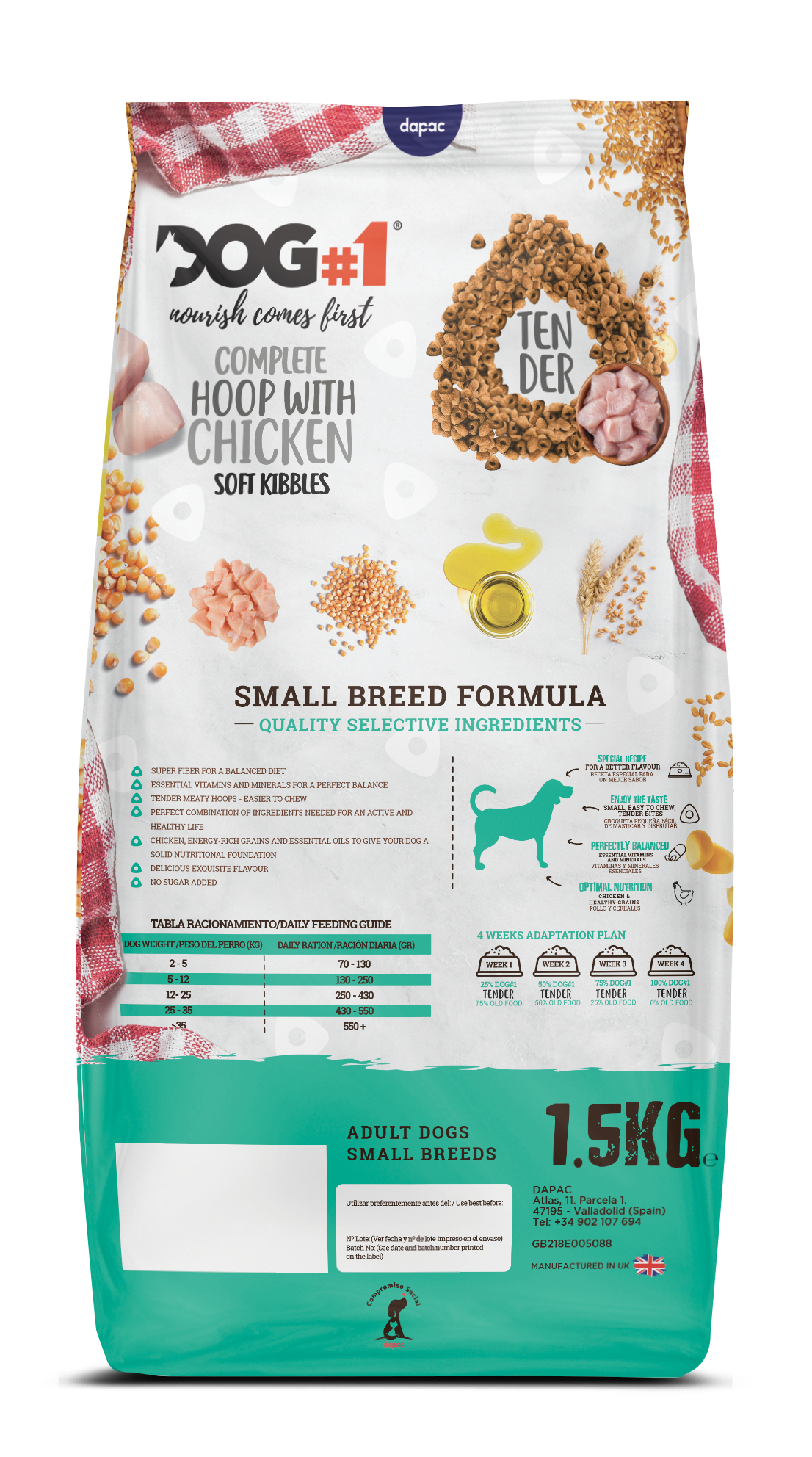
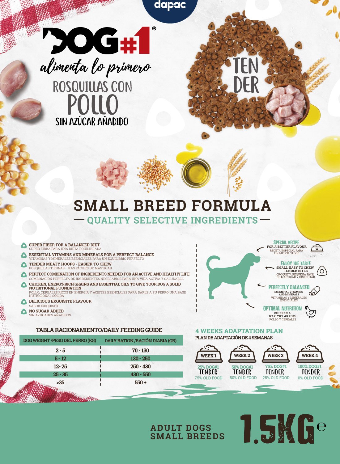
Dog#1 Tender is a complete dog food brand that specializes in natural and quality ingredients, providing a plus in the choice of better proteins such as chicken, energy-rich cereals and essential oils to give your dog a solid nutritional base.
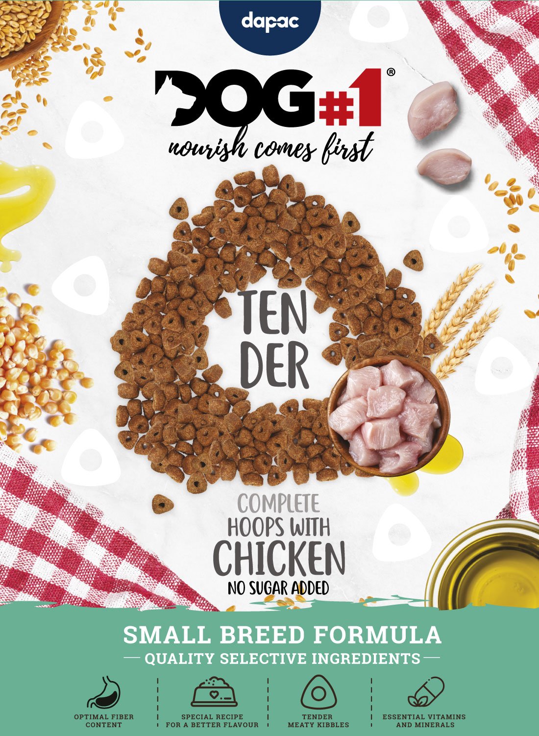
The brand decided to change its packaging design to highlight the values of healthy food and quality ingredients that its product represents. The new image highlighted the characteristic shape of its croquettes with a triangular shape and holes that increased the palatability of the food in the dog’s snout. Therefore, in the design of the bag we decided to highlight these visual properties of the product also in a graphic way.
The new specialized graphic packaging design for Dog#1 Tender was developed by our team of graphic designers, experts in the creation of packaging for food products, who have many years of experience designing and recognizing the criteria for success in the Pet Food category.
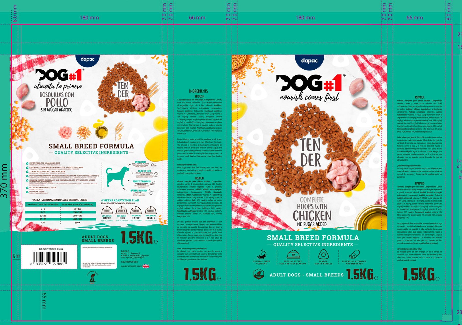
The objective of the design was to create a brand image that highlights the quality and values of the brand. To do this, a color palette was used that evoked the freshness and quality of the ingredients. Images of the ingredients used in Dog#1 Tender Bites dog food were also included to highlight their quality and natural origin.

OUTCOME:
Specialised graphic packaging design can make the difference between success and failure for a brand. Especially when it comes to a new sub-line or product range.
Dog#1 Tender’s new product design was well received by the market. The specialised graphic packaging design highlighted the values of healthy food and quality ingredients that the brand stands for, and highlighted the ingredients and properties of the product and the distinctive shape of the triangular kibble in the front of the bag design.
- Increasing the customer base: By offering a mid-priced product, it is possible to attract both customers who are willing to pay a little more for a higher quality product, as well as those who are looking for a cheaper option than mid-range ones. This can result in an increased customer base. Increased profitability: By offering a mid-priced product, higher profit margins are possible than with cheaper products. This is because production costs will not be as high as for mid-range products, but higher prices can be charged than for more basic products.
- Brand differentiation: By creating a sub-brand that offers mid-priced products, it is possible to differentiate the brand from the competition. Customers can see that the brand offers products in different price ranges and may feel that the brand is better suited to their needs. Market positioning: By offering a sub-brand with mid-priced products, the brand can position itself as a more premium option than low-cost brands, but more accessible than high-end brands. This can help the brand attract customers who are looking for a higher quality option but cannot afford the more expensive brands.
In conclusion, the creation of this Dog#1 sub-brand in the middle of the basic tier or mid-tier product ranges can bring significant benefits to a product portfolio, such as increased customer base, increased profitability, brand differentiation and market positioning.
Is Your Brand Aligned with Your Product?
Does the design of your packaging or the presentation of your product not communicate its key features and unique value proposition? You don’t have 2 chances to communicate your product well. The current market demands authenticity and a lot of innovation. At Brandesign we design brand strategies so that your brand becomes your company’s most valuable asset. We do it from research, preparation and with excellent care to creativity, because your product must be unique. Shall we start?

I worked in P&G building global brands with branding strategies for regional markets according to each consumer. I complemented my 360º profile working in media agencies to analyze campaigns after the click.

I’ve always been with a pencil in my hand, scribbling ideas to design professional projects in the environment of digital arts, graphic design, animation and 3D. I love to see how step by step my creations come to life.

Versatile, decisive and productive. Throughout my career as a journalist and digital marketing specialist, I have done reports, articles, interviews, public reports, creating content for brands on social networks and portals.

I like to thoroughly understand the client’s needs and translate them into digital solutions, the Internet is growing every day in a diversity of formats and digital resources and we always find the tailored IT solution that best suits the users.

Some call me a designer, others an art director, even my mother says I’m an artist and the truth is that I only like labels to design them.

I always try to give an answer and a solution every time you call me, I answer the calls and the Brandesign chat from the customer service.
