DESIGNING THE RESTAURANT OF THE #ALTERNATIVESALAD
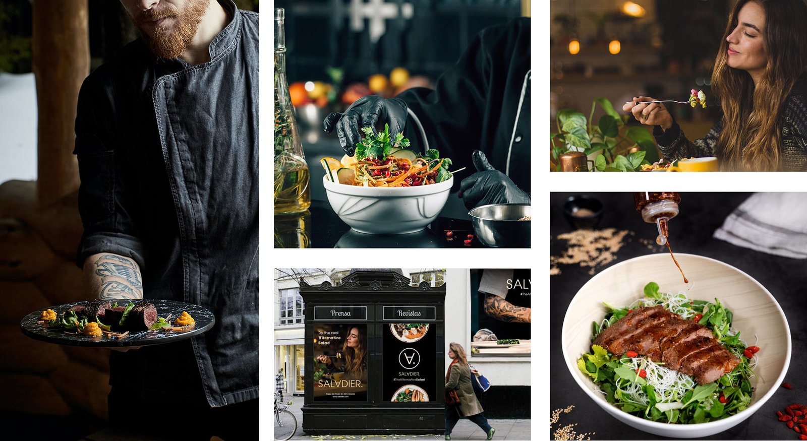
The client approached us at Christmas 2019 with a clear idea of what he was looking to undertake: A signature restaurant specialising in healthy, delicious and unique food, salads? yes, but not just any salad, we wanted to offer Madrileños the opportunity to try salads with a high protein content, which in addition to being good, nourish you.
There are already many restaurants in Madrid that offer salads, but this concept would also bring new flavours from Western Asia that no Madrilenian had ever tasted before in a salad. Ingredients such as sujuk, halloumi, or an authentic falafel fused with oriental flavours such as teriyaki sauce or wagyü beef would give us the nuances to understand the development of this new product and brand.
SALADIER: helps people to have a very delicious and healthy meal for their day to day life.
The project that our client requested from us covered all the areas that Brandesign offers: From the definition of their Buyer Persona, market analysis, a visual audit of companies and direct restaurants in the sector, to the Brand Plan. The project covered from the naming strategy to the logo design or brand development with a common thread.
NAMING
The objective: To find a short name that, in addition to having a free trademark for its registration at European level, was powerful and had a .com domain available (due to the possible internationalization of the business). The name of a trademark lasts as long as its useful life. The importance of a good naming.
The name Saladier has, in fact, three readings in three languages in one word: “Salad” (a healthy dish) “Saladier” (Saladier, not a salad, but a dish) and, with our twist, “Salud” (health). It’s a very good organic word. Regardless of our menu, the brand promise will always be an alternative place to eat salads (and more) in a healthy and delicious way. And now, it’s time for SALADIER to make its way into the restaurant brands in Madrid.
SALADIER
CORPORATE IDENTITY
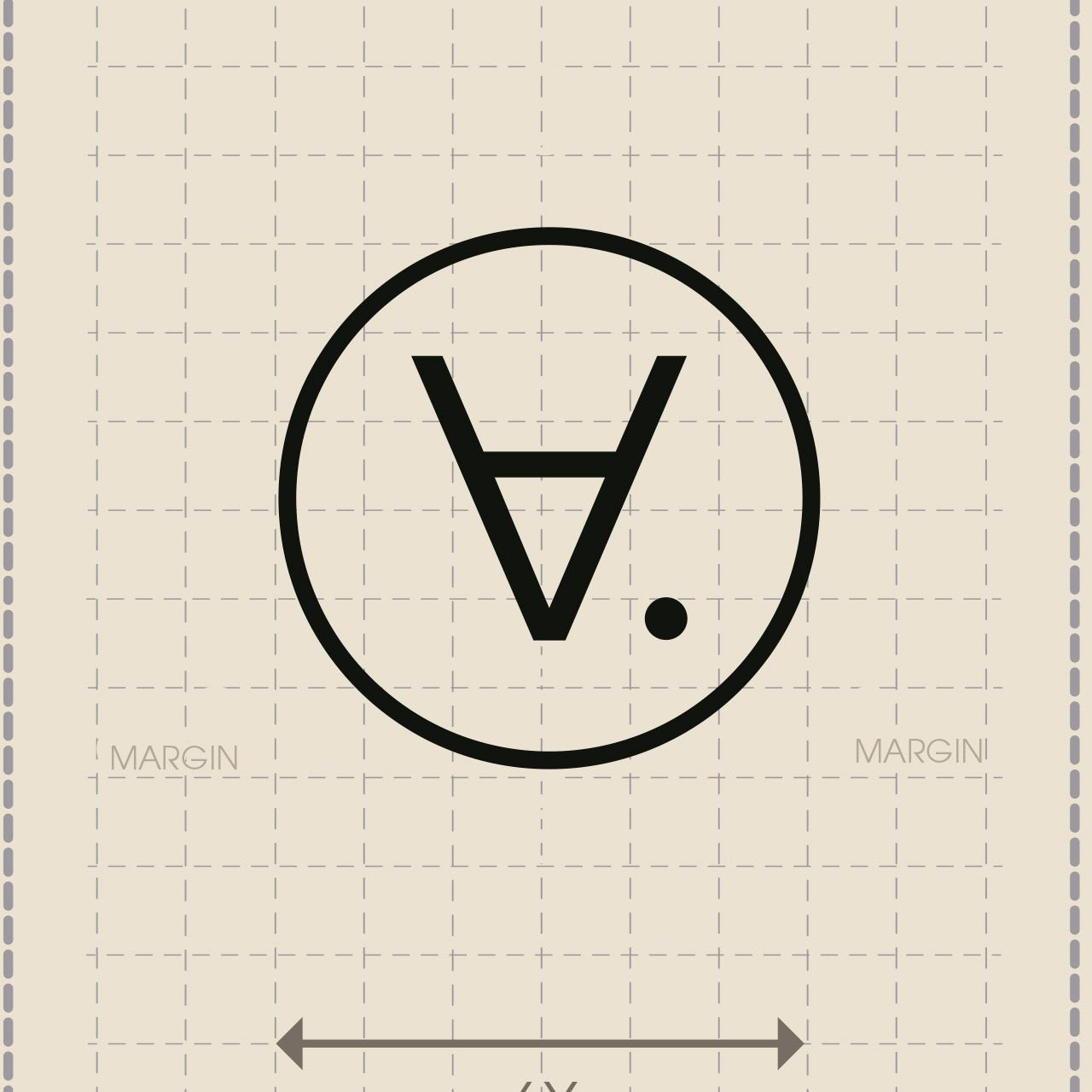
The challenge: If we already had a name with multiple readings, we had to do the same with the logo. To find a logo whose double reading between SALAD and HEALTH was implicit in the word, so we designed an imagotype where we rotated the letter “A” of “Saladier” (Salad / Salad Bowl) to simulate a “U” and create a word similar to “Health”. The adaptive design of our logo allows its use in all kinds of shapes and media.
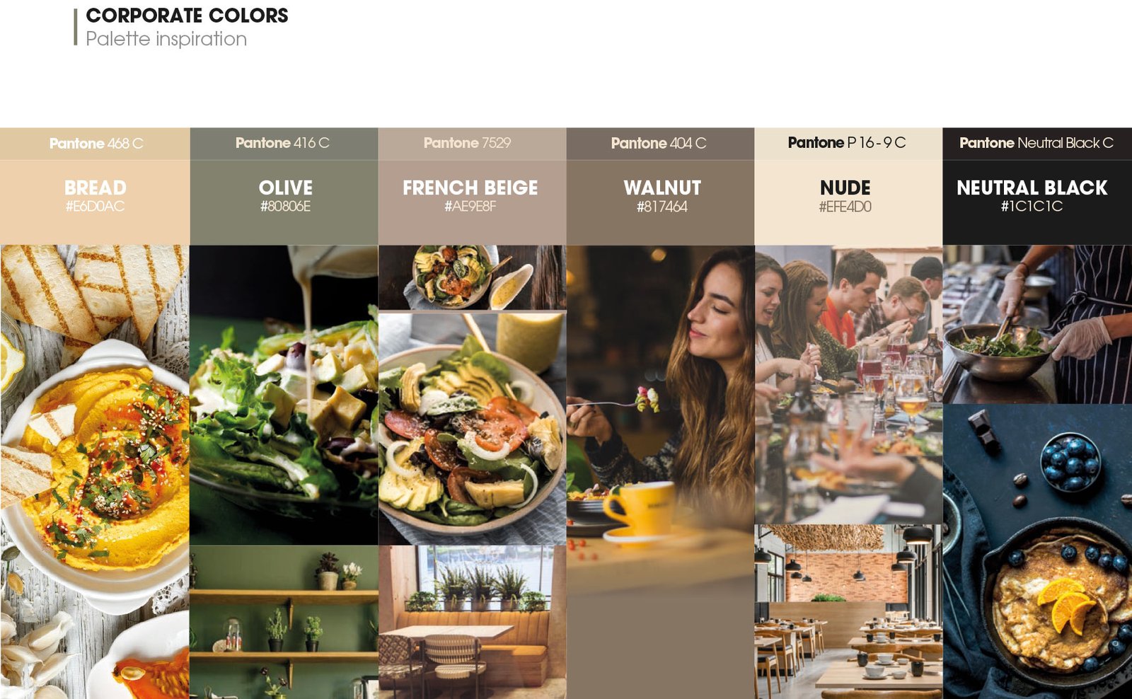
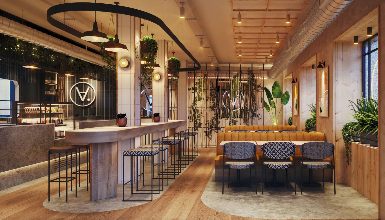
In terms of colour palette: We don’t want to fall into the cliché of using green as a colour. Buff! there are so many brands with this colour that it is difficult to innovate in this brand asset, so we chose an elegant palette (worthy of signature cuisine) to remind us of natural elements and healthy living in an elegant and mature way. Inspired by the food and elements present in the restaurant: woods, warm lights: the result is an alternative and cosy palette.

BRAND APPLICATIONS
The implementation of a brand is one of the things we most enjoy at Brandesign, because once the brand’s corporate identity has been designed and its brand book or corporate identity manual has been created, that is when the brand is really put to the test. It is when the Branding is enriched and we can play with the logo adaptations
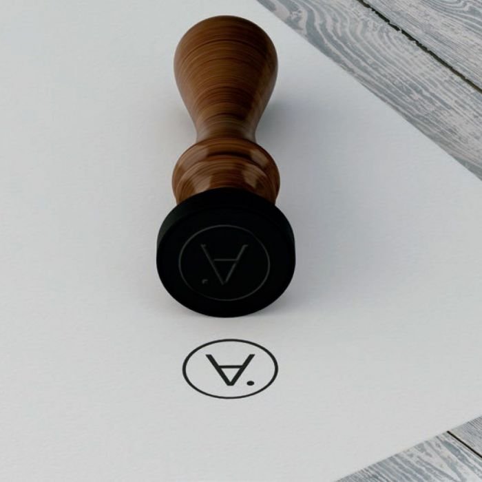
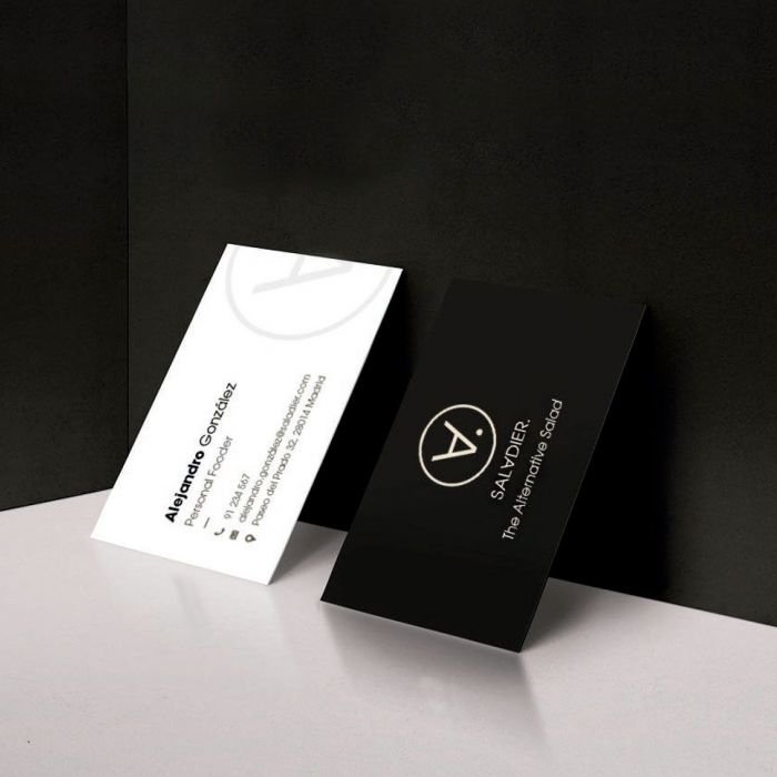
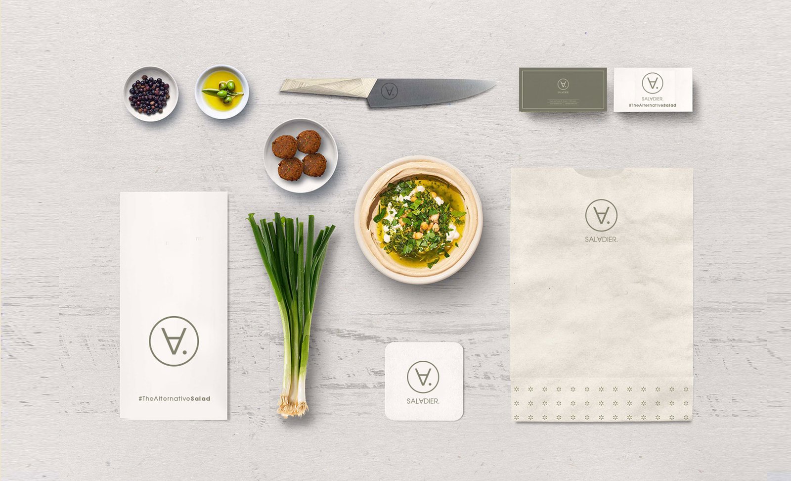
on surfaces rich in textures such as recycled papers, ecological inks and natural supports. We allow ourselves to play with the colour green for the use of indoor material, such as napkins or cup holders made from recycled material, in order to bet on a brand that is also ecological.
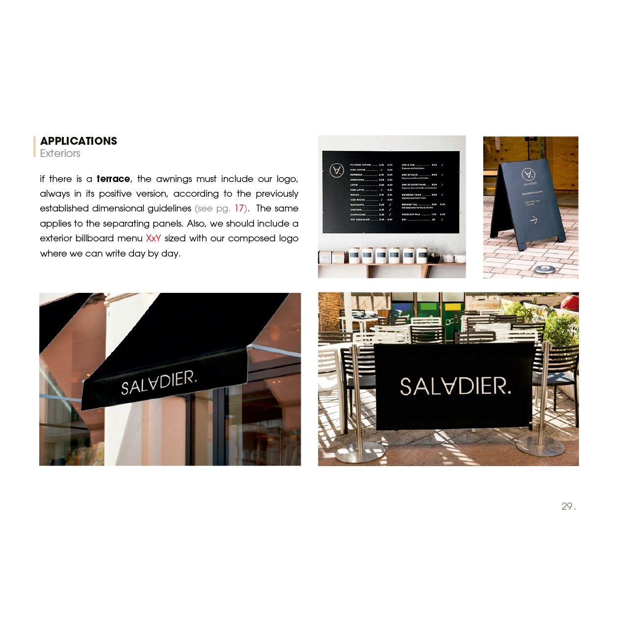
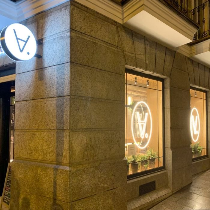
While for exteriors such as terraces and banners we restrict the use of the brand to the purest black and white.
To implement the branding, we study the benefits of each medium: both offline and online: from the use of recycled print, contemplating that the execution of the logo can be from embroidery to screen printing to the use of the logo in digital environments such as social networks. As for the design of a restaurant identity, we seek to soak up all the possible applications that it may have and respond to an optimal application of the brand.

PACKAGING TAKE AWAY
As I told you, we started the development of this brand when Walid contacted us in December 2019, at that time we had no idea that in just 3 months later, a global pandemic would break out and keep us all confined long enough for any restaurant in Madrid to rethink absolutely everything. And yes, it was a headache for us to think what do we do now? we had to suspend our campaign to launch the first restaurant in Museo Del Prado and look for options… Well, yes, we are an agency, we have to adapt…
With the confinement came the rise of food networks in Madrid and home delivery gave us a challenge: to summarize the restaurant experience in a
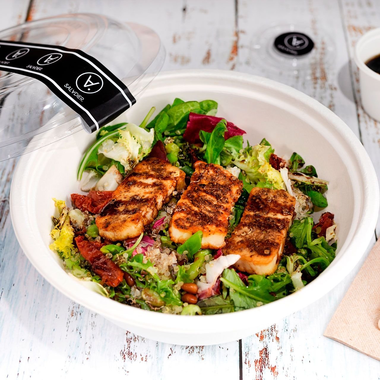
packaging. We sought to shift that Customer Journey experience and transform it into an UnBoxing experience. The solution was in the Corporate Identity Manual: to come up with recycled materials, good tools and plenty of them, an elegant and minimalist design and we did something right because we started to be one of the most requested take aways and restaurants in Madrid: (as said by the ElComidista of El Pais). No, we have not invented the wheel in terms of packaging, only in a very sober labelling, a personalised bag, resistant and ecological materials, and yes, we are comforted to know that we have achieved our objectives.
SOCIAL MEDIA CONTENT
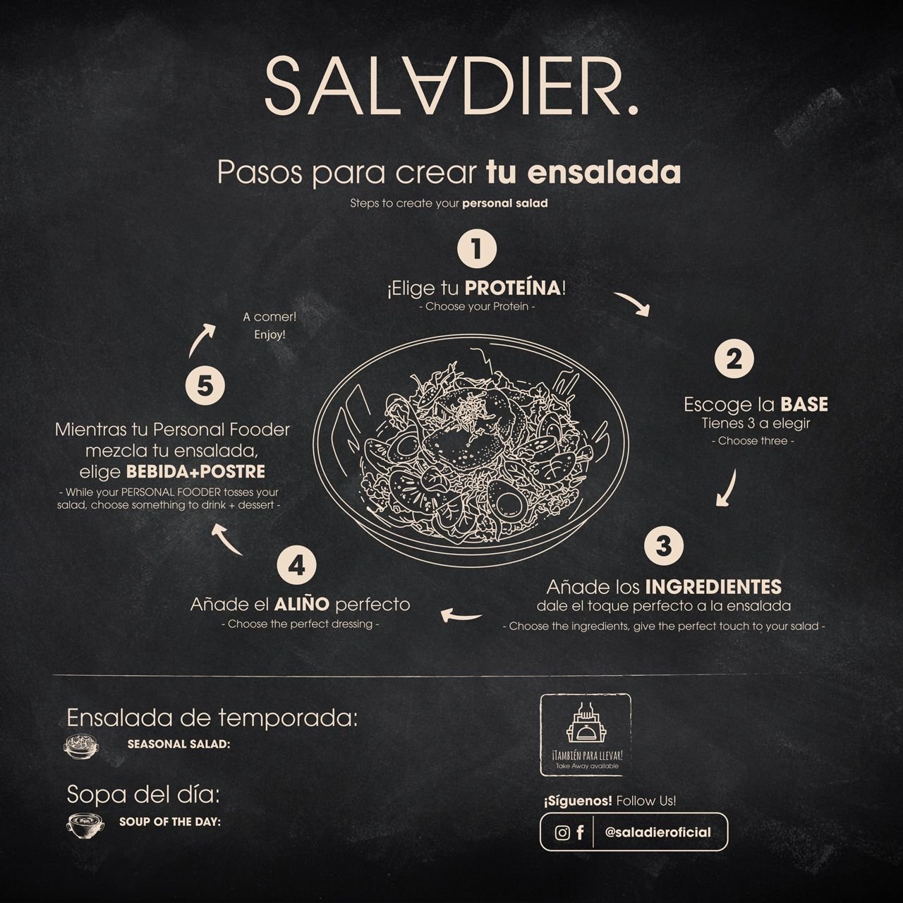
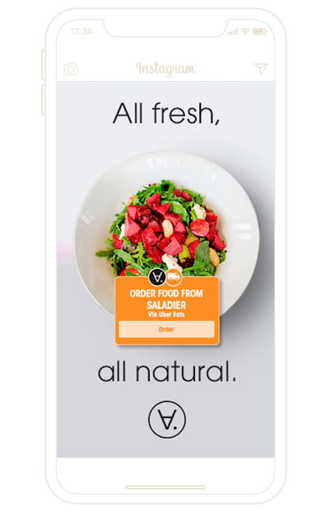
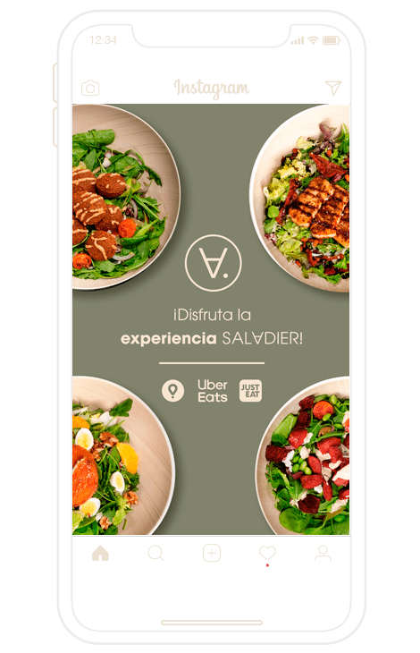
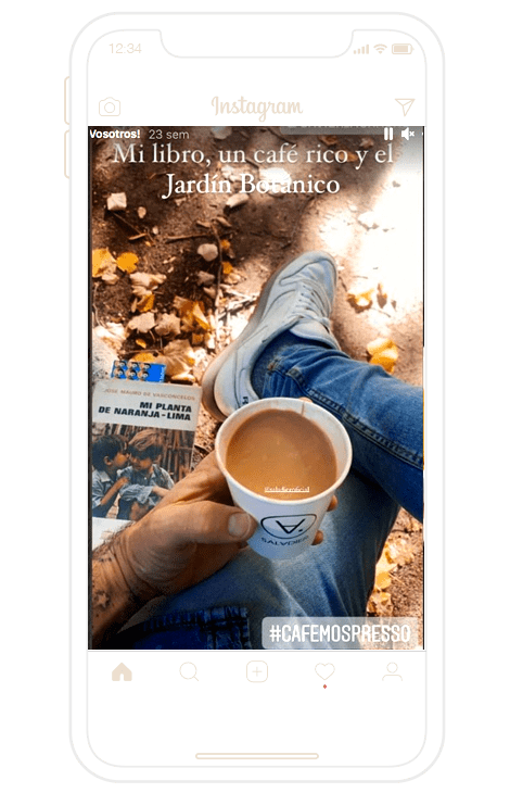
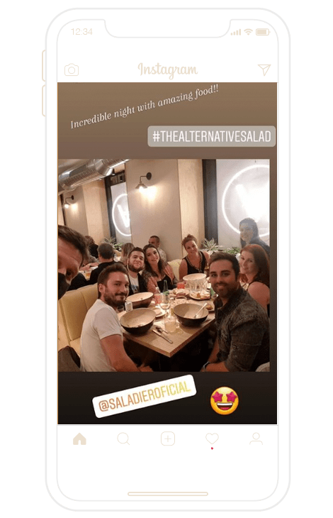
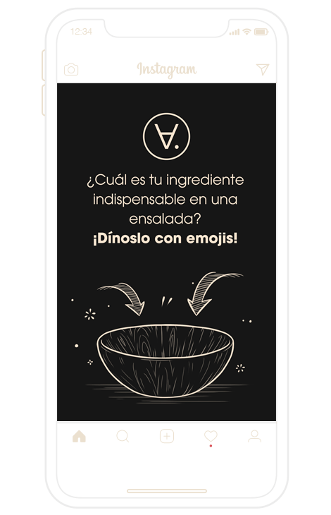
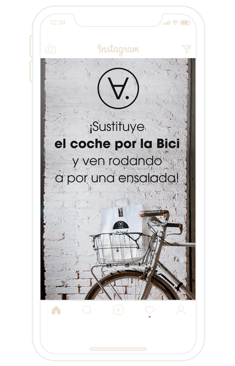
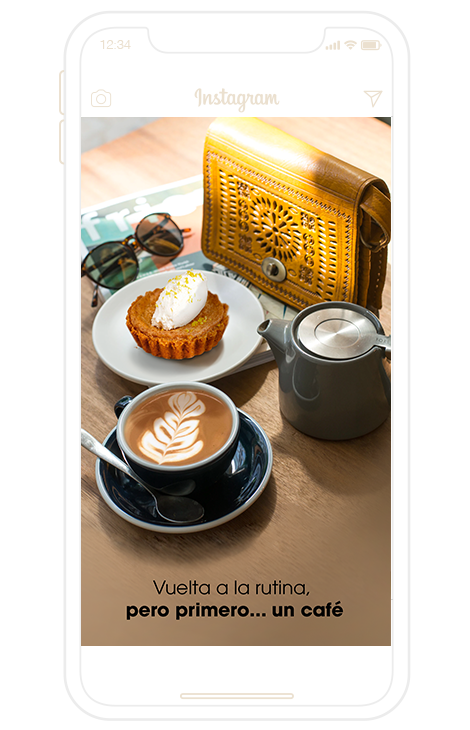
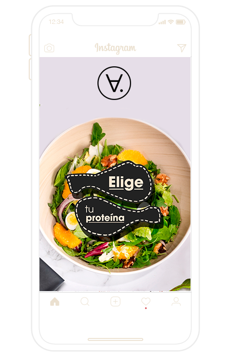
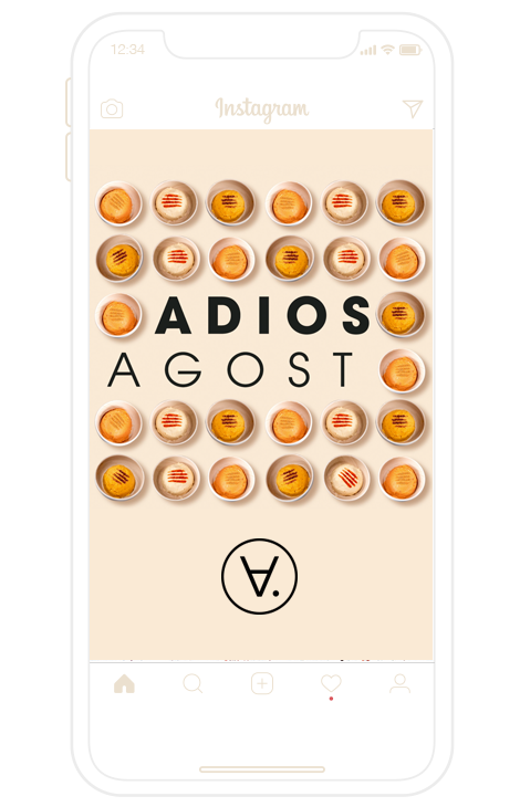
With Saladier we also had the opportunity to create and manage their social networks. For a signature restaurant in Madrid, Instagram becomes practically a MUST to create valuable content. Due to the type of target, the desired positioning, and the imperative need to tell stories and promotions to its customers, we created the account of @SaladierOficial to publish hundreds of stories and posts about each recipe, each seasonal menu, as well as interacting with followers and influencers. We take social networks not as a showcase for advertising but to expand that storytelling that happens between a brand and its consumers.

ARE YOU STARTING A NEW BUSINESS?
Choose very well the agency that will accompany you in the beginning, because you don’t have 2 chances to create a good first impact. Whether you are setting up a restaurant or a shop, your customers will not only evaluate you on the taste of your dishes, but they will also make a value judgement on the visual aspect of your business. We also eat through our eyes. A brand has to look serious, reliable, credible and also be different from the current market in order not to be just another business. Contact us! We would like to be your creative team in this key moment of creating a new business.

I worked in P&G building global brands with branding strategies for regional markets according to each consumer. I complemented my 360º profile working in media agencies to analyze campaigns after the click.

I’ve always been with a pencil in my hand, scribbling ideas to design professional projects in the environment of digital arts, graphic design, animation and 3D. I love to see how step by step my creations come to life.

Versatile, decisive and productive. Throughout my career as a journalist and digital marketing specialist, I have done reports, articles, interviews, public reports, creating content for brands on social networks and portals.

I like to thoroughly understand the client’s needs and translate them into digital solutions, the Internet is growing every day in a diversity of formats and digital resources and we always find the tailored IT solution that best suits the users.

Some call me a designer, others an art director, even my mother says I’m an artist and the truth is that I only like labels to design them.

I always try to give an answer and a solution every time you call me, I answer the calls and the Brandesign chat from the customer service.
