Working with Canal Isabel II in its strategic plan 2030
In 2018 we received a call to participate in a tender for a Branding project for Canal de Isabel II and the truth is that all of us in the team were quite impressed by the invitation, and suddenly we felt quite small next to a company as innovative and big as Canal de Isabel II. Working for Canal Isabel was an excellent challenge to overcome and to motivate, especially when they are one of those large organisations where decision-making is done as a group and in a consensual way.
Each one of us at Brandesign was absolutely ready to take this step. Many years of training in branding and corporate identity design were about to be put to the test.
Coordination and careful planning is the key to success.
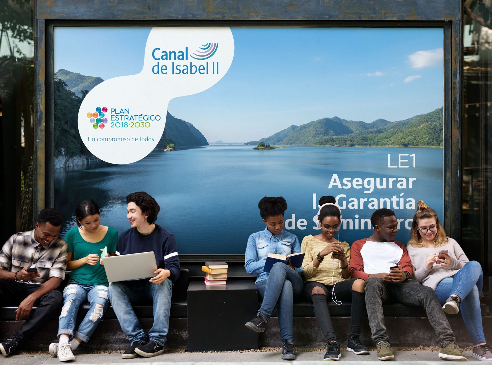
The project was based on 3 development phases marked in time and several deliverables. The first: we had to restyle or renew the generic logo of the company’s Strategic Plan, the second: create an identity to reflect more clearly the objective and mission of each of its 10 strategic lines; each (LE) one symbolises a plan of sustainability and commitment to quality with the staff and the environment. The third phase: to collect all this strategy in a Brand Book or Corporate Identity Manual.

LOGO DESIGN:
The objective: To design a logo that is flexible enough to be visualised from a video or digital corporate presentation, to be printed on any kind of POP or merchandising material.. The logo type or logo should have a double reading: The first one is to remind the sustainability purposes and commitment of the company until 2030 as an organisation and the second one: in addition to an individual function, it should consist of 10 elements that represent each of these lines separately.
For this challenge at Brandesign we always think from the end to the beginning: that is to say: to know exactly the habitat that this brand will have, and to propose solutions for each support. Keep in mind that we will have versions or enlargements of this brand in full colour for video formats, as well as printed material such as magazines or RollUp for events, and even embossing or embroidery that it may have on a uniform or garment. So our solution was to come up with a very
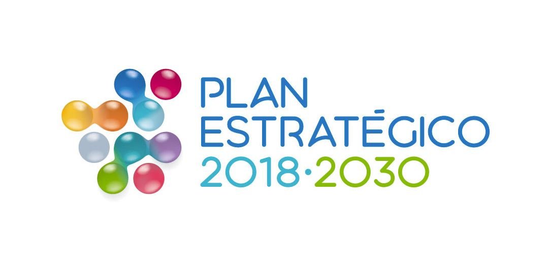
After the round of conceptualisation and sketches, we validated the design of a 10-Drop System, being the state water management company, we thought that there was no more flexible system than that of water drops that join or separate on the basis of one or several strategic lines joined or related.
This system of 10 points or ten “drops” can be redistributed like water, adopting different shapes based on the container space. The formation of the 10 drops of water are not random, using the very nature of water which follows a hexagonal formation to combine and align this imagotype.
It is not a rigid system, on the contrary, the drops can be isolated or connected to each other, their union depends on the convergences of each strategic line representing the integration and convergence of all the lines and all the members of the organisation in the same goal.

COLOR strategy:
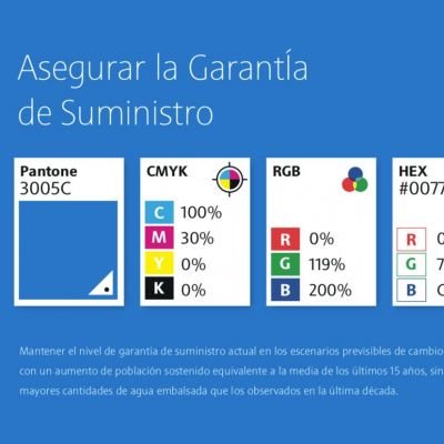
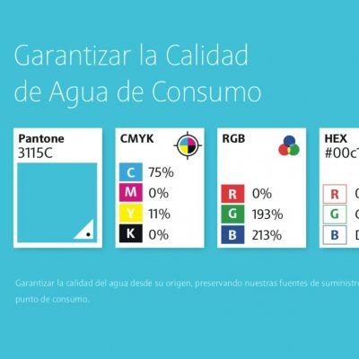
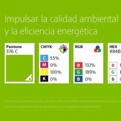
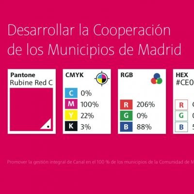
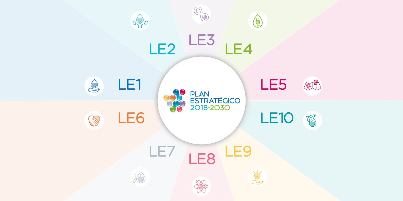
In addition to a global strategy: such as creating the central logo of the Strategic Plan, within the planning it was necessary to work on an individual objective: that of defining a colour for each strategic line. Canal Isabel II as a governmental organisation for water management in the Community of Madrid must promote its values such as efficiency, commitment, proximity, transparency, innovation, talent and economic and environmental sustainability. Each one of these values has a mission and a Strategic Plan for the period 2018-2030.To help communicate its objectives and align its employees and suppliers in the necessary actions to achieve them in the medium and long term.
The challenge: It was a challenge for us not only to study the entire corporate identity of Canal Isabel II as a brand but also to align various brand departments: Image and Publications, Public Relations, Corporate Identity and others in order to carry out a
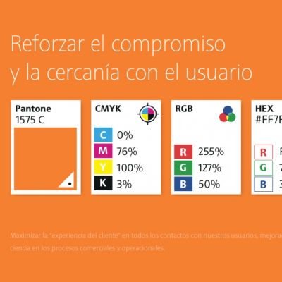
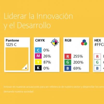
Auditoria Visual on each LE. To do this we had to study the colours present in each category: from conservation and water quality (purely cold colours) to the commitment to proximity to citizens, cooperation between municipalities and the continuous improvement of their human capital (warm colours). But how to reach a consensus in various departments on the use of each colour? By knowing the colour and palette of colours that reigned in each category by auditing their internal communications as well as knowing with which one the leader responsible for each Strategic Line identified himself. The conclusion was taken in consensus with several specialists and to establish a colour palette code ranging from Pantones, WebSafe, Hexadecimal, Four-colour, CMYK, RGB, Video and more.
CORPORATE IDENTITY MANUAL:
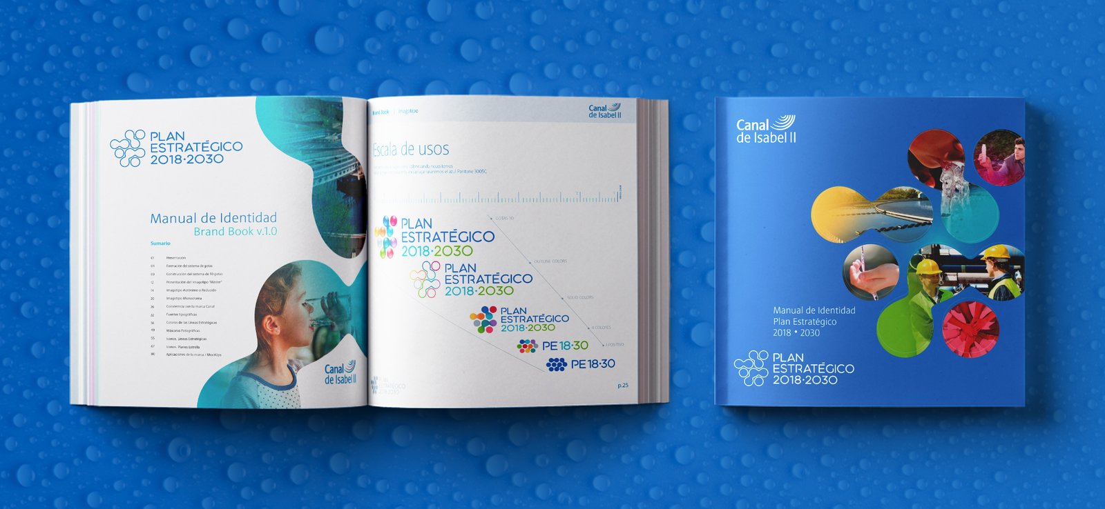
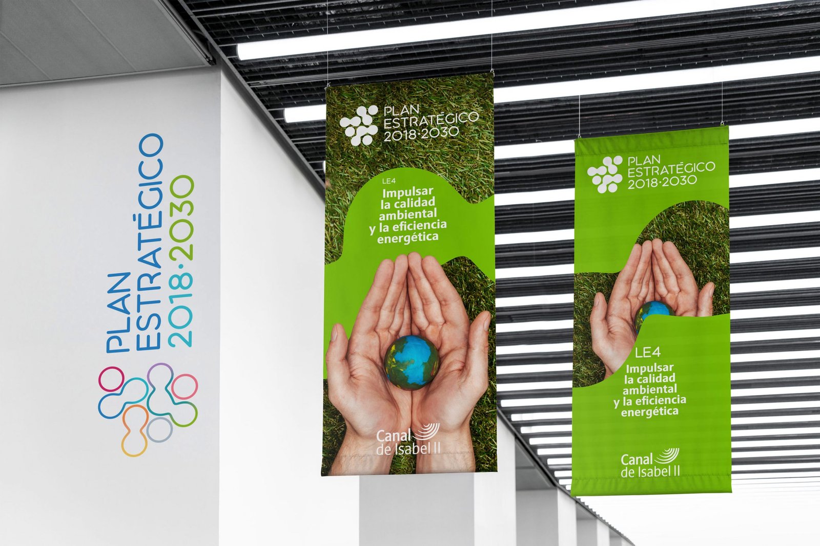
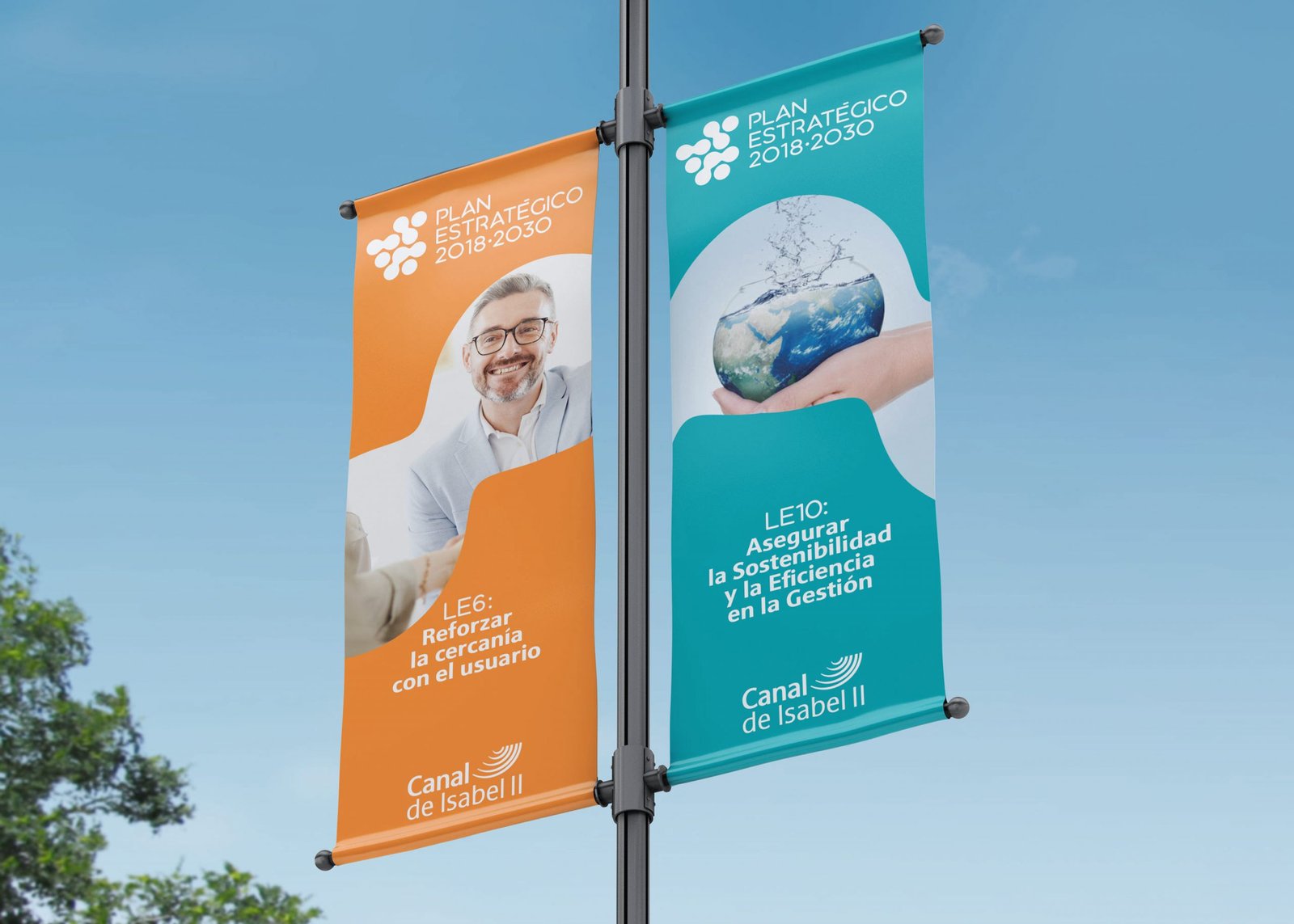
Finally, having already established a global identity for the responsive logo of the Strategic Plan, and designating icons, colours and purposes for each Strategic Line individually, we have gathered the whole strategy of the Strategic Plan. corporate identity in a manual. When we face a Brand Book or Corporate Identity Manual, we do so with the understanding that more than dictating the guidelines or rules for implementing the brand, what we must also do is to inspire its continued creation. We do this from an exhaustive manual reflecting the verbal or visual identity of the brand, creating technical guidelines and also creating MockUps or examples executing the possible scenarios of the brand in digital fictitious. For this Strategic Plan it took us 85 pages to capture these scenarios and guidelines. We share with you some of those pages.


RESULTS:
An experience of teamwork.
It has been very satisfying to work alongside professionals such as Pilar’s team in the communication and corporate identity department of Canal Isabel II.
The project was well received by several of the departments we worked with. The event was launched in 2019 and our communication pieces are being communicated efficiently until 2030.
There has been a total involvement of the whole organisation and we have finally been able to do justice to this project by publishing it in our Branding portfolio. We hope you liked it.
DO YOU WANT TO TRANSLATE YOUR COMMUNICATION STRATEGY INTO A CORPORATE IDENTITY MANUAL?
At Brandesign we know how valuable a brand is: it is a company’s most profitable asset and designing it is as essential as safeguarding it. In a Brand Book or corporate identity manual we put all our knowledge about brand identity and brand positioning strategy so that your franchises, suppliers and employees keep it current, innovative and loyal. Shall we work together?

I worked in P&G building global brands with branding strategies for regional markets according to each consumer. I complemented my 360º profile working in media agencies to analyze campaigns after the click.

I’ve always been with a pencil in my hand, scribbling ideas to design professional projects in the environment of digital arts, graphic design, animation and 3D. I love to see how step by step my creations come to life.

Versatile, decisive and productive. Throughout my career as a journalist and digital marketing specialist, I have done reports, articles, interviews, public reports, creating content for brands on social networks and portals.

I like to thoroughly understand the client’s needs and translate them into digital solutions, the Internet is growing every day in a diversity of formats and digital resources and we always find the tailored IT solution that best suits the users.

Some call me a designer, others an art director, even my mother says I’m an artist and the truth is that I only like labels to design them.

I always try to give an answer and a solution every time you call me, I answer the calls and the Brandesign chat from the customer service.
