
A successful branding strategy: VIVE ENERGY
It was the beginning of 2019 when Vanesa called us to ask us to design a triptych for her company, which pleased us because at Brandesign, although we have many new branding projects, we also work on all kinds of projects for any size of company. As soon as we wrote down the guidelines of the briefing of the leaflet he needed, we asked him to schedule a meeting to get to know us and expand the information first hand, especially when it is a client that we did not know. So we went for a de-Brief with the client.
You probably don’t know this, but in the team we have the help of Stephanie, who leads the Marketing actions within the agency but also likes to understand how to create unique strategies. While we often take a lot of notice of what the client asks us to do first hand, she is very much about rethinking any action before taking it. A tquis-Miquis to the core, Stephanie skipped the triptych request and came up with a totally different strategy. The productivity and generation of proposals and ideas was such that the triptych project was cancelled and gave birth to a new project of Brand Strategy and Rebranding more authentic
Have you done everything and see no change? Reinvent yourself to grow.
Our clients’ objectives are also our objectives. If the client asks us to take an action that we believe, based on our experience, will not work, we do not undertake it. Before being creative, we are consultants. We look after and advise our clients because we know the impact of doing things well and not throwing money away.
We share with you a case study that was a challenge for us; to help the client that sometimes, reinventing and validating a strategy is much more effective in the end than continuing advertising campaigns that are more of the same.

APPROACH:
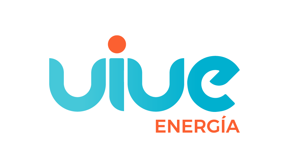
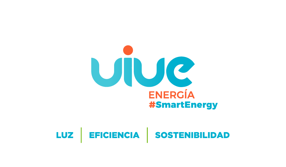
The first thing that struck us was that there was no precise differential value in the offer, there are already several energy companies in Spain, so we wanted to design a different brand. The branding agency before us had proposed a blue brand with certain technical guidelines but lacking in personality. At first glance we noticed a tagline that sounds good in principle, it is minimalist, simple and direct: “LUZ + GAS + MÁS”.
Graphically it is 3 words of 3 letters that are easy to compose and phonetically it is pleasant; the problem: The client does not sell Gas.
At that stage the Customer had no gas distribution service for either SMEs or residences. Another flaw is that the ‘MORE’ was much more. We discovered a threshold of services much more interesting than summarising it in those 3 words just to make it rhyme well. The case was not about changing the claim under the logo, the analysis looked deeper: the brand’s value proposition and the definition of the Brand Equity.
LOGO DESIGN:
Nuestro trabajo no se basó en un mero cambio estético de rediseñar el logotipo, sino desarrollar toda la estrategia de branding y el plan de marca de fondo. Tras una Brand Audit
and conducting interviews with different profiles inside and outside the company, such as 1:1 calls with sales representatives, installers and some key customers, we analysed the category, defined the buyer persona, profiled the customer typology and proposed a series of action plans to conquer each differentiated target with a different and adaptable communication strategy.
After the complete definition of the brand, worked hard between our marketing and branding department and the client, we began to validate and redefine the basic elements of the brand.
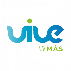
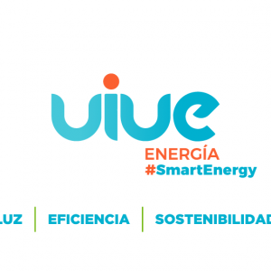
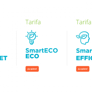
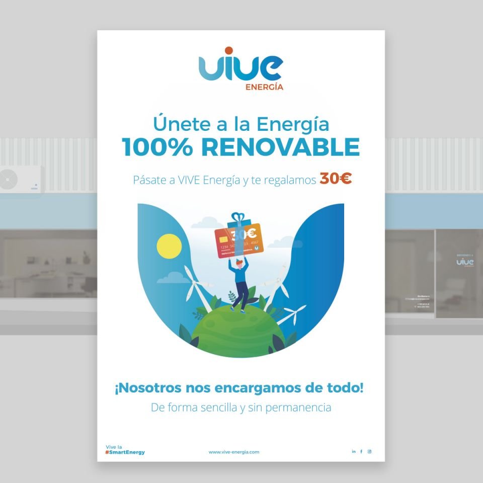
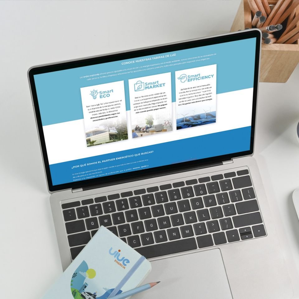
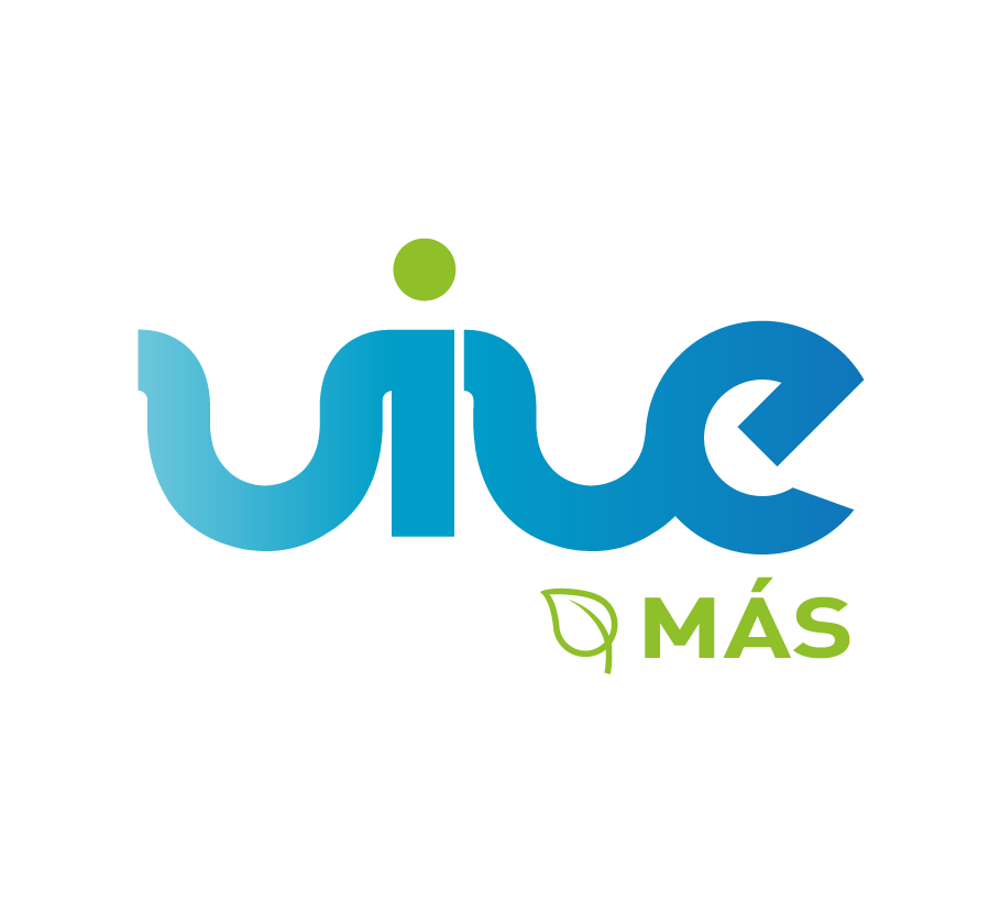
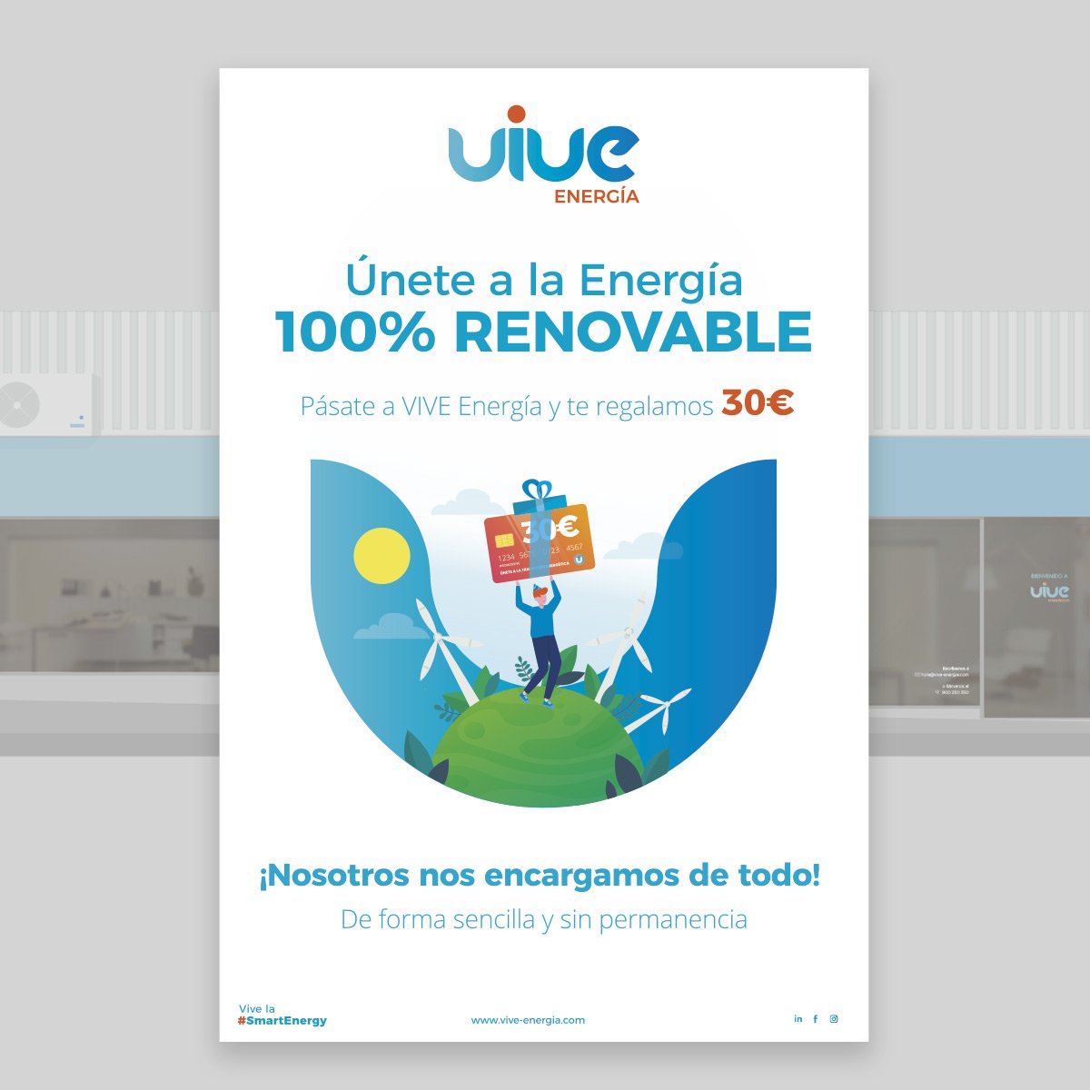
We have shifted from ‘LIGHT, GAS AND MORE’ to a focus on sustainability and environmental responsibility because today’s businesses demand not only energy but a commitment to quality and environmental responsibility. We now offer to sell only green energy exclusively from 100% renewable sources, as well as a range of energy efficiency, sustainability and urban mobility products and services.
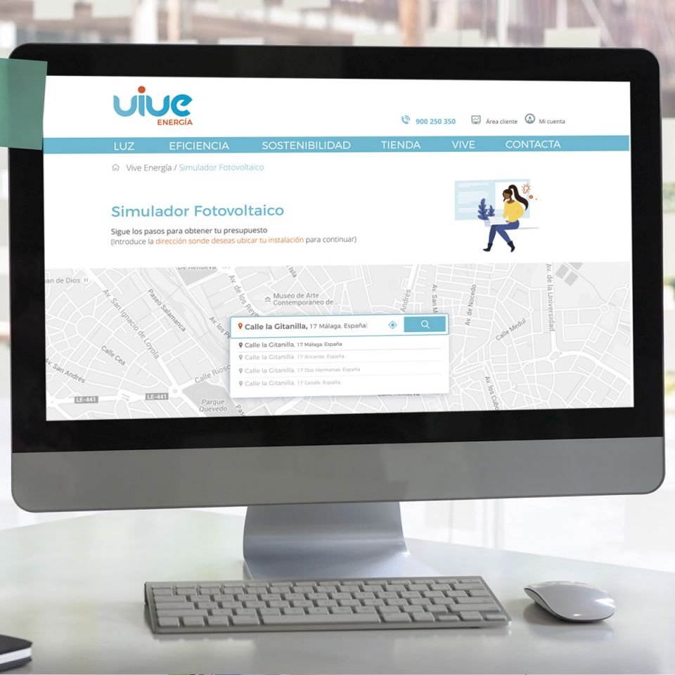
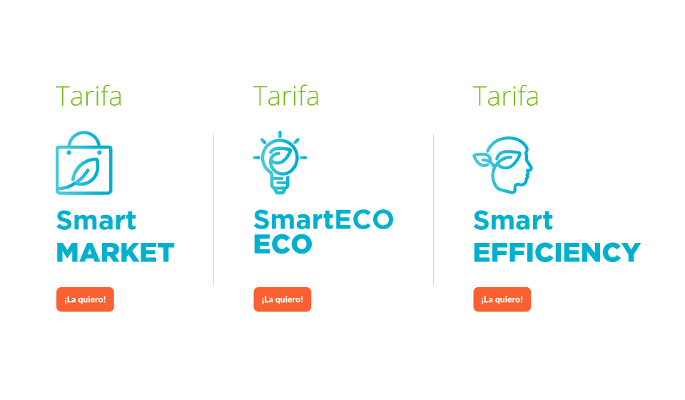
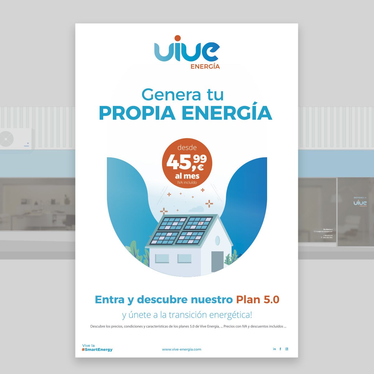
The customer made a change in the choice of suppliers and electricity producers to select, sell and distribute only clean energy. It expanded its range of services to offer monitoring and energy savings, combined with solar self-consumption projects, photovoltaic installations such as the sale of LED lighting, scooters and electric bicycles. At a conceptual level we were inspired by a SmartCity, a model of sustainability ideal for both businesses and residences.
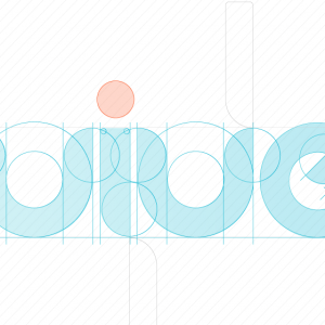
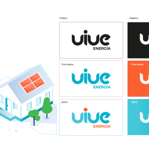
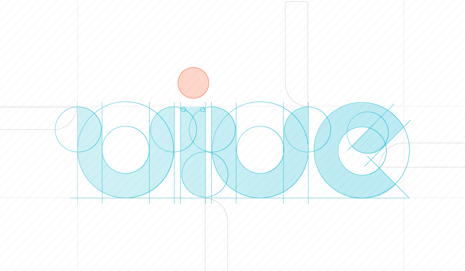
We had come across a logo with some basic problems: REDUNDANCY: It seemed to us that ‘The energy you use to live’ as a slogan for a company whose naming is already ‘Vive Energía’ did not add value. SHAPES: The ending of the letter ‘e’ was not as harmonious as possible, that is to say, the cane where the ‘e’ ended was not as sinuous as the rest of the letters, the joins and separations of the letters had reading problems and in itself the ‘e’ was not as harmonious as the rest of the letters. no responsive logo for small scales. LACK OF UNITY: We found 3 versions of the logo with 3 different colours, in our opinion Coca-Cola does not change its brand colour even though it has different products; Endesa’s blue does not vary despite the different services it offers. The versioning applies to products, not to company brands.


CORPORATE IDENTITY MANUAL:
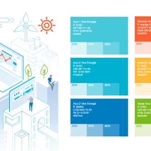
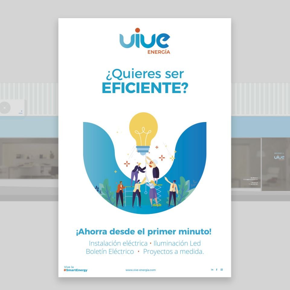
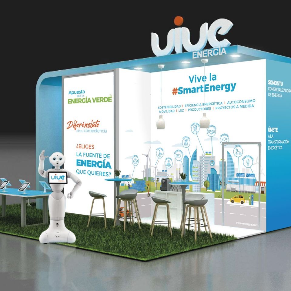
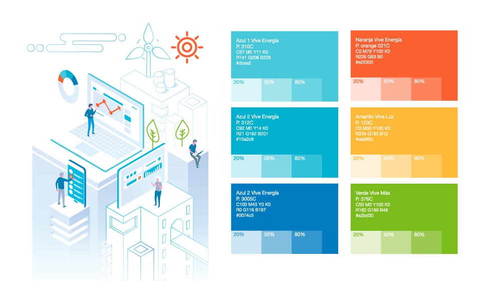
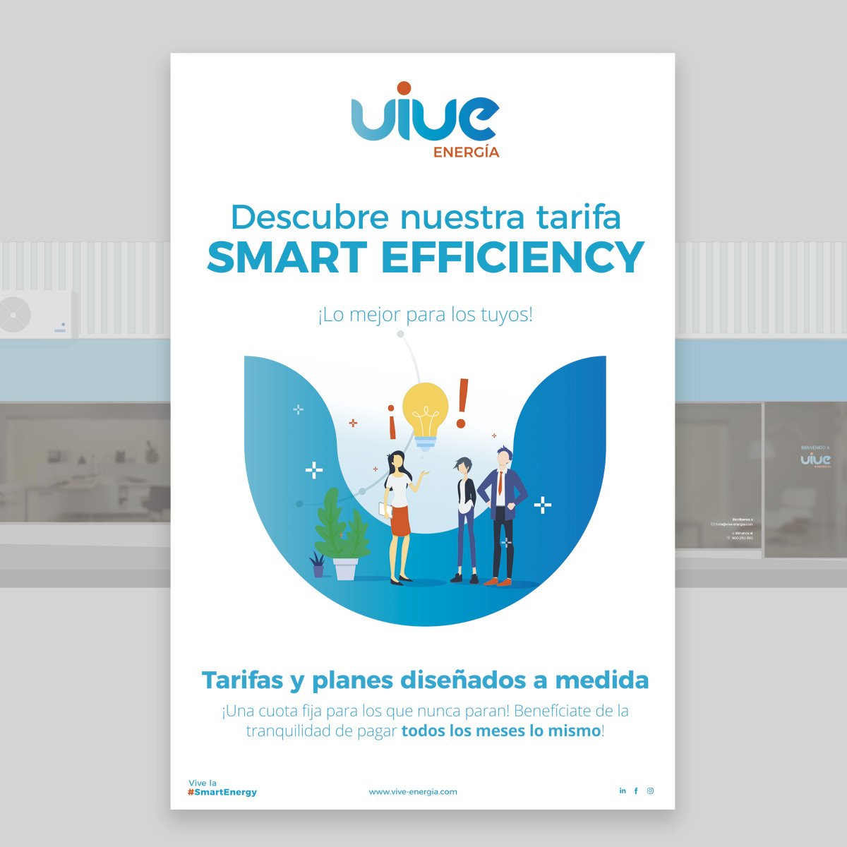
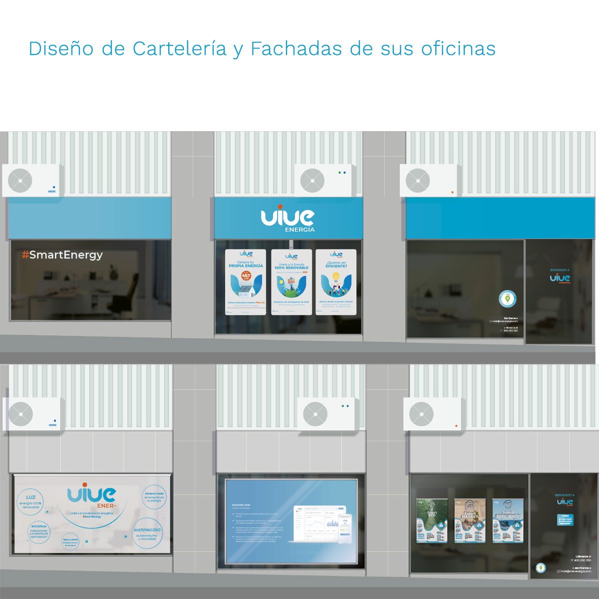
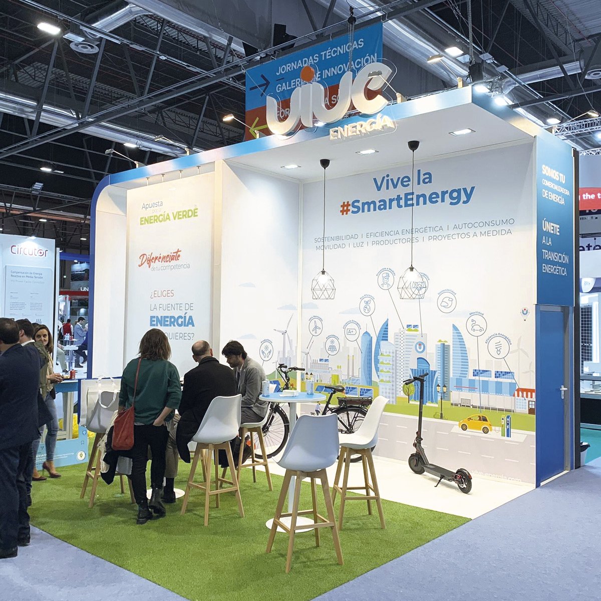
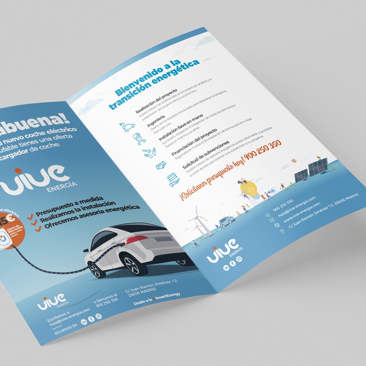
Once the entire brand strategy for the company had been defined, we proceeded to set out the technical guidelines for applying the logo in different scenarios: The use of colours for print and digital media, the range of typefaces ideal for communication pieces, and we established a visual theme around flat modern illustrations where we could develop the different sustainability scenarios: illustrations of smartcities, people moving around on scooters, charging their electric car, making responsible use of renewable energy.
As you can see, it has been a luxury to be able to propose and shape the whole new brand strategy hand in hand with the client.
In the chapters of this corporate identity manual, the following were defined:
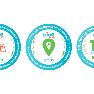
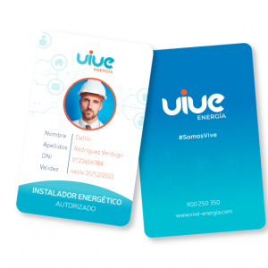
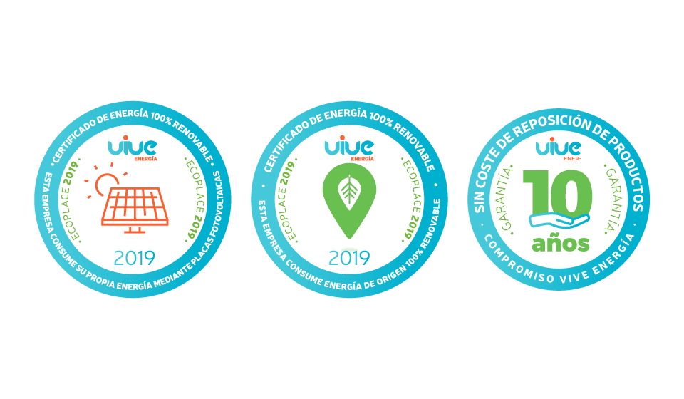
The coparative colour palette The different versions of the logo: Monochrome, Positive, Slide, Isotype for the App, etc The typographic fonts present in the logo and in its communication and web The illustrations and photographic principles in the choice of photographs Naming and nomenclature for its Plans and Electricity tariffs + logos Design of the CSR seals and renewable energy quality stickers for its customers Brand applications such as Accreditations, electronic signature of emails, business cards, etc.

BRAND MAINTENANCE:
This is our story with Vive Energía: it started with a specific request for a triptych and 3 years later we have become their creative agency ‘partner’ for much more than their branding.
With them we have been able to design not only
your brand identity and brand plan
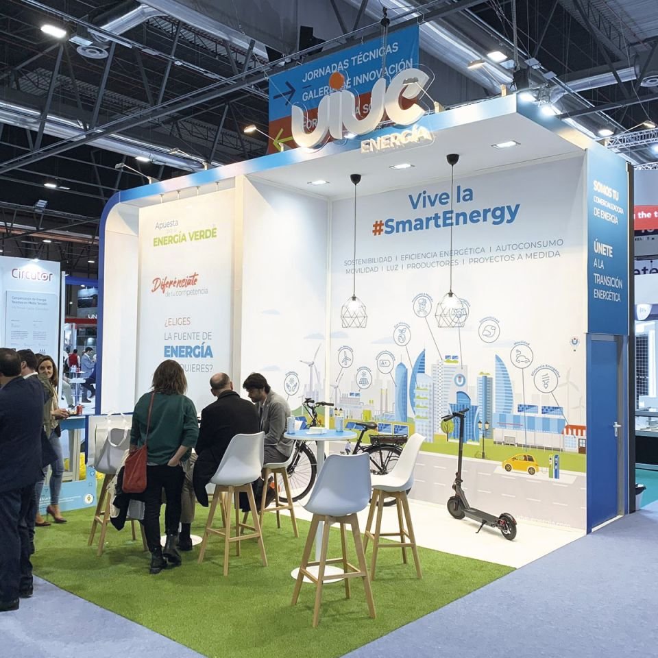
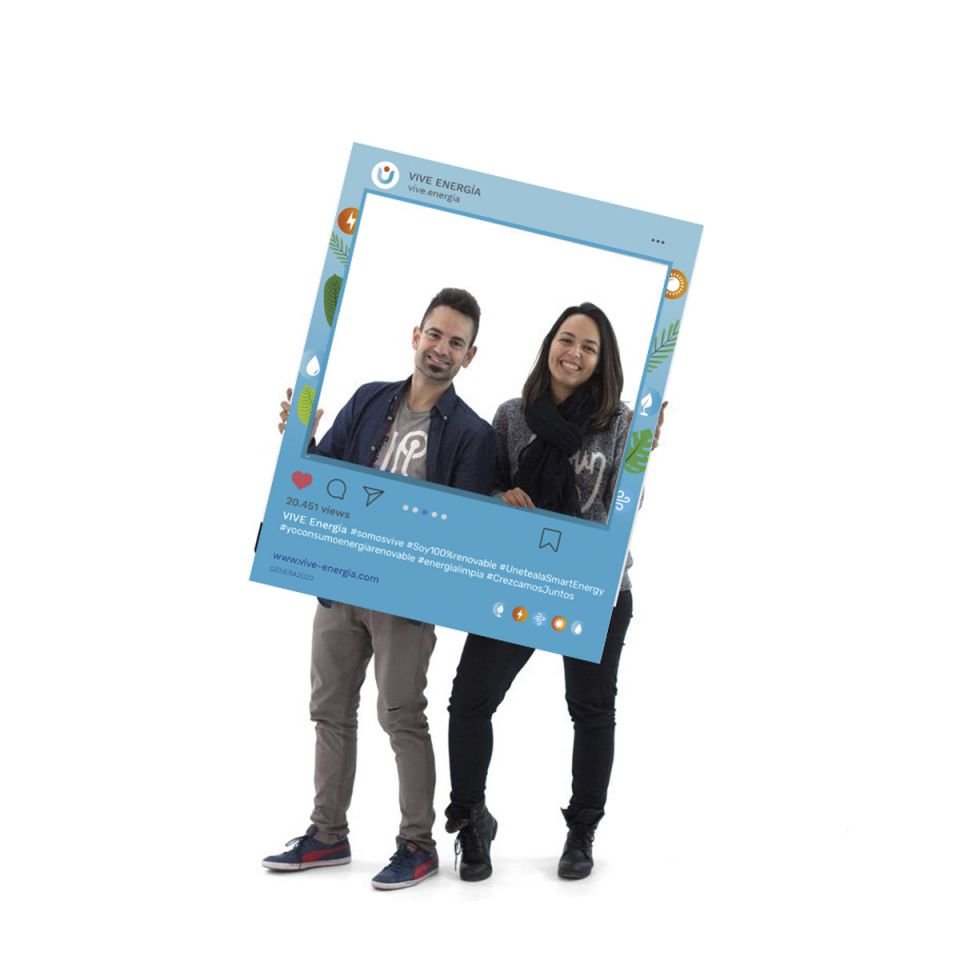
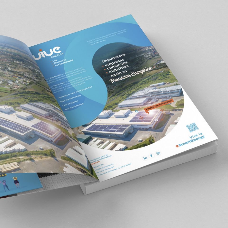
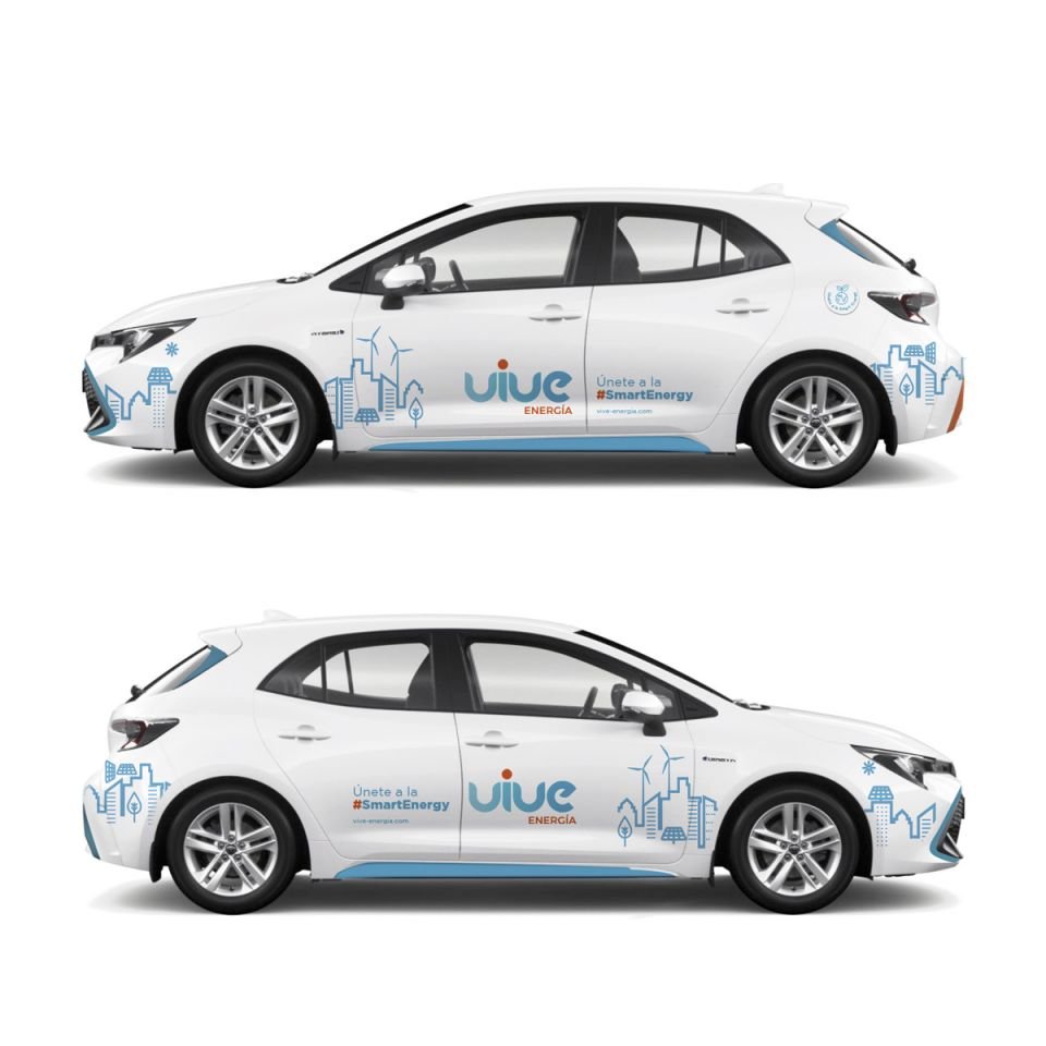
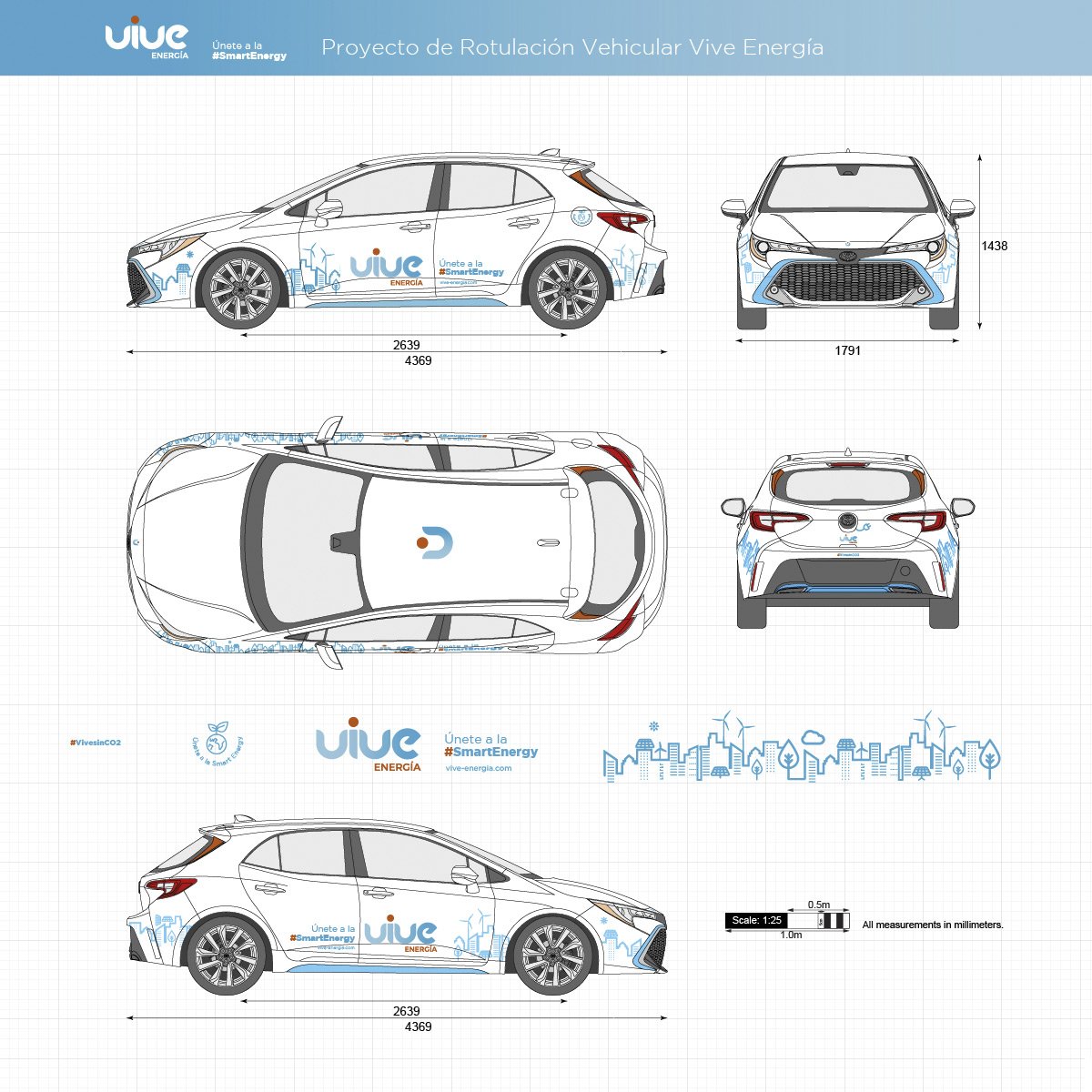
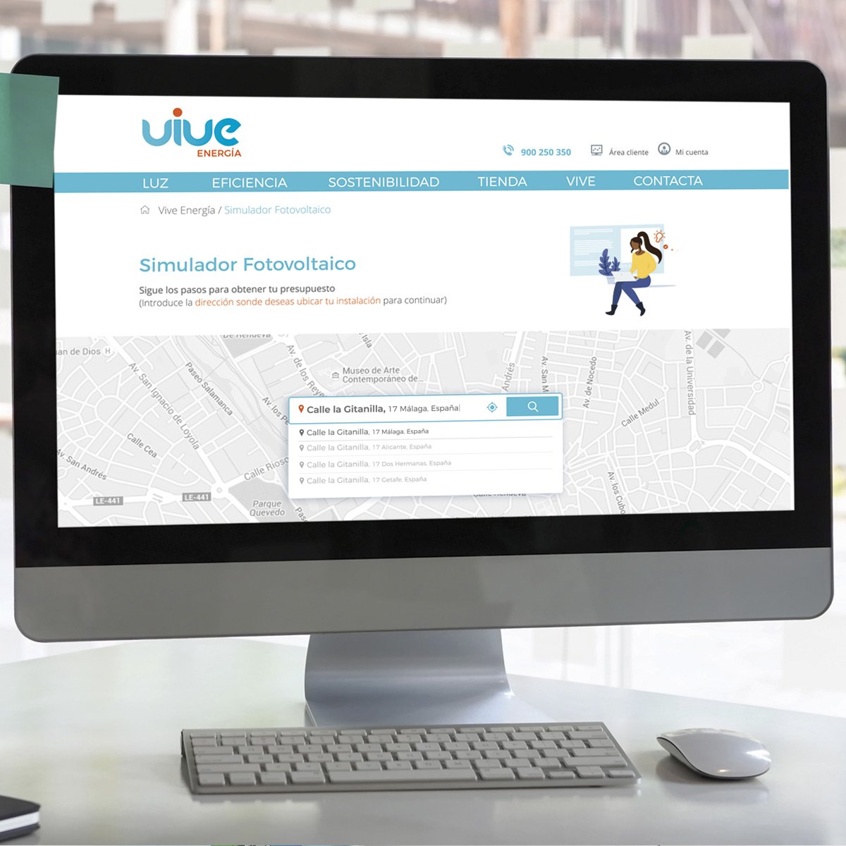
but all the visual and digital aspects of their brand such as: their website, changing the focus of their strategy and lead generation, maintaining their blog and social networks with organic content, giving creative support for their events and stands at fairs, exhibitions and events, designing their communications, advertising, press ads, magazines, templates and forms to their own spaces designing the billboards of their shops, interior decoration vinyls and signage for their fleet of vans and many more things.
From Brandesign we thank Vive Energía for giving us the opportunity to team up with them, and see how little by little they are growing. In 2021 they are ranked #85 in the TOP 100 companies that sell the most electricity in Spain. A success story that we wanted to share with you from your branding and design agency.


Some creative projects of graphic design, marketing, advertising and web design carried out between 2019 and 2021. © Vive Energia Eléctrica, s.a.


DO YOU HAVE AN EFFECTIVE BRANDING PLAN?
Does the presentation of your service not communicate its key features and unique value proposition? You don’t have 2 chances to communicate your company well. The current market demands authenticity and a lot of innovation. At Brandesign we design brand strategies so that they become your company’s most valuable asset. We do it from research, preparation and with excellent care to creativity, because your company cannot afford not to stand out. Shall we start?

I worked in P&G building global brands with branding strategies for regional markets according to each consumer. I complemented my 360º profile working in media agencies to analyze campaigns after the click.

I’ve always been with a pencil in my hand, scribbling ideas to design professional projects in the environment of digital arts, graphic design, animation and 3D. I love to see how step by step my creations come to life.


Versatile, decisive and productive. Throughout my career as a journalist and digital marketing specialist, I have done reports, articles, interviews, public reports, creating content for brands on social networks and portals.

I like to thoroughly understand the client’s needs and translate them into digital solutions, the Internet is growing every day in a diversity of formats and digital resources and we always find the tailored IT solution that best suits the users.

Some call me a designer, others an art director, even my mother says I’m an artist and the truth is that I only like labels to design them.

I always try to give an answer and a solution every time you call me, I answer the calls and the Brandesign chat from the customer service.